

Wix Editor: Showing and Customizing Popups on Your Mobile Site
3 min
In this article
- Showing a popup on your mobile site
- Editing a popup on your mobile site
By default, any popups that you have on your desktop site are automatically hidden from your mobile site.
You can choose to keep your popups hidden from your mobile site, or customize and optimize them from the mobile editor to show them on mobile.
Showing a popup on your mobile site
Depending on your mobile site's content and layout, you may want to display the popup to your mobile site visitors. As popups act as pages, you can set your popup to display on mobile via the Pages panel.
If you change your mind, you can easily hide it again at any time.
To show your popup on mobile:
- Access the mobile editor.
- Click Menus & Pages
on the left side of the mobile editor.
- Click Popups.
- Click the relevant popup.
- Click the Settings icon
.
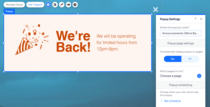
Note: This option is only visible if you clicked Yes under Automatically display popup on pages in the popup settings on your desktop editor. - Click Yes under Automatically display popup on pages.
Editing a popup on your mobile site
Edit the content of your popup on your mobile site to make it look good on smaller screens. You may want to have less text on your popup on mobile than on your desktop site, or you may want to change how site visitors can close it.
To edit your popup for mobile:
- Access the mobile editor.
- Click Menus & Pages
- Click Popups.
- Click the relevant popup.
- Click the elements in your popup (such as text and images) to customize them, add animation effects, or hide them from your mobile site.
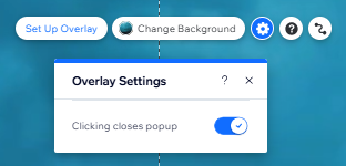
- Click outside the popup to access the overlay, and then click the Settings icon
- Click the 'X' icon (if you set your popup to include one) to either add animation, or hide it from your mobile site.
- Click the 'Close button' (if you set your popup to include one) to change the text size and alignment, add animation, or hide it from your mobile site.
Important:
Design options for popups are limited in the mobile editor. For example:
- You can not edit your popup overlay on the mobile version of your site.
- If you add a color or image overlay on desktop, this is automatically applied to your mobile site. However, if you add a video overlay, this will convert to a still image from the video on the mobile version of your site.
- The background you choose is automatically applied to your mobile site, and cannot be changed in the mobile editor.
Note:
The delay timer on your popup begins once the site is fully loaded. If you have set your delay timer to 0, you may still experience a slight delay while the site is loading.
