Wix Editor: Adding and Customizing Mobile-Only Elements
5 min
In this article
- Adding mobile-only elements
- Designing mobile-only elements
- Adjusting the layout of a mobile-only element
- Duplicating mobile-only elements
Using the mobile Editor, you can add elements that are exclusive to your mobile site. Add text, images, buttons, embeds and other elements that are completely optimized for small screens.
As mobile-only elements don't appear on your desktop site, you can design them as you wish, adjust the layout and duplicate them for easy editing. This allows you to replace desktop elements that aren't suitable for mobile, or create a completely different look just for mobile.
How do I access the mobile Editor?
Adding mobile-only elements
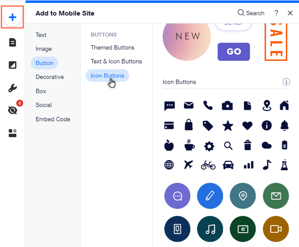
Add mobile-only elements to tailor your site completely for visitors on mobile devices. Add elements like text, images, buttons and more from the Add to mobile panel in the mobile Editor.

Click an option below to learn more about the types of elements available:
Text
Image
Buttons
Decorative
Box
Social
Embed Code
Not sure if it's a mobile or desktop element?
Mobile-only elements display a Mobile icon  when you click them.
 when you click them.
Designing mobile-only elements
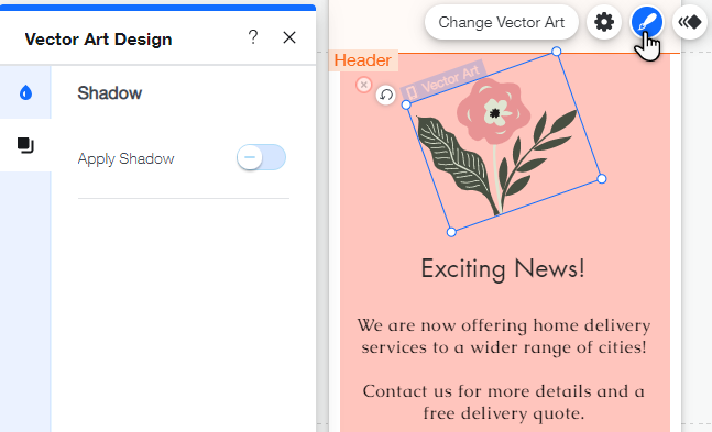
You can customize your elements using design options such as fill color, border, and shadow. By designing your elements, you can make your mobile site truly unique and create something fun and informative for your visitors.
To design your element:
- Click the mobile-only element.
- Click the Design icon
 .
. - Use the customization options available to design your element.
Note:
The available design options depend on the type of element.

Adjusting the layout of a mobile-only element
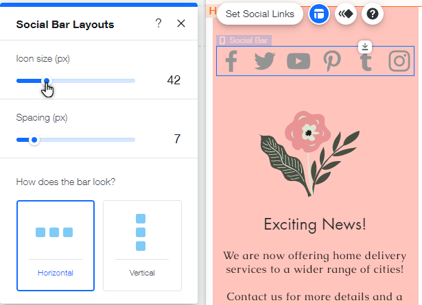
Change the layout of elements to align your mobile site. Adjusting your elements can keep your site neat, and provide a smooth experience for mobile visitors.
To change the element's layout:
- Click the mobile-only element.
- Click the Layout icon
 .
. - Use the customization options available to adjust the layout.
Note:
The available layout options depend on the type of element.

Want to move a strip?
You can click and drag strips / columns in the mobile Editor to move it and its elements.
Duplicating mobile-only elements
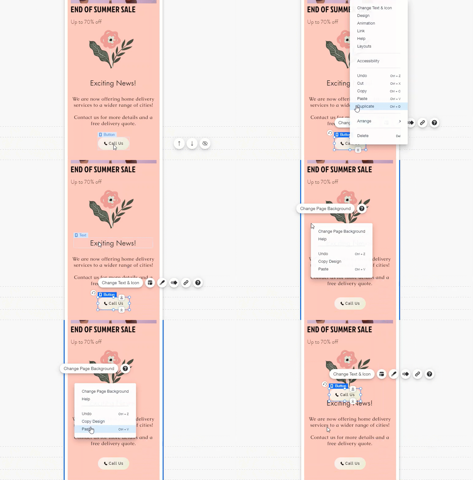
You can copy and paste elements on your mobile site to quickly and easily add as many as you like.
To duplicate a mobile-only element:
- Right-click the element.
- Click Copy.
- Right-click the page / strip.
- Click Paste.
Notes:
- Only supported mobile elements can be copied from the desktop Editor, and pasted to the mobile Editor.
- Mobile-only elements cannot be pasted to the desktop Editor.


 on the top of the Editor.
