You can change the layout of your gallery cover image and galleries at any time if you prefer a different design.
Changing the layout of your cover photo
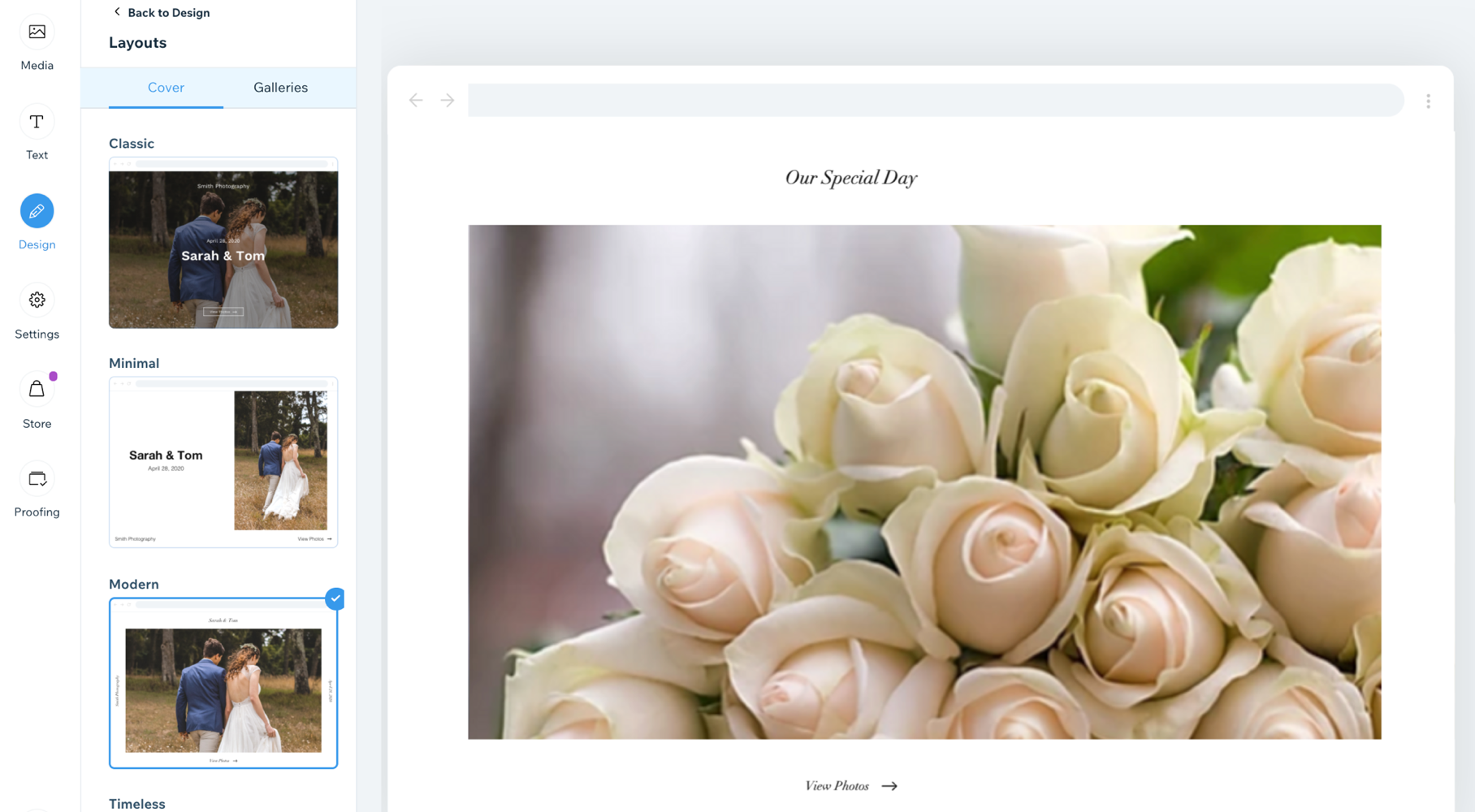
Your album cover is the first thing you see when you view your album. It's important to choose a layout that is right for you. You can customize the layout of your cover photo, without it effecting the rest of your album.
To change the layout of your cover photo:
- Go to your Photo Albums in your site's dashboard.
- Do one of the following:
- Create a new album.
- Edit and existing album.
- Click the Design tab on the left.
- Click Layouts.
- Click the Cover tab at the top of the panel.
- Select a layout from the options available.
Changing the layout of your gallery
You can change the layout of your gallery without it effecting your cover image. Each layout option gives you different customizable settings.
To change the layout of your gallery:
- Go to your Photo Albums in your site's dashboard.
- Do one of the following:
- Create a new album.
- Edit and existing album.
- Click the Design tab on the left.
- Click Layouts.
- Click the Galleries tab at the top of the panel.
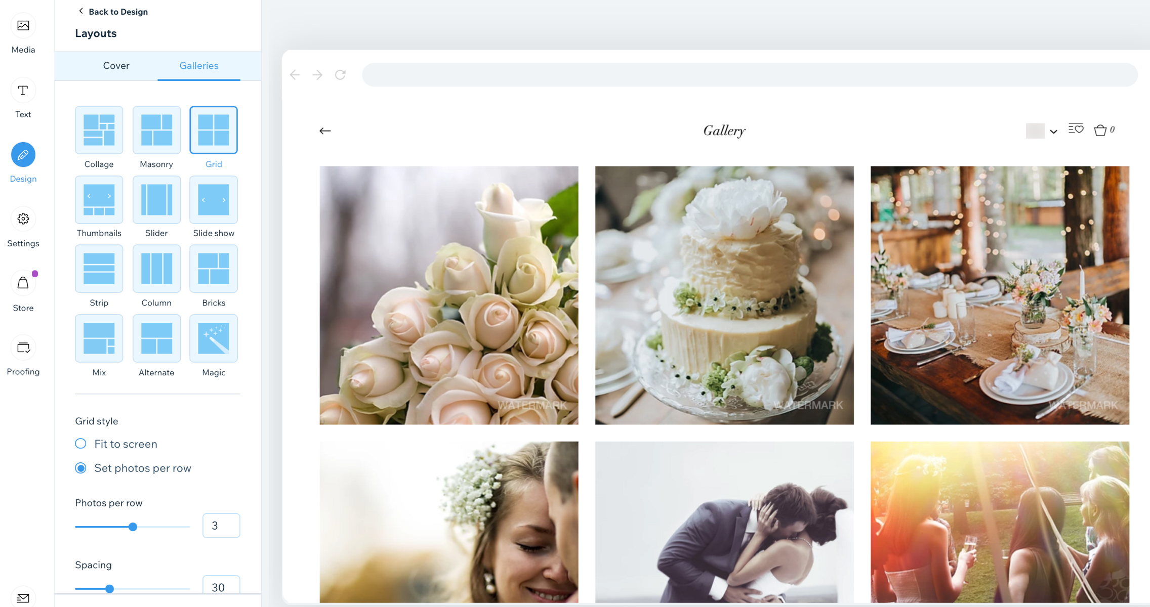
- Select a layout from the options available. Note: We are using the Grid layout.
- Customize the following settings:
- Grid style:
- Fit to screen: The amount of photos shown on one row is dependent on your screen size.
- Thumbnail size: Drag the slider to increase or decrease the size of each thumbnail.
- Set photos per row: A set amount of photos are shown on each row, e.g., 3.
- Photos per row: Drag the slider to increase or decrease the amount of photos per row.
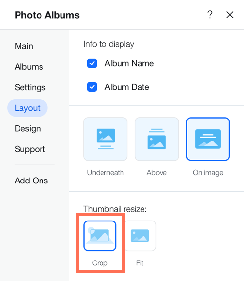
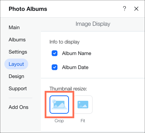
- Thumbnail resize:
- Crop: The image slightly cropped around the sides.
- Fit: The image size is reduced to fit the entire image in the area provided.
- Image ratio: Choose the image ratio from the options provided. Note this option only applies to cropped thumbnails.
Customizable layout features
Each customizable layout offers a range of settings you can personalize. Choose from static or sliding gallery layouts - or select the Magic layout and let us generate a layout for you.
Click a layout below to learn more about its features:
Use the Collage Layout when you want to show images of different orientation (both vertical and horizontal) placed randomly within the gallery.
- Scroll Direction: Choose vertical or horizontal scroll.
- Gallery orientation: Choose whether photos will be shown vertically or horizontally.
- Info to display: Choose what gallery info is shown.
- What happens to the info on hover?: Choose whether the gallery info appears, disappears, or doesn't change when you hover the cursor over it.
- Thumbnails size: Choose how big images in the gallery are.
- Spacing: Choose how much space to have between the images.
- Collage density: Choose how many images will be shown at a time in the gallery.
- Load more button: Choose to show or hide the Load more button.
- How many images load: (This option is only relevant if you have chosen to enable a Load more button)
- All images
- One more section (adds another section of the same size as the original gallery)
Use the Masonry layout when you want to show images of different orientation placed in columns or rows.
- Gallery orientation: Choose whether photos will be shown vertically or horizontally.
- Info to display: Choose what gallery info is shown.
- What happens to the info on hover?: Choose whether the gallery info appears, disappears, or doesn't change when you hover the cursor over it.
- Thumbnails size: Choose how big images in the gallery are.
- Spacing: Choose how much space to have between the images.
- Load more button: Choose to show or hide the Load more button.
- How many images load: (This option is only relevant if you have chosen to enable a Load more button)
- All images
- One more section (adds another section of the same size as the original gallery)
Use this layout when you want your images to be shown within a grid.
- Scroll Direction: Choose vertical or horizontal scroll.
- Info to display: Choose what gallery info is shown, and if it appears underneath, above or on the image.
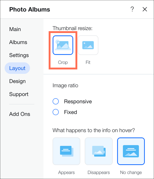
- Thumbnail resize:
- Crop: You can choose the image ratio.
- Fit: Adapts image size to the size of the gallery.
Note: The Border width & color and Corner radius options are only available when you choose to crop your thumbnails in your layout's settings.

- Image ratio: Choose from the image ratio options available, e.g. (4:3, 1:1).
- What happens to the info on hover?: Choose whether the gallery info appears, disappears, or doesn't change when you hover the cursor over it.
- Fit to screen: Shows as many images as can fit within the gallery with a fixed size
- Set items per row: Drag the slider to show more or less images per row.
- Thumbnails size: Choose how big images in the gallery are.
- Image per row: Choose how many images are shown per row (only when Horizontal orientation is chosen).
- Spacing: Choose how much space to have between the images.
- Load more button: Choose to show or hide the Load more button (appears only if Vertical scroll direction is chosen).
- How many images load: (This option is only relevant if you have chosen to enable a Load more button)
- All images
- One more section (adds another section of the same size as the original gallery).
- Gallery direction: Choose a direction for the gallery images to scroll.
- Left to right
- Right to left
Use the Thumbnails layout when you want to show multiple thumbnails next to the selected image.
- Loop images: Viewers can scroll through images in a continuous loop.
Note: The “Left” button always gets deactivated when you reach the first image while scrolling backward.
- Slide automatically: Choose to display your items in a continuous slideshow:
Note: If you want to change the transition effect, please go to the "Slide Animation" tab in the Design settings. - Info to display: Choose what gallery info is shown.
- Thumbnail resize:
- Crop: Adapts the image size to the size of the gallery.
- Fit: Shows the image in its original ratio and adapts it to the gallery size. If there is too much empty space around the image you need to increase the height of the gallery.
Note: The Border width & color and Corner radius options are only available when you choose to crop your thumbnails in your layout's settings.

- Thumbnail placement: Choose where you want thumbnails to appear on the screen (below, left above or right of the current image on display).
- What happens to the info on hover?: Choose how you want the information text to appear when the cursor hovers over the album. To see how it looks, preview your site and hover over the image.
- Appears: Info text appears over the main album image.
- Disappears: Info text disappears from the main album image.
- No change: Info text remains static over the main album image.
- Gallery direction: Choose a direction for the gallery images to scroll.
- Left to right
- Right to left
User the Slider layout if you want to show multiple images with a horizontal scroll.
Note: the number of images shown at a time in this layout depends on the gallery size. If some images look cut you need to change the size of the gallery. Another solution is to choose “Crop” and “Responsive” in the layout settings.
- Loop images: Choose to allow visitors to scroll through your images in a continuous loop.
- Slide automatically: Choose to display your items in a continuous slideshow.
- Info to display: Choose what gallery info is shown.
- Thumbnail resize:
- Crop: Choose whether the ratio is fixed or responsive.
- Fit: Shows the image in its original ratio and adapts it to the gallery size. If there is too much empty space around the image you need to increase the height of the gallery.
Note: The Border width & color and Corner radius options are only available when you choose to crop your thumbnails in your layout's settings.

- Image ratio:
- Responsive: The image size will adjust automatically depending on the viewer's device.
- Fixed: Choose from the image ratio options available, e.g. (4:3, 1:1). Images will appear in this ratio across all devices.
- What happens to the info on hover?: Choose how you want the information text to appear when the cursor hovers over the album. To see how it looks, preview your site and hover over the image.
- Appears: Info text appears over the main album image.
- Disappears: Info text disappears from the main album image.
- No change: Info text remains static over the main album image.
- Spacing: Choose how much space to have between the images.
- Gallery direction: Choose a direction for the gallery images to scroll.
- Left to right
- Right to left
Use the Slide Show layout if you want to show one image at a time with horizontal scroll.
- Loop images: Choose to allow visitors to scroll through your images in a continuous loop.
- Slide automatically: Choose to display your items in a continuous slideshow:
Tip: When you set your Slideshow to slide automatically, you have the option to display a Slideshow counter on your gallery from the Text tab in the Design Section. - Info bar size: Adds space for icons, title and description under the gallery.
- Play Button: Add a button to allow visitors to pause or play the slideshow. (This option is only available when you choose to enable Slide Automatically).
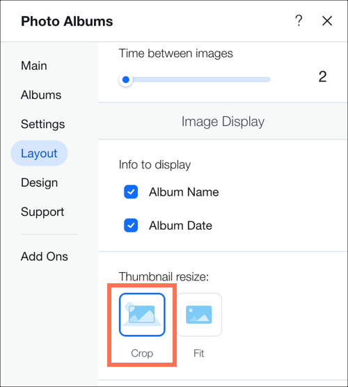
- Time between images: Choose how much time passes before the slide changes (appears only when “Slide automatically” is activated).
Note: if you want to change the transition effect, please go to the “Slide Animation” tab in the “Design” settings. - Info to display: Choose what gallery info is shown.
- Thumbnail resize:
- Crop: Adapts the image size to the size of the gallery.
- Fit: Shows the image in its original ratio and adapts it to the gallery size. If there is too much empty space around the image you need to increase the height of the gallery.
Note: The Border width & color and Corner radius options are only available when you choose to crop your thumbnails in your layout's settings.

- Gallery direction: Choose a direction for the gallery images to scroll.
- Left to right
- Right to left
Use the Column layout if you want to show multiple images at a time in one row.
- Loop images: Choose to allow visitors to scroll through your images in a continuous loop.
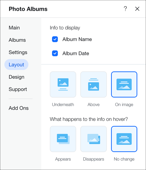
- Info to display: Choose what gallery info is shown.
- Album Name
- Album Date

- What happens to the info on hover?: Choose how you want the information text to appear when the cursor hovers over the album. This only appears when you select On image in the previous option. To see how it looks, preview your site and hover over the image.
- Appears: Info text appears over the main album image.
- Disappears: Info text disappears from the main album image.
- No change: Info text remains static over the main album image.
- Spacing: Choose how much space to have between the images.
- Gallery direction: Choose a direction for the gallery images to scroll.
- Left to right
- Right to left
Bricks, Mix and Alternate
Use these layouts to display gallery items of different sizes and orientation side by side.
- Spacing: Choose how much space to have between the images.
- Load more button: Choose to show or hide the Load more button (appears only if Vertical scroll direction is chosen).
- How many images load: (This option is only relevant if you have chosen to enable a Load more button)
- All images
- One more section (adds another section of the same size as the original gallery).
- Gallery direction: Choose a direction for the gallery images to scroll.
- Left to right
- Right to left
This layout allows you to change the layout to another one in one click. Simply click Create Magic Layout to randomize your gallery layout.
FAQs
Here are some common questions about customizing your gallery:
Can I hide my album cover entirely?
Yes, you can hide your album cover entirely if you don't want it to appear.
Is there a way to make my gallery load more quickly?
You can adjust the image quality of your gallery. This will only affect the way images appear in your gallery (not images in expand mode, full screen or downloads). Lower image quality may reduce gallery loading time.
To adjust the image quality of your gallery:
- Go to Photo Albums in your site's dashboard.
- Click Edit next to the relevant album.
- Click Settings on the left.
- Drag the Image quality in gallery slider to adjust the way your photos appear in your gallery.
