Wix Editor: Using and Customizing Your Color Theme
5 min
In this article
- How theme colors work on your site
- Choosing a color theme
- Customizing your color theme
- Setting default colors for elements
- Manually applying theme colors to elements
- FAQs
Creating a color theme is an important step in your site's design process. When used consistently, color themes set the tone for your visitors and introduce them to your brand.
Your color theme is automatically used across your site, and in the 'themed" elements in the Add panel. You can also apply the colors of your theme to any element on your site.
How theme colors work on your site
The theme colors you choose are displayed in the color picker - where you can change the color of elements individually. As well as appearing in the picker, the colors are also automatically delegated and applied to certain elements across your site.
Base colors
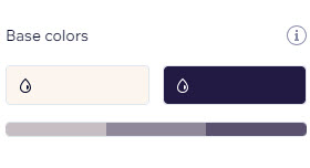
Base colors are used for backgrounds and text across your site. If you've added Wix apps (e.g., Wix Stores, Wix Blog, etc.) to your site, those pages use the same background and text colors.
In most cases, the brightest color (1) is used for the background while the darkest (2) is for text. A gradient is automatically created, so you can adjust the shades as needed.
We recommend selecting a high-contrast pairing, so that the information on your site is easy to read.
Accent colors
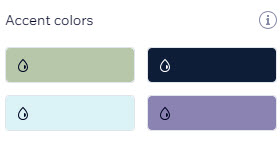
Encourage visitors to interact with your site by selecting eye-catching accent colors. These colors are used for secondary and decorative elements such as links, buttons, and menu elements. They also appear in themed elements like buttons and boxes, as well as pages related to Wix apps (e.g., Wix Stores, Wix Blog, etc.)
Choosing a color theme
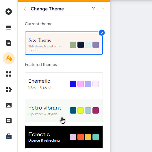
There are a variety of theme presets available for you to apply to your site, which include both text and colors. Our themes have been carefully created with complementary colors to cover a broad range of styles and design needs.
To choose and customize a color theme:
- Click Site Design
 on the left side of the editor.
 - Click Change Theme under Site Theme.
- Browse through the presets and click to select a new one.
Customizing your color theme
You can customize the site's color theme to match your brand's aesthetic. Choose new colors, and adjust the shade of base colors to get the look you really want.
To customize your color theme:
- Click Site Design
 on the left side of the editor.
 - Click Color theme under Customize your site design.
- Choose how you want to change the theme:
- Change theme colors:
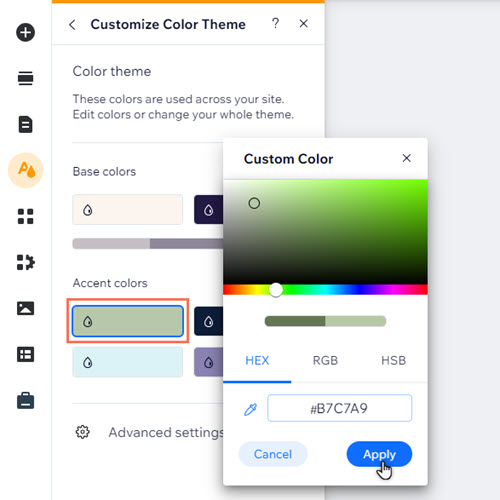
- Click the color you want to edit in the panel.
- Select a new color by either using the cursor to find and select a new color, or entering the exact color in HEX, RGB or HSB values.
- Click Apply.
- Adjust the shade of your theme's base colors:
- Click the relevant shade on the base color gradient.
- Use the sliders to adjust the saturation and brightness to your liking.
- Click Apply.
- Change theme colors:
Setting default colors for elements
After choosing and customizing your color theme, you can set default theme colors for certain elements across your site. This is a great way to reinforce your brand, and make sure that elements complement each other.
To set default colors for elements:
- Click Site Design
 on the left side of the editor.
 - Hover over Color & Text Theme and click Customize.
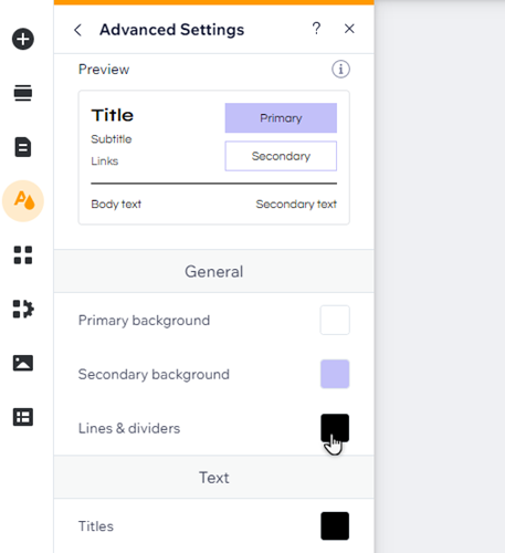
- Click Advanced Settings.
- Click the color box next to the relevant element to assign a color:
- General: Choose the colors you want to use for primary and secondary backgrounds on your site, as well as lines and dividers.
- Text: Apply your chosen colors to different text types across your site, including subtitles and links.
- Buttons: Set the colors you want to use on primary and secondary buttons. You can choose a color for each button state (regular, hover, or disabled) separately.
Manually applying theme colors to elements
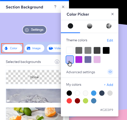
You can apply theme colors to any additional elements on your site. They are saved in the color picker in the element design panel, so it's even easier to create a consistent design.
To apply a theme color to an element:
- Click the element in your editor.
- Click the Design icon
.
- Click Customize Design (if displayed).
- Click the color settings.
- Click the color box.
- Select a theme color from the picker.
FAQs
Click a question below to learn more.
Can I save custom colors that are not part of my theme?
Why can I only add custom colors in some places?
Do themed elements already use my theme colors?


