

Wix Editor: Designing Your Collapsible Text
2 min
In this article
- Customizing the design of your text
- Customizing the design of the expand / link button
Once you've added and set up collapsible text, you can customize the design and settings to match your site. Adjust the font, formatting, and spacing to suit your site's look and alignment, and to match your site and brand.
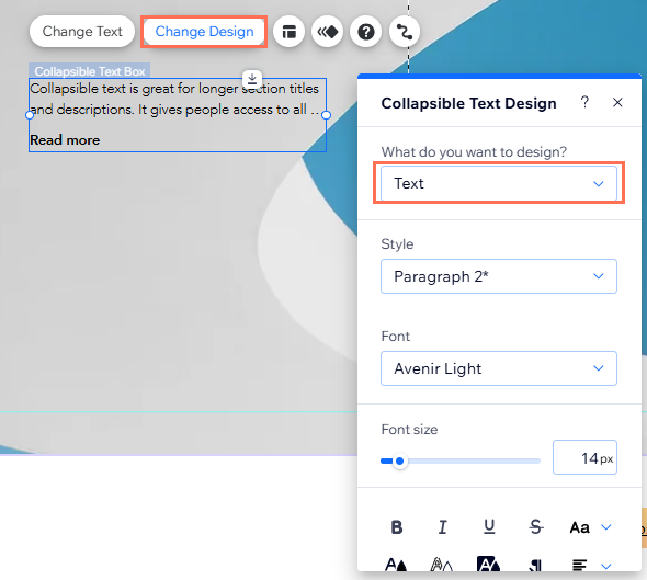
Customizing the design of your text
After setting up your collapsible text, you can customize the design including the formatting, alignment, and fonts.
To customize the design of your text:
- Go to your editor.
- Click the text box.
- Click Change Design.
- Select Text from the dropdown menu, and customize it with the following options:
- Style: Select the text theme from the dropdown menu to quickly apply a font and size to your text.
- Fonts: Choose how your text looks from the dropdown menu.
- Font size: Make your text as small or as big as you want.
- Formatting: Further customize your text by applying settings such as bold and italic. You can also choose a text, highlight, and outline color.
- Alignment: Change how your text is aligned, and the direction it goes in.
- Character and line spacing: Make the spacing between your characters and lines smaller or more prominent.
- Shadows: Add a shadow to give your text a 3D effect. You can customize different aspects of the shadow to make it more or less dramatic.
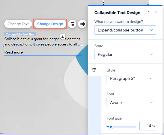
Customizing the design of the expand / link button
If you chose to collapse the text, you can design the expand and collapse buttons. If your text goes to a link, you can also change the link button to look exactly as you want.
There are 2 states that you can customize:
- Regular: How the button looks before a visitor interacts it.
- Hover: How the button looks when a visitor hovers their cursor over it.
To customize your text box button:
- Go to your editor.
- Click the text box.
- Click Change Design.
- Select Expand/collapse button from the dropdown menu.
- Click either the Regular or Hover tab to customize the design for each state with the following settings:
- Themes: Select the text theme from the dropdown menu to quickly apply a font and size to your button.
- Fonts: Choose how the text looks from the dropdown menu.
- Font size: Make the button text as small or as big as you want.
- Formatting: Further customize your button by applying settings such as bold and italic to its text. You can also choose a text, highlight, and outline color.
- Alignment: Change how the text is aligned, and the direction it goes in.
- Character and line spacing: Make the spacing between your characters and lines smaller or more prominent.
- Shadows: Add a shadow to give your button a 3D effect. You can customize different aspects of the shadow to make it more or less dramatic.