
header-logo
Getting started with WixBuild your website and business with Wix. Try using our AI tools to create your website, customize templates, or hire professionals to build or enhance your online presence.
Creating a websiteRead how to use the Wix Editor and manage content on your site. Discover how to protect your visitors' privacy and make your site accessible.
Account & billingReview your account settings, manage your subscriptions and plans and understand your invoices.
Using the Wix mobile appsUse our mobile apps to run your business efficiently on the go and set up a dedicated app for your site members to stay in touch.
Connecting a domainFollow our step-by step guides to learn how to purchase, connect or transfer a domain for your site, and find out how to keep your site’s data secure.
Managing your businessGet tools to grow your business and web presence. Find the right tools for your specific needs, set up online payments and keep track of your site's analytics.
Promoting your siteLearn to make your site more visible promoting it on search engines, sending emails and running paid ads. Improve your online presence with practical tips.
Studio, Partners & EnterpriseGet the most out of your Studio or Enterprise account with advanced features that'll help you work more efficiently.
Need more help?Find solutions for site performance and technical issues, learn about issues we’re working to fix or contact us for help.
placeholder-preview-image
Wix LearnImprove your skills with our courses and tutorials.
Wix BlogGet tips for web design, marketing and more.
SEO Learning HubLearn to increase organic site traffic from search engines.
Website developmentBuild a custom site using our full-stack platform.
Hire a ProfessionalGet matched with a specialist to help you reach your goals.
placeholder-preview-image
In this article
  • Opening your mobile menu
  • Elements on your mobile menu

Wix Editor: About the Mobile Menu

In this article
  • Opening your mobile menu
  • Elements on your mobile menu
As more and more people are using their phones to view websites, it is important that your site is easy to navigate on mobile devices. Customize your site's mobile menu to make it look and behave just the way you want.
Important:
This article refers to the mobile menu that was released at the beginning of 2019. Update to the new one in just a few clicks.
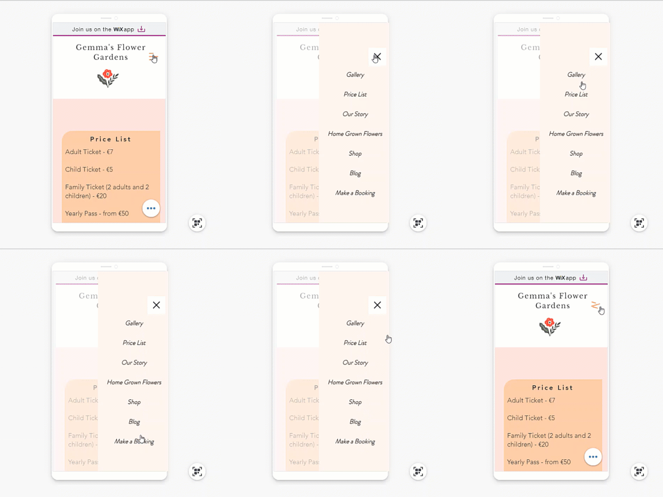
Gif of mouse hovering over site pages of mobile menu.

Opening your mobile menu

When working in the editor, you can see what your menu looks like when it's open and closed. This allows you to customize both views.
Use the closed view to select the icon and customize its design, and use the open view to adjust the design of the text, background, and more.
To open the menu, simply click the icon in the mobile editor, then click Edit Menu
Screenshot of mouse hovering over Edit Menu button in mobile editor.

Elements on your mobile menu

Your mobile menu consists of 3 parts; the menu icon, the menu box and the menu itself. From the mobile editor, you can customize each element individually so that it matches your mobile site. 
Click an option below to learn more about each element.
What's next?
Change your mobile menu's size and alignment to suit your site's layout. 

Helpmate

Hello

Need a bit more guidance?
Unlock personalized helpLog in to get the most out of Helpmate.