Studio Editor: Setting the Site's Max Width
4 min
In this article
- Setting the max width for your client's site
- Excluding specific pages or sections from max width
- Turning off max width for the entire site
- FAQs
In the Studio Editor, certain elements are set to scale proportionally by default, which means they grow in direct relation to the screen size. On larger screens, they might even grow too big for your liking.
Set the max width for sections on your client's site to keep elements from growing beyond the point you want them to.
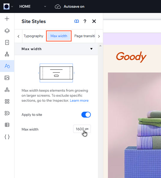
Setting the max width for your client's site
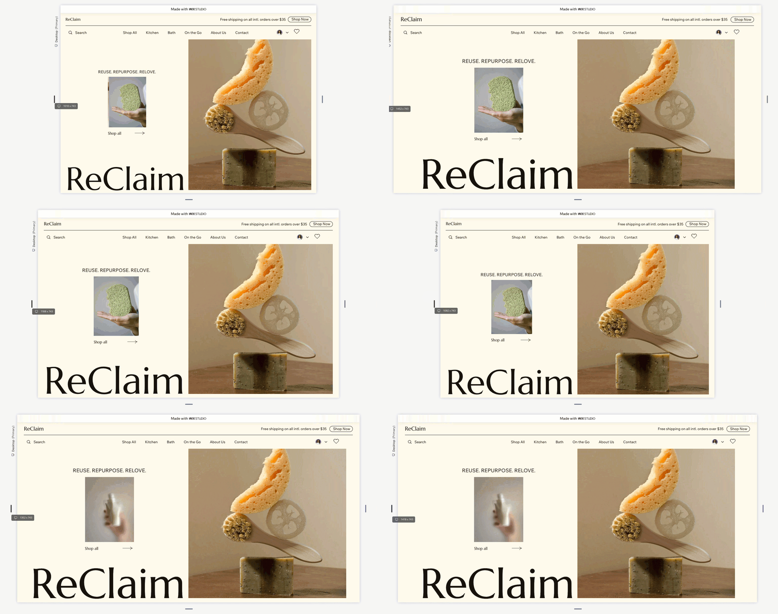
Head over to the Site Styles panel to set the max width. On screens that are wider than the value you set, the element sizes stay fixed, and the site gets side margins.
The max width you set applies to the entire site, but you can exclude specific sections if needed.
Note:
The max width must be larger than 1001px.
To set the max width:
- Click Site Styles
 on the left side of the editor.
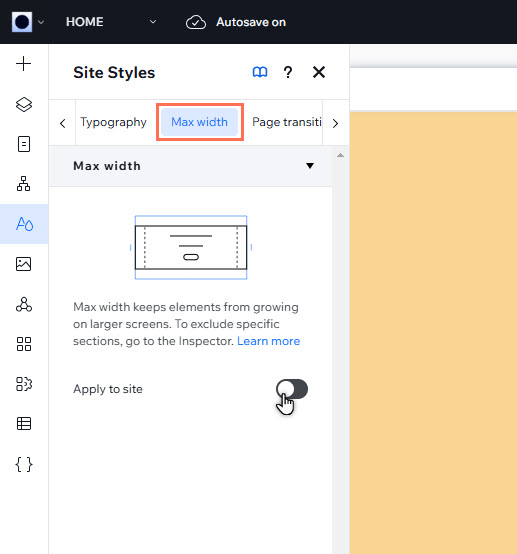
 - Click the Max width tab.
- (If disabled) Enable the Apply to site toggle.
- Enter the desired width in pixels.
Excluding specific pages or sections from max width
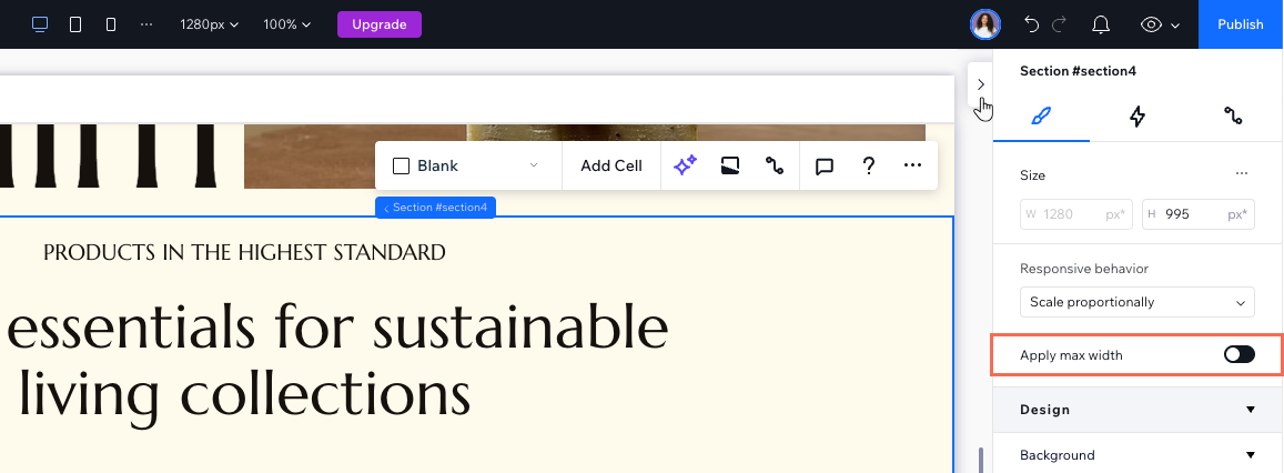
You can always disable the max width setting for specific sections or pages. This means that elements that scale proportionally will continue to grow in direct relation to the visitor's screen.
To exclude a page or section:
- Select the relevant section.
- Click the Open Inspector icon
 at the top right of the editor.
 - Disable the Apply max width toggle under Responsive behavior.
Want to exclude the entire page?
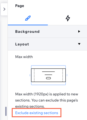
Select the page in the Inspector's breadcrumbs, then click Exclude existing sections under Layout. This disables max width for all the sections you currently have on the page.

Turning off max width for the entire site
Want to disable max width on every page / section? You can turn it off for the whole site. This means that all sections will continue to scale up on larger screens.
To disable max width for a site:
- Click Site Styles
 on the left side of the editor.
 - Click the Max width tab.
- Click the Apply to site toggle to disable it.
- Click Turn Off in the pop-up to confirm.
Changed your mind?
Enable the toggle again to apply max width to the entire site.
FAQs
Click a question below to learn more.
What happens if I don't set the max width?
What happens when I add new sections, after excluding a page from max width?
Can I add an element outside the max width boundaries?


