

Studio Editor: Managing and Customizing Basic Buttons
4 min
In this article
- Managing a button's settings
- Customizing the design of a button
A basic button contains text, making it a minimalist, clear call-to-action for visitors to your client's site. You can manage the button's settings and customize its design to ensure it continues to complement the site's look, and encourage interaction.
Important:
- This article refers to old buttons (basic buttons). These buttons are no longer available to add in the Add Elements panel. However, you can manage any existing old buttons with the steps in this article.
- We recently released our new one button component that has a wide variety of customization options. Learn how to add and set up a new button.
How do I know which button I have?

Managing a button's settings
You can change where the button links to at any time. You can also update the text to reflect the button's action.
To adjust your button settings:
- Go to your editor.
- Select the button.
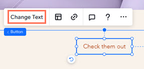
- Choose what you want to adjust:
Change the text
Link the button
 .
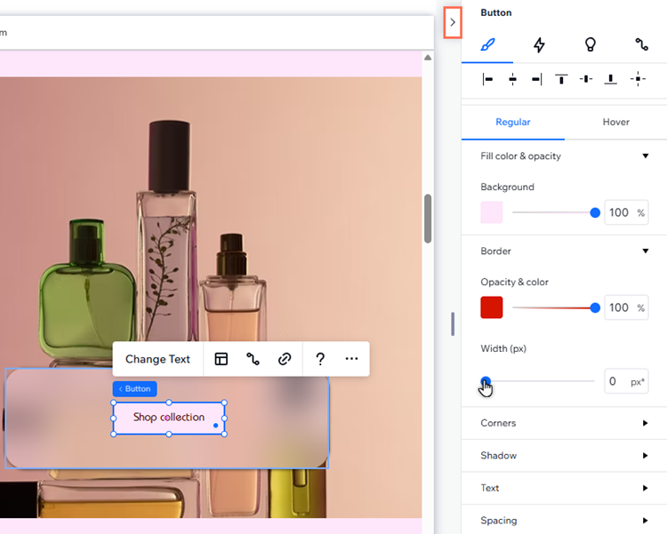
.Customizing the design of a button
Design the button to make it look how you want. You can select a different fill color, add a shadow and adjust other settings like spacing and text formatting to update its look.
To customize a button:
- Select the button in your editor.
- Choose what you want to customize:
Design the button
 at the top right of the editor.
 to customize them separately.
 Adjust the button's layout
 .
. 
Tip: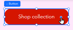
You can also adjust the corners of the button by dragging the radius handle on the canvas.
