Studio Editor: Adding and Customizing an Accordion
In this article
- Adding an accordion element
- Adding and managing accordion items
- Choosing how the accordion opens and closes
- Designing an accordion
- Adjusting the accordion layout
Use the accordion element to show a large amount of content in a small space. By allowing visitors to expand and collapse items, they can easily find the information they need without having to scroll through a long list.
Adding an accordion element
Select an accordion design you like to get started. You can personalize each item in your accordion to show your client's content. Add the elements you need and organize them however you want inside the container.
To add an accordion element:
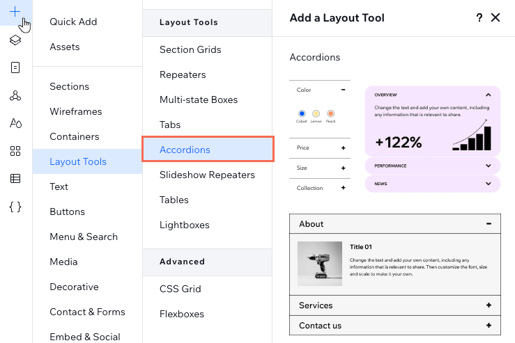
- Click Add Elements
 on the left side of the editor.
 - Click Layout Tools.
- Click Accordions.
- Drag an accordion you like onto your page.
- Edit the content of the accordion items:
- Select the accordion element you just added.
- Click Manage Items.
- Click the item you want to edit.
Tip: This opens the item on the canvas so you can see what it currently shows. - Add the relevant elements and information to your item.
Adding and managing accordion items
Manage the items that appear in your accordion element. You can add more items for your client's content, give them new titles and change their order of appearance.
To add and manage accordion items:
- Select the accordion element.
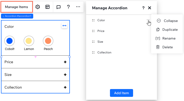
- Click Manage Items.
- Hover over the item and click the More Actions icon
 .
. - Choose what to do with this accordion item: Duplicate, Rename or Delete.
Tips:
- Click Add Item at the bottom of the panel to add a new blank item.
- You can change the order of your items. Hold the Reorder icon
 next to an item and drag it to the desired location.
Choosing how the accordion opens and closes
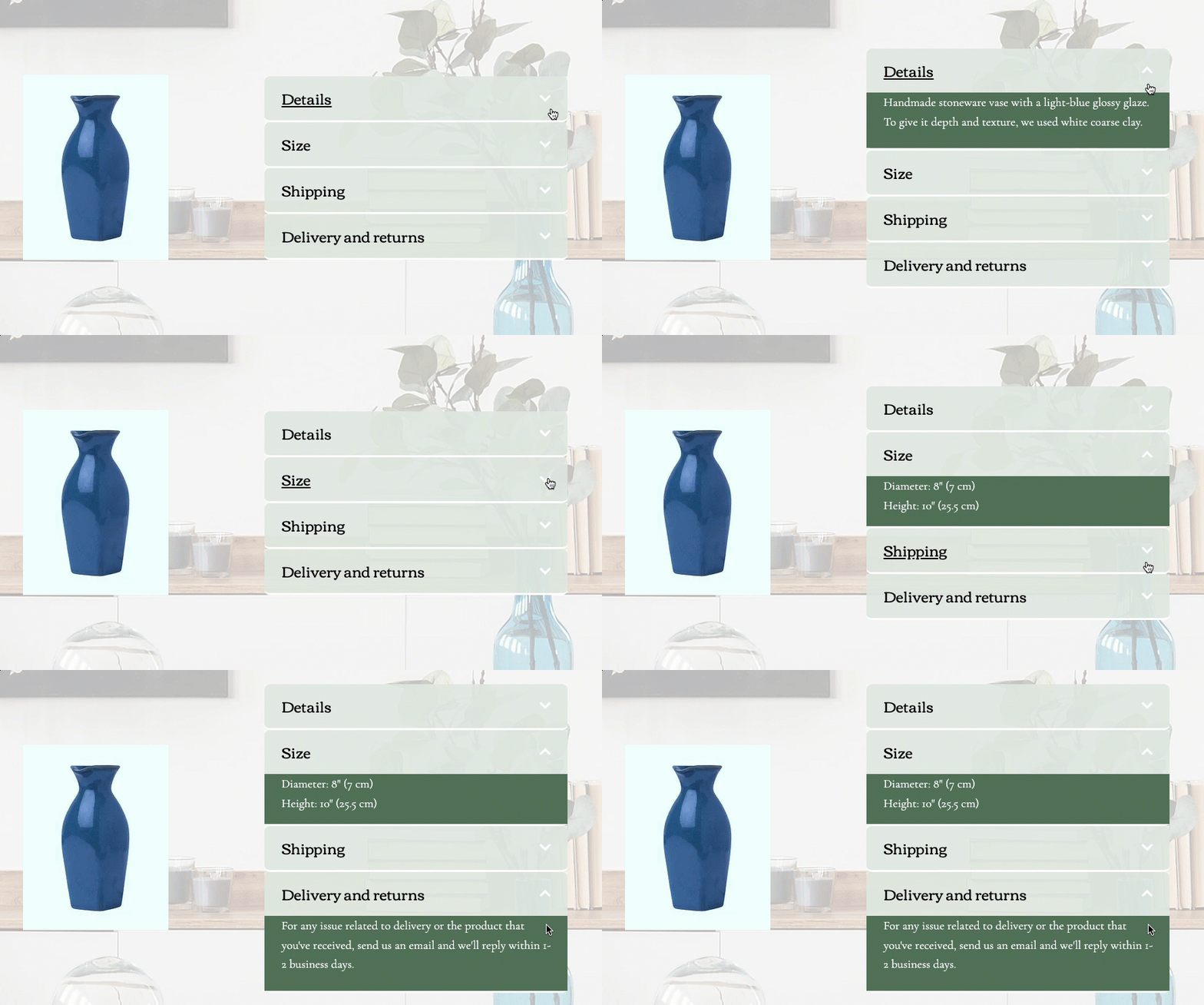
Decide how your accordion looks when visitors load the page. You can have all items open so the information is easily accessible, or closed for a more minimal look. You can also choose whether or not visitors can open multiple items at the same time.
To choose how the accordion opens and closes:
- Select the accordion element.
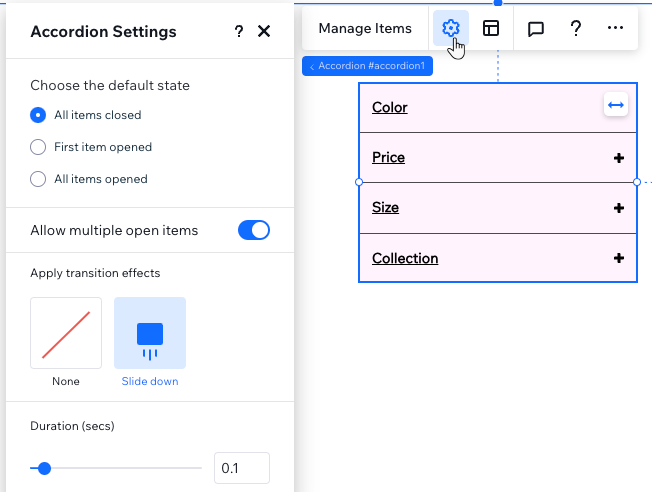
- Click the Settings icon
 .
. - Select an option under Choose the default state:
- All items closed: Visitors first see the accordion items closed. They choose which item to expand to read more.
- First item opened: Visitors see the content of the top item while the other items are closed.
- All items opened: Visitors see the content of all items when the page loads.
- Click the Allow multiple open items toggle:
- Enabled: Visitors can have as many open items as they like in the accordion.
- Disabled: Visitors can only open one item at a time.
- (Optional) Apply a transition effect that appears when visitors click an item to open it.
Note:
The option to allow multiple items open in the accordion is not available if you choose
All items opened as the default state.
Designing an accordion
You can design every part of the accordion so it matches the rest of your page. Customize the item titles, the containers that show the content of each item, or the entire space of an item (title and container included).
To design an accordion:
- Select the accordion element.
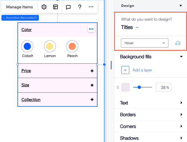
- Click the Open Inspector icon
 at the top right of the editor.

- Choose what you want to design from the drop-down:
- Titles: These are the titles of your items. You can design the titles to look different when visitors hover over them.
- Containers: These are the containers that show the content of each item.
- Accordion items: This controls the entire space of an accordion item (title and container included).
- Use the available options to pick different backgrounds, fonts, corners, borders and more.
Adjusting the accordion layout
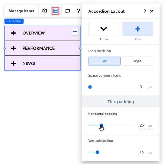
Adjust the layout of the accordion element to your needs. You can choose the alignment, padding and position of your item titles, as well as the icon that appears next to each title.
Tip:
You can
apply a CSS grid to every individual item to create your pixel perfect layout.
To adjust the accordion layout:
- Select the accordion element.
- Click the Layout icon
 .
. - Adjust the layout of the accordion element:
- Choose an icon: Select the icon that appears next to your item titles: Arrow or Plus.
- Icon position: Decide if the icon appears to the left or right of your titles.
- Space between items: Drag the slider to make the space between items smaller or bigger.
- Title padding: Drag the sliders to add horizontal and vertical padding around the item titles.
- Formatting: Choose the direction and alignment of the accordion items.