Studio Editor: About Stack
2 min
In this article
- Choose the stack direction
- Drag and drop to set spacing
- Design the stack to your needs
A stack is a flexbox container that "hugs" your elements, whether they are in a vertical or horizontal order. Stack elements to ensure they look great on every screen size, preventing overlaps (small screens) and big gaps (large screens).
Choose the stack direction
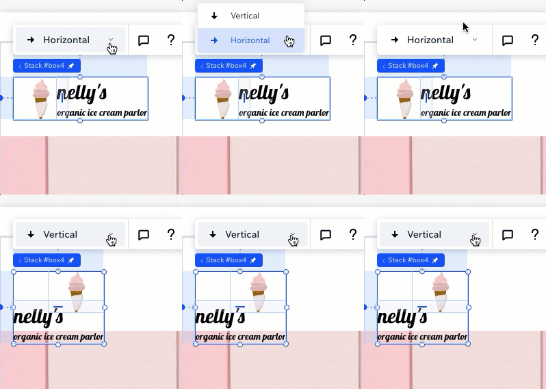
When placing elements in a stack, you can choose the direction - horizontal or vertical. This depends on whether you want the elements to appear in a vertical or horizontal order.
Either way, you can always switch the direction. This automatically rearranges the elements so they're in the right order.

Drag and drop to set spacing
Our drag and drop functionality makes it easier than ever to set spacing between elements in a stack.

You can also create negative margins to make elements overlap intentionally.

Design the stack to your needs
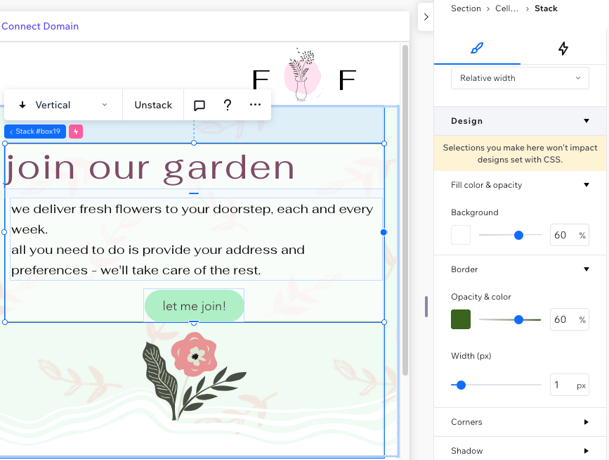
The stack container is transparent by default, but you can design it to your needs from the Inspector panel. Add a background color, border and shadow to make the stack stand out.


