Site Members: Changing the Layout of the Member Page
2 min
In this article
- Layout options for the Member Page
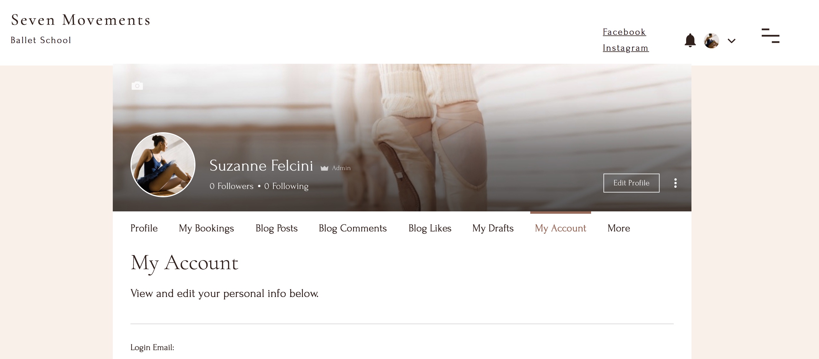
- Full-width layout
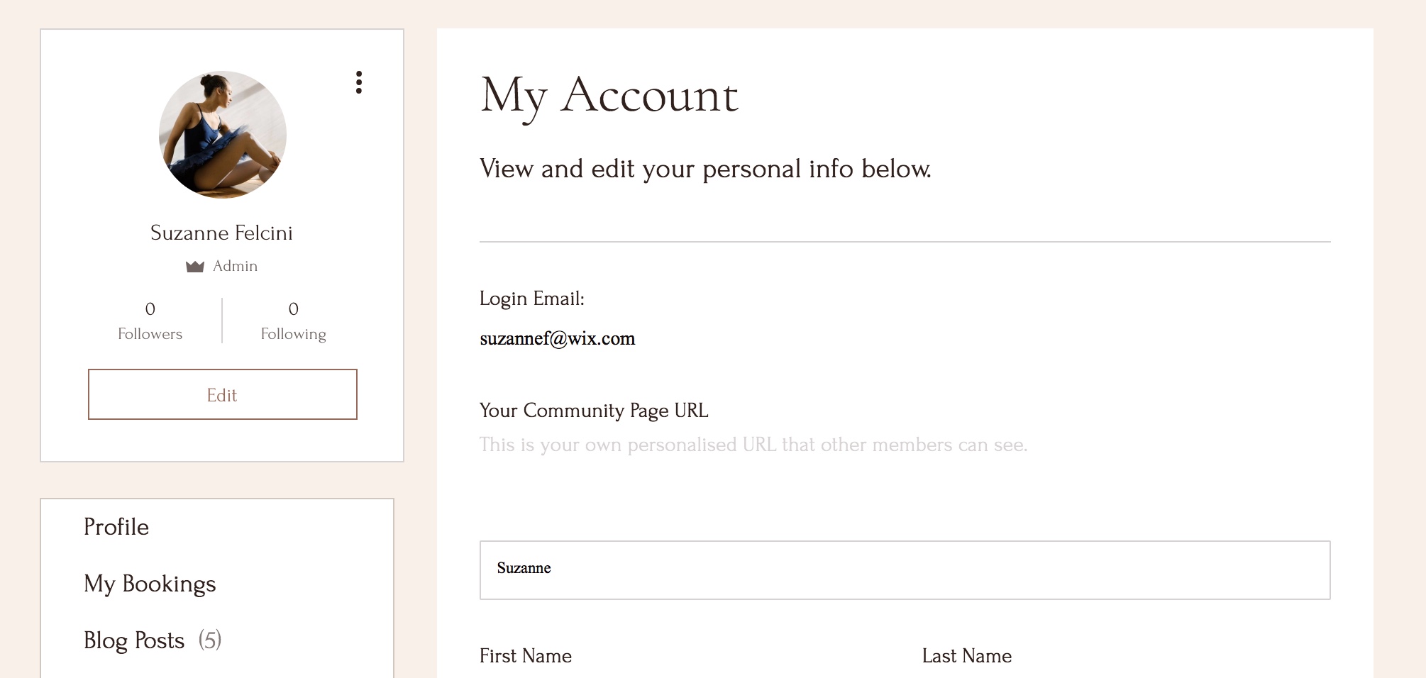
- Cards layout
- Changing the layout of the Member Page
This article refers to the new version of the Members Area app which is not available to all users yet. If you're using the previous version, read the information here. Click here to check which version you're using.
Choose a layout for the page that shows your Members Area. You can switch the layout at any time – the elements re-arrange automatically.
Layout options for the Member Page
There are 2 layouts for you to choose from. Learn more about them below and select the one that's right for your site.
Full-width layout
The profile design for the full-width layout for member pages spans the width of your site. This means that it looks great from whatever size screen your visitors are viewing your site on, including mobile.

Cards layout
The cards layout is more of a traditional layout, and suits formal businesses better as it puts less emphasis on the member. It's also really easy to move each section around individually and place it where you want.

Changing the layout of the Member Page
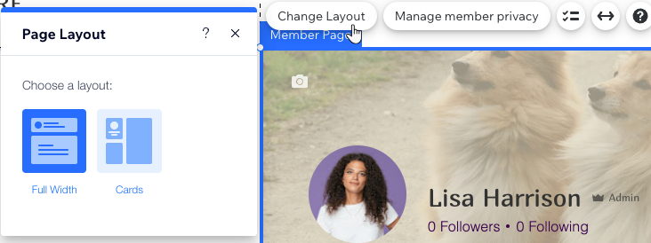
You can choose a new look for the Member Page by selecting the entire element and clicking Change Layout.
Wix Editor
Studio Editor
- Click Pages and Menu
 on the left side of the Editor.
 - Click Members Area.
- Click Member Page.
- Select the Member Page element.
- Click Change Layout.
- Select the layout you like.


