

Pricing Plans: Customizing the Mobile View of the Pricing Plans Page
13 min
In this article
- Adjusting the layout of your pricing plans
- Choosing what to display on your pricing plans
- Resizing the text on your pricing plans
- Reordering your pricing plans
Customize the way your pricing plans appear on mobile to ensure a great experience for clients, no matter what device they're using. Choose what information is necessary to display, change the text size and adjust the layout of the Pricing Plans page so it fits smaller screens.
Additionally, you have the flexibility to change how the available pricing plans show up on a page. This can come in handy when you want to spotlight any special deals or offers.
Important:
In the Wix Editor, the desktop and mobile versions of a site represent different viewing modes of the same site; they are not separate sites. Changes to a desktop site affect the mobile-friendly site, while changes to a mobile site do not affect the desktop site.
Adjusting the layout of your pricing plans
Make it as easy as possible for people to choose the right plan by customizing the layout of the Pricing Plans page on a mobile site. You can change the alignment and spacing between elements on the page so it's easy to read on smaller screens.
Wix Editor
Studio Editor
Wix Harmony Editor
- Go to your editor.
- Click the Switch to Mobile icon
 at the top of the editor.
 - Go to your Plans & Pricing page:
- Click Pages & Menu
 on the left side of the editor.
 - Click your Plans & Pricing page.
- Click Pages & Menu
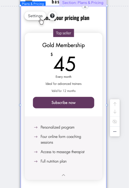
- Click the Pricing Plans element on the page.
- Click Settings.
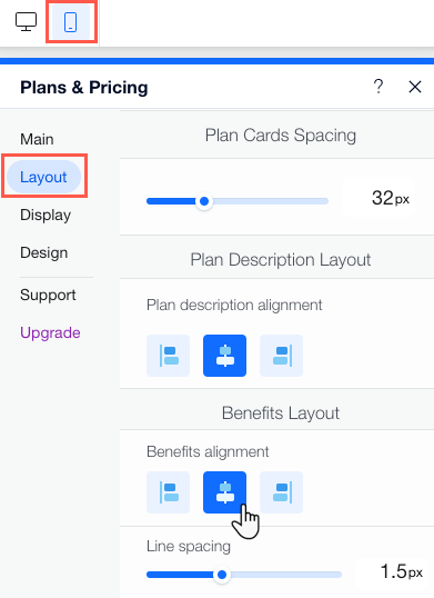
- Click Layout.
- Customize the layout using the following options:
- Page Text Layout: Choose your alignment preference for your title, subtitle and disclaimer.
- Plan Card Spacing: Use the slider to set the amount of space between elements on your plan cards.
- Plan Description Layout: Set your plan description alignment.
- Benefits Layout: Choose your alignment and line spacing for your plan benefits.
Choosing what to display on your pricing plans
Choose what details you want to display about each of the available plans on mobile. You can show or hide information like plan names, taglines and benefits.
Wix Editor
Studio Editor
Wix Harmony Editor
- Go to your editor.
- Click the Switch to Mobile icon at the top of the editor.
- Go to your Plans & Pricing page:
- Click Pages & Menu on the left side of the editor.
- Click your Plans & Pricing page.
- Click Pages & Menu
- Click the Pricing plans element on the page.
- Click Settings.
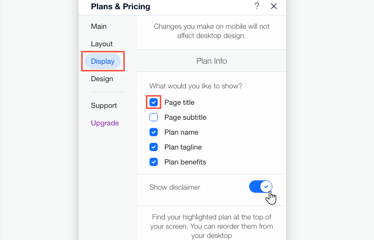
- Click Display.
- Customize the display using the following options:
- What would you like to show?: Choose which information to display about your pricing plans: page title, page subtitle, plan name, plan tagline and plan benefits.
- Show disclaimer: Enable this toggle to display any relevant terms and conditions for clients to view before they purchase a plan.
Tip: You can enter your text in the Disclaimer text field on desktop only.
Resizing the text on your pricing plans
Customize the Pricing Plans page design so everything is easy to read and the benefits of each plan are clear. Use the sliders to adjust the proportions of all the elements on your Pricing Plans mobile site.
Wix Editor
Studio Editor
Wix Harmony Editor
- Go to your editor.
- Click the Switch to Mobile icon at the top of the editor.
- Go to your Plans & Pricing page:
- Click Pages & Menu on the left side of the editor.
- Click your Plans & Pricing page.
- Click Pages & Menu
- Click the Pricing Plans element on the page.
- Click Settings.
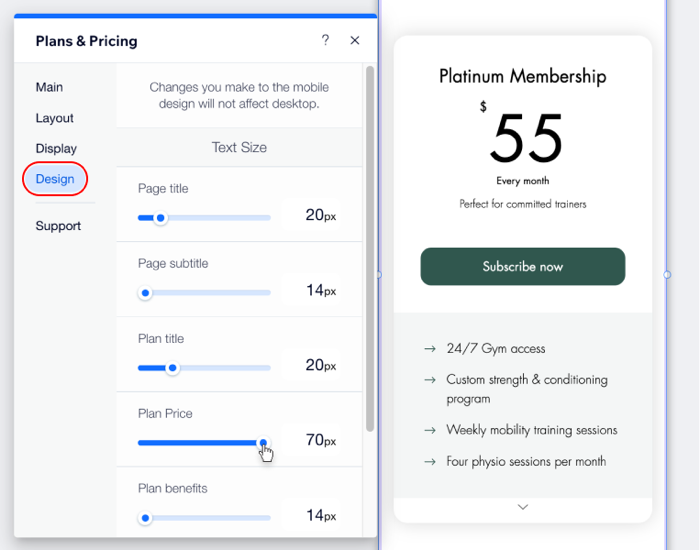
- Click Design.
- Use the sliders under Text Size to resize different text elements on the page (e.g. the plan's title, price, benefits, etc.)
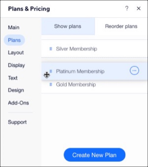
Reordering your pricing plans
Reorder your pricing plans so that they appear in the order you want on your mobile site.
Wix Editor
Studio Editor
Wix Harmony Editor
Note: If you want to change the order of your plans on your mobile site, you need to do it from the desktop view in the Wix Editor by following the steps below. There are additional customization options limited to desktop, like modifying text and Add-Ons.
- Go to your editor.
- Go to your Plans & Pricing page:
- Click Pages & Menu on the left side of the editor.
- Click your Plans & Pricing page.
- Click Pages & Menu
- Click the Plans & Pricing element on your page.
- Click Settings.
- Click the Plans tab then click the Reorder plans tab.
- Drag and drop the plans into position.
Tip: To see these changes, Click the Switch to Mobile icon at the top of the Editor.