

Wix Editor: Gallery Comparison and Glossary
4 min
In this article
- General Options
- Settings Panel
- Design Panel
We have tons of beautiful, diverse galleries for you to display images on your site. Each gallery includes different characteristics and options, so that you can find the perfect one for your needs.
Did you know?
The Pro Gallery has the most customization options and is a great way to display images, videos and text together.
General Options
Each gallery type in Wix Editor comes with a unique set of capabilities to serve different purposes.
Depending on the abilities you need, search for the gallery that works best for you:
Ability | What it means | Available galleries |
|---|---|---|
Show image titles and descriptions | Visitors can learn more information about each image. |
|
Stretch the gallery to full-width  | Your gallery is stretched to fill the entire width of your visitors' screen. |
|
Adding navigation arrows | These arrows allow your visitors to browse through your gallery. |
|
Autoplay | Your gallery starts playing automatically, without visitors having to click anything. |
|
Add a Play button | Your gallery doesn't start playing automatically – visitors need to click the Play button. | Slider (Postcard) |
Loop | Your gallery images play on repeat when visitors hover over the navigation arrows. | Slider (Spheres) |
Settings Panel
Every gallery comes with a Settings panel, so you can decide how it plays and behaves.
Below, you can learn what each setting does and which galleries have it:
Setting | What it does | Available galleries |
|---|---|---|
Autoplays on loading | Enable this toggle so your gallery starts playing automatically, as soon as the page loads. Control the time (in seconds) given to each image under How long between images? |
|
Play button | Enable this toggle to give your visitors the control |
|
In a loop | Enable this toggle so your gallery images play on repeat when visitors hover over the navigation arrows. Control the time (in seconds) given to each image under Speed. | Slider (Spheres) |
Navigation arrows | Enable this toggle to add arrows to your gallery, so visitors can browse more freely. Note: In the Slider (Spheres) and 3D Slideshow galleries, these arrows are part of the design and cannot be removed. |
|
Slide buttons | Enable this toggle to add buttons to your gallery, so visitors can browse through the slides. | Animated Slide |
When they're resized | Choose how images are resized to fit the gallery:
|
|
When clicked | Choose what happens when visitors click a gallery image:
| All galleries include this option |
Do images show text? | Choose what information visitors can see about each image:
|
|
Apply transition effects? | Add a cool effect for your images when they load. For example, make them fade in and out of view. Note: The available effects differ based on the gallery you choose. |
|
How are extra rows shown? | You can decide what the "Show More" button says, and how many rows to show after clicking this button. | Polaroid and Rollover Grids with over 9 images. |
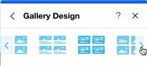
Design Panel
When clicking the Design icon  , you can either choose a different look for your gallery or click Customize Design to adjust specific settings.
, you can either choose a different look for your gallery or click Customize Design to adjust specific settings. Below, you can learn about all the different options to customize the gallery's design:
Setting | What it does |
|---|---|
Fill Color & Opacity | Match your gallery colors to the rest of your site by changing the colors of text boxes, frames, the background, etc. |
Border | Design a border for your images to make them stand out. |
Corners | Change the shape of your images by rounding the corners. |
Shadow | Create a 3D effect for your images by adding shadows. |
Text | Format the text that appears on your gallery to match your site and brand. Adjust the font color, size, and more. |
Spacing | Adjust the height and padding of the text box showing the image details. |
Regular / Hover | In Grid galleries, you can customize the design for each of these views separately:
|
Pagination Opacity & Color | In the Animated Slide gallery, you can choose the color and opacity of the circle buttons that visitors click to move between slides. |
Slides Opacity & Color | In the Animated Slide gallery, you can choose the background color and its opacity for each individual slide. |
Want to make your gallery even more stylish?
At the top of the Gallery Design panel, choose from a range of galleries with different frames, shapes and decorations.
