Editor X: Pro Gallery Best Practices
4 min read
In this article
- Finding the settings you need
- The Settings panel
- The Inspector panel
- Making your gallery responsive
- Check the gallery's size, docking and margins
- Stretch the gallery
- Use different layouts
- Troubleshooting gap and spacing issues
Editor X is transitioning to Wix Studio, our new platform for agencies and freelancers.Learn more about Wix Studio
Pro Gallery lets you display videos, images and text, all in one beautiful multimedia gallery. Read the guidelines in this article to make the most out of Pro Gallery in Editor X – discover the different ways you can customize your gallery and make it look great in any screen size.
Finding the settings you need
There are two main areas where you can adjust different gallery settings:
- The Pro Gallery settings panel
- The Inspector panel
The Settings panel
The Settings panel lets you adjust your gallery's design and functionality. You can choose a layout that suits your images, decide what happens when clicking on an item, add animations and much more.
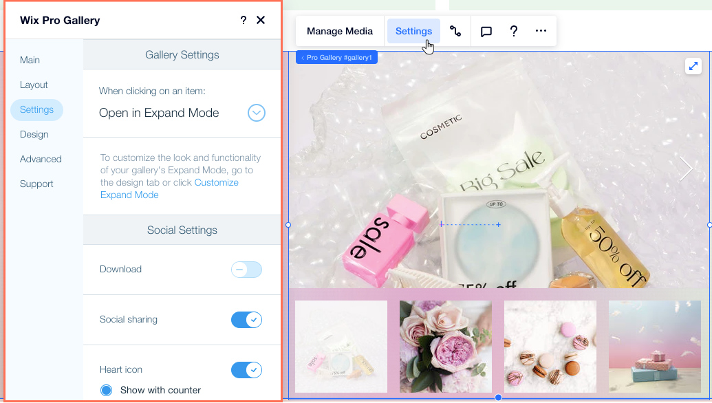
The Inspector panel
From the Inspector panel, you can adjust your gallery's size, position and behavior across breakpoints. These settings can help to ensure your gallery is responsive and looks great in every screen size.
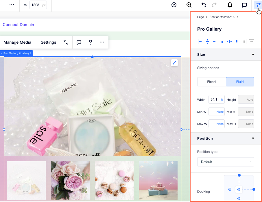
Making your gallery responsive
There are many different ways to ensure your gallery is responsive to all screen sizes. Read below to choose the best method for your design needs.
Check the gallery's size, docking and margins
You can show the same gallery layout on all screen sizes. We recommend using a fluid measurement (e.g. %, vh, vw) to set the size of your Pro gallery, so it resizes automatically and in relation to your visitor's screen.
Tip:
It is not possible to adjust your gallery's height when:
- Your gallery is set to scroll vertically.
- Your gallery is horizontal with a fixed ratio.
You can change these settings from the Layout tab in the gallery's Settings panel.
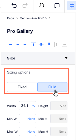
Still in the Inspector panel, check the docking and margins of your gallery on every breakpoint. If these settings don't fit a smaller screen, your gallery might only appear partially or not at all. You can make these settings relative to the screen using fluid measurements (e.g. %).
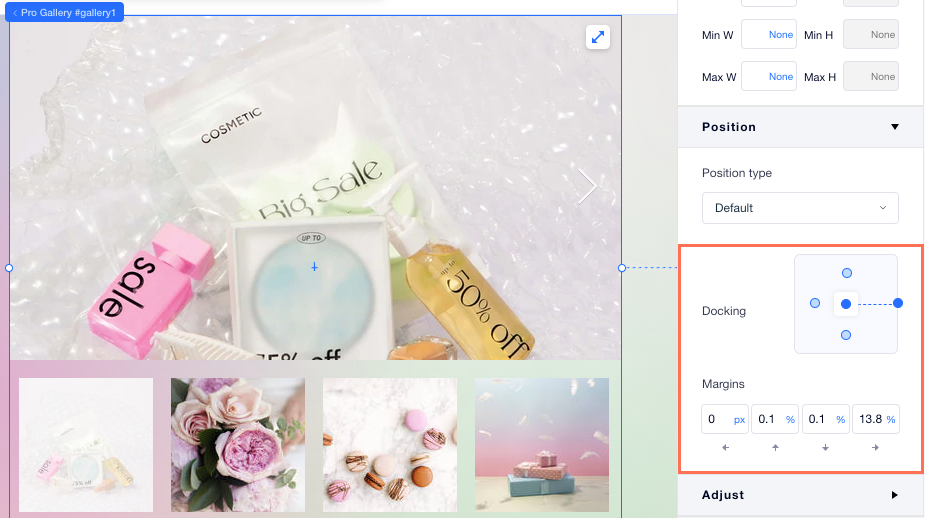
Stretch the gallery
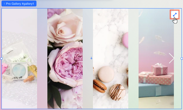
You can stretch a gallery across a section so it automatically adjusts to different screen sizes. This means you don't have to worry about sizing, docking and margins.
Use different layouts
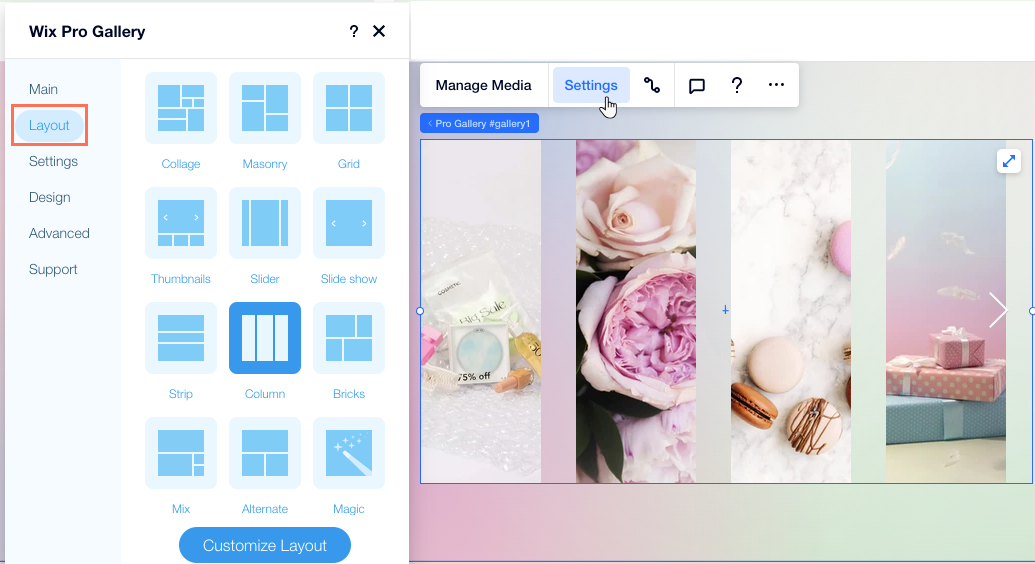
Pro Gallery offers many different layouts - some are more minimal and others suit larger screens better. You can choose a layout for each of your breakpoints so the gallery always fits your visitor's screen.
Troubleshooting gap and spacing issues
If you find that there is too much space above, below or between gallery images, try the steps below.
Reduce the spacing between images
Check the text box size
(Slide show layout) Check the info bar size


