Editor X: Adding and Customizing the Pro Gallery
13 min read
In this article
- About the Pro Gallery
- Adding the Pro Gallery to your site
- Customizing your Pro Gallery settings
- Customizing the Pro Gallery Expand Mode
- Pro Gallery Glossary
Editor X is transitioning to Wix Studio, our new platform for agencies and freelancers.Learn more about Wix Studio
It's so important to add those special touches and show off your images, videos and text in a way that's right for you!
The Pro Gallery is a professional solution that offers a wealth of customization options, from layout, design, and style there's so much to explore. So whether you're a food blogger, photographer, or professional agency, the Pro Gallery offers you the tools you need to wow your clients.
Learn more about:
About the Pro Gallery
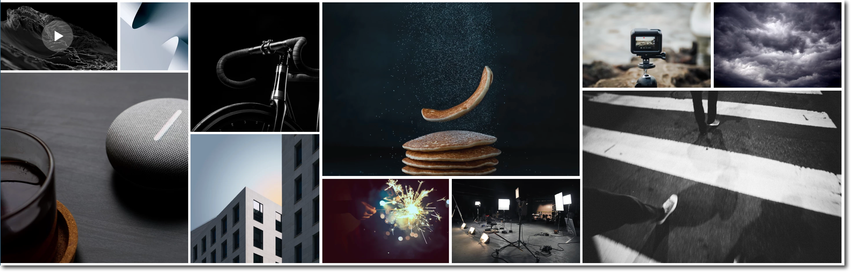
There's so much you can do with a Pro Gallery, it offers tons of customization options and it's a great way to really showcase your style and work.
Pro Gallery features:
- Can be stretched to full width to be used as a background.
- Displays different types of media in one gallery (photo, video, and text items).
- Customize how your Pro Gallery resizes across all breakpoints.
- Wide range of layouts with unique settings and customization options per layout.
- Offers separate layouts and design for the mobile breakpoint.
- Allow your media items to be expanded or open in full screen with a click.
- Customize the layout and design of the expanded view.
- Share, Like and Download icons on each gallery item.
- Connect it to collection databases using the CMS (Content Management System).
Manage your Pro Gallery media
You can manage all your media in the Pro Gallery Media Manager. Just click on the app in your Editor X and click Manage Media to get started on organizing your media.
Adding the Pro Gallery to your site
You can add the Pro Gallery to your site in just a few quick steps.
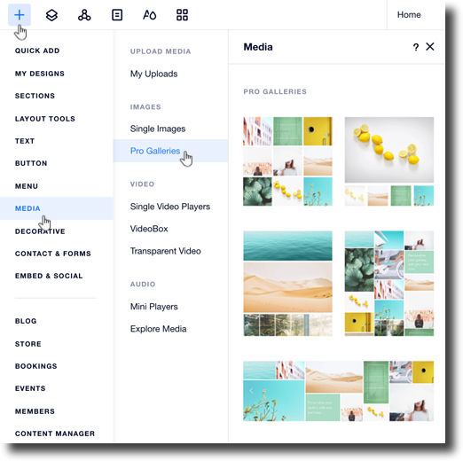
To add a Pro Gallery to your site:
- Click Add
 on the top of Editor X.
 - Click Media.
- Click Pro Galleries.
- Choose a Pro Gallery and click on it to add it to your site.
Important:
The Pro Gallery is added as its own section to your page, you can drag and drop it into a different section if you want to display it somewhere else.
Customizing your Pro Gallery settings
- Click your Pro Gallery in Editor X.
- Click Settings.
- Click the Layout tab.
- Choose a layout from the options available.
- Click Customize Layout for more customization options:
Important:
The layout customization options vary per layout and some options are only available on specific layouts.
Show me more
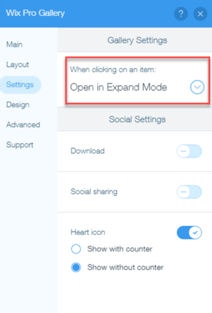
6. Click the Settings tab to customize your gallery settings:
Show me more
 to control what happens when your site visitors click a gallery item.
7. Click the Design tab to customize your gallery design.
8. Choose what you'd like to customize:
Overlay & Icons
Item Style

9. Click the Advanced tab to customize your advanced gallery settings:
Show me more
 to choose how you want the videos in your Pro Gallery to play.
 Tip:
It is not possible to adjust your gallery's height in the Inspector panel when:
- Your gallery is set to scroll vertically.
- Your gallery is horizontal with a fixed ratio.
You can change these settings from the Layout tab.
Customizing the Pro Gallery Expand Mode
- Click your Pro Gallery in Editor X.
- Click Settings.
- Click the Settings tab on the left.
- Select Open in Expand Mode from the When clicking on an item drop-down.
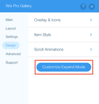
- Click the Design tab.
- Click Customize Expand Mode.
- Customize the following settings on the right side of the pop-up:
Info Settings
Viewing Settings
Design Settings
 arrow to select a font style and click color box to select a color for the title.
 to select a font style and click color box to select a color for the description.
Pro Gallery Glossary
Check out the glossary tables for each of the settings tabs for more information.
Layout tab:
Setting | What is does | Options |
|---|---|---|
Slide Automatically | Items continuously slide without the visitor clicking the navigation arrows. | - Enabled: The gallery items slide without clicking. Drag the Time Between Images slider to change the number of seconds between the items. -Disabled: The visitor must click the navigation arrows to scroll through the gallery items. |
Info to Display | The item information displayed when visitors hover over your gallery items. | - Title: The item title is displayed on hover. - Description: The item description is displayed on hover. Customize the font, color and alignment using the formatting options. - Slideshow counter: Show the gallery item number and total number of items (This option is only available for the slide show layout) Note: Large fonts may be cut off on smaller thumbnail images. |
Info Position | The location of the text on each gallery item. | - Underneath: The text appears underneath the item. - Above: The text appears above the item. - On Image: The text appears on top of the images. |
What happens to the info on hover? | The behaviour of the text when visitors hover over the gallery items. | - Appears: The text and overlay appear when hovering over items, - Disappears: The text and overlay disappear when hovering over items, - No change: Text and overlay are always displayed. Note: these options only appear if you set the info to be displayed on the image (Info Position setting). |
Info Bar Size | The size of the information bar below the gallery items. | Drag the slider to increase or decrease the size of the space below your gallery where the 'Heart' and 'Share' icons appear. Selecting the text checkboxes in Design also displays the title and description in the info bar. |
Play Button | Show or hide a Play button for your visitors to pause or play the slideshow. | - Enabled: A Play button is displayed. Your site visitors can pause or play your slideshow. - Disabled: A Play button is not displayed. Note: these options only appear if you set your items to slide automatically (Slide Automatically setting). |
Scroll Direction | The direction that your visitors scroll through the gallery. | - Vertical: Visitors scroll down the page vertically to see more items. - Horizontal: Visitors click the scroll arrows on the left and right of the gallery to see more items. |
Image Orientation | The orientation of the gallery items. | - Horizontal: Items are displayed in a horizontal orientation. This is good for wide-angle or landscape shots. - Vertical: Items are displayed in a vertical orientation. This is good for portraits or close-ups. |
Thumbnail Resize | The size of the gallery items. | - Crop: The gallery items are cropped to fit their content into the item size in the gallery. Select the image ratio of the items. - Fit: The gallery items are resized to show their whole content. |
Image Ratio | The proportional relationship between the item width and height. | Select the ratio of the gallery items. |
Thumbnail Placement | The location of the gallery thumbnails. | Select the location of the gallery thumbnails. |
Thumbnail Size | The size of the gallery thumbnails | Drag the slider to increase or decrease the size of the gallery thumbnails. |
Thumbnail Spacing | The space between the gallery thumbnails. | Drag the slider to increase or decrease the spacing between the gallery thumbnails. |
Spacing | The space between the gallery items. | Drag the slider to increase or decrease the spacing between the gallery items. |
Collage Density | The density (number and size) of the items in the gallery. A higher density displays more items of smaller sizes. A lower density displays less items of larger sizes. | Drag the slider to increase or decrease the density. |
Fit to screen/ Set items per row | The number of items on each row of your gallery. | - Fit to screen: Your items are automatically optimized to fit your visitors' screens. - Set items per row: Choose the number of gallery items on each row, regardless of your visitors' screen size. Drag the Images per row slider to set the amount. |
Load More Button | Show or hide a Load More button for your visitors to click to load more items on your gallery. Note: This option is only available when the Scroll Direction is vertical. | - Enabled: A Load More button appears under the gallery. Choose if all images are displayed or just one more section when the Load More button is clicked. - Disabled: Your gallery is fully displayed when the page loads and your visitors do not need to click anything to see more. |
Settings tab:
Setting | Explanation | Options |
|---|---|---|
When clicking on an item | Control what happens when your site visitors click a gallery item. | - Open in Expand: The gallery item opens in expand mode. Customize the expand mode from the Design tab. - A link opens: Your site visitors are directed to a link (a web address, page, lightbox etc.) Click Media Manager to set up the link. - Nothing happens: Nothing happens when your site visitors click a gallery item. - Open in Fullscreen: The gallery items open in full screen. |
Download | Show or hide a Download icon for your visitors to download your images and videos. | - Enabled: A Download icon is displayed. Your site visitors can download your images or videos (not free Wix ones). - Disabled: A Download icon is not displayed. |
Social Sharing | Show or hide social icons so your visitors can easily share your gallery items. | - Enabled: Social share icons are displayed (Facebook, Twitter, Pinterest, Tumblr and email). - Disabled: Social share icons are not displayed. |
Heart Icon | Show or hide a Heart icon for your visitors to show they like a gallery item. | - Enabled: A Heart icon is displayed. Choose if you want to display the counter to show publicly how many people liked the gallery item. - Disabled: A Heart icon is not displayed. |
Design tab:
Setting | Explanation | Options |
|---|---|---|
Overlay & Icons | Customize your Pro Gallery icons when visitors hover over your gallery items. | - Color Overlay: Choose if you want a color overlay to appear when your visitors hover over your gallery. Click the color box to select the color and drag the slider to change the opacity. - Icon Color: Click the color box to select the Heart and Download icon colors. - Overlay Effect: Select an effect that is displayed when your visitors hover over an image. - Arrows Size: Drag the slider to increase or decrease the size of the navigation arrows. - Arrows Color: Click the color box to select the navigation arrow color. |
Texts | Customize the text on your gallery. | - Title Style & Color: Select the font and color of the titles. - Description Style & Color: Select the font and color of the titles. - Horizontal Alignment: Select the horizontal alignment of the text. - Vertical Alignment: Select the vertical alignment of the text. |
Item Style | Customize the style of the your gallery items. | - Border Width & Color: Select the color and width of the border of your gallery items. - Corner Radius: Drag the slider to increase or decrease the radius of the corners of your gallery items. - Shadow: Choose to show or hide a shadow behind your items. - Hover Effect: Select an effect to appear when visitors hover over your gallery items. - Image Loading: Select if your images appears blurred, or a color is displayed, while your images load. |
Scroll Animations | Choose how your gallery items appear when your visitors scroll down your gallery. | Select an animation. |
Advanced tab:
Setting | Explanation | Options |
|---|---|---|
Image Quality | Select the image quality of your gallery items. | Drag the slider to increase or decrease the quality of the images in your gallery. Note: Using higher quality might cause your images to load slower. |
Image Sharpening | Sharpen your gallery images. | - Enabled: The images are sharpened. Customize the amount, radius and threshold of the sharpening. - Disabled: The images are not sharpened |
Play Videos | Control how your videos play. | - On Hover: Your videos play when your visitors hover over them in the gallery. - Autoplay: Your videos play automatically in the gallery. - On click: Your videos play when your visitors click them in the gallery. |
Play with Sound | Your videos in your gallery are muted by default. Control if your videos play with sound. | - Enabled: Videos play with sound in the gallery view. - Disabled: Videos are muted in the gallery view. Your videos always play with sound in expand mode. |
Playback Speed | Control the playback speed of the videos. | Select the playback speed from the options. |
Loop Videos | Control if your videos play continuously in a loop or not. | - Enabled: Your videos play continuously. - Disabled: Your site visitors need to click the play icon to play your videos. |
