
Wix Logo: Best Practices for Logo Design
3 min
In this article
- Logo Layout
- Logo Colors
- Hiding elements in your logo
When it comes to design, your creativity is the only limit. Below are some guidelines to help you achieve a clean, sleek logo with a professional edge.
Learn more about our guidelines for:
Logo Layout
The smaller the width of the logo, the bigger the logo will appear inside its margins, as well as in small file sizes like a social profile image and a website logo.
You can break the name into separate lines, or even use the tagline to split the name in order to create a shorter line.
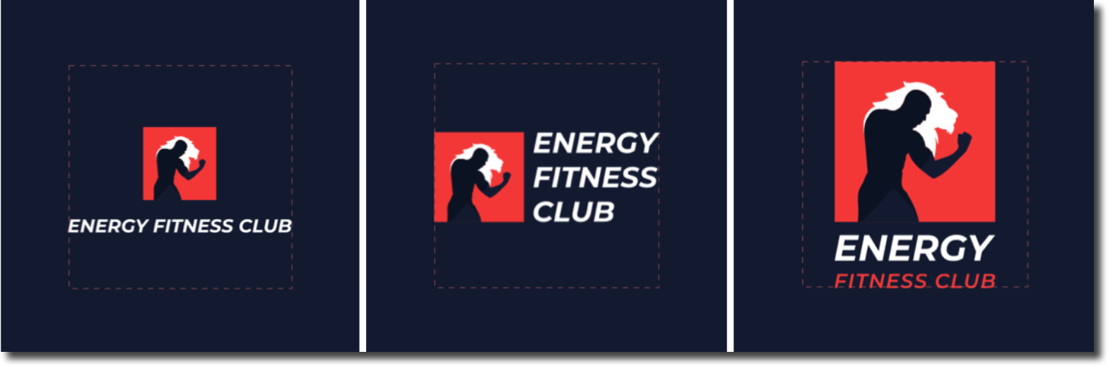
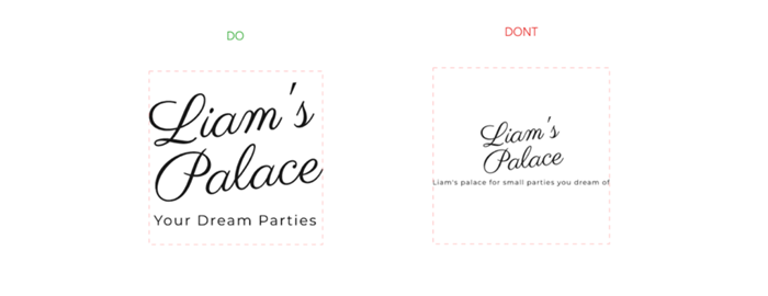
If you have a tagline, try to keep it short and catchy. A long tagline may not be readable in a small version of your logo.
Logo Colors
Make sure the elements contrast against their background. Some color combinations might obscure the text or icons you've added to your logo, and may even make them look pixelated in small sizes.
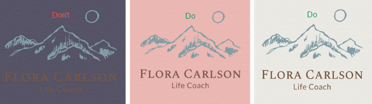
Be careful with extremely thin font weights or thin-lined icons and shapes, as they can look blurred or even invisible in small sizes.

Tips:
- When designing a logo, make sure that it looks good in all sizes, from large to small. Try to zoom out / check it in a small size like it normally appears on your brand materials, and check that everything is clear, and the text is readable.
- Avoid overlapping text when designing your logo, as the texts blend into one color and are unreadable in some files. This happens in the following file types:
- Standard logo files: Black on Transparent, Black on White, White on Black and White on Transparent.
- Resizable vector files: Black and White.
Hiding elements in your logo
Avoid doing the following:
- Making an element the same color as the logo background to hide it.
- Covering elements of a logo with shapes or icons.
- Moving elements outside the Logo Maker's borders, as they will be visible in the final logo files.
Note:
Overlapping shapes and icons have lower opacity in black and white files in order to prevent blending of the elements of the same color.
Tip:
Click here for information on how to customize your logo.