

Wix Editor: About the Mobile Menu
3 min
In this article
- Opening your mobile menu
- Elements on your mobile menu
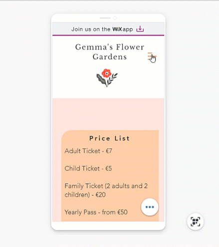
As more and more people are using their phones to view websites, it is important that your site is easy to navigate on mobile devices. Customize your site's mobile menu to make it look and behave just the way you want.
Important:
This article refers to the mobile menu that was released at the beginning of 2019. Update to the new one in just a few clicks.
Opening your mobile menu
When working in the editor, you can see what your menu looks like when it's open and closed. This allows you to customize both views.
Use the closed view to select the icon and customize its design, and use the open view to adjust the design of the text, background, and more.
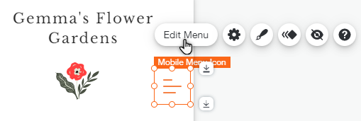
To open the menu, simply click the icon in the mobile editor, then click Edit Menu.
Elements on your mobile menu
Your mobile menu consists of 3 parts; the menu icon, the menu box and the menu itself. From the mobile editor, you can customize each element individually so that it matches your mobile site.
Click an option below to learn more about each element.
The menu icon
 .
. 
The menu box

The menu

What's next?
Change your mobile menu's size and alignment to suit your site's layout.
