Wix Editor: Slideshows on Mobile
4 min
In this article
- Changing the size of your slideshow
- Adjusting your slideshow settings
- Changing the layout of your slideshow
Slideshows are a sophisticated, unique way to display images and content on your site. Use them to display presentations, products, or deals.
You can adjust slideshows on your mobile site to suit the screen size, and encourage your visitors to interact and explore from their devices.
Important:
Updating the order of the slides from the desktop editor does not automatically update them for your mobile site. You can update the order of the slides on your mobile site by hiding then unhiding the slideshow. This resets the design of your slideshow, so we recommend getting the slides in order before adjusting the design.
Changing the size of your slideshow
Like all elements, your slideshow is optimized to fit your mobile site. However, you can adjust the size to suit your site's layout and alignment, all while still displaying relevant and interesting content for your visitors.
You should know:
This option is only available for Box slideshows. However, you can adjust the height of a Full Width slideshow by clicking and dragging the Stretch Handle icon  .
.
To change the size of your slideshow:
- Click the slideshow in the mobile editor.
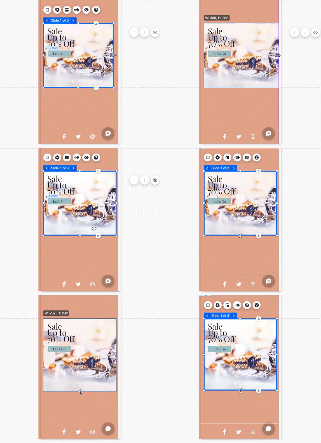
- Click and drag the sides of the slideshow to adjust the height and width.

Adjusting your slideshow settings
Use the settings to set your slideshow to behave how you want on your mobile site. You can adjust settings such as autoplay, and which content is displayed.
To edit your slideshow settings:
- Click the slideshow in the mobile editor.
- Click the Settings icon
and adjust the following options:
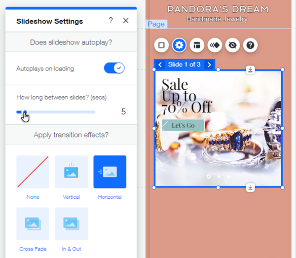
- Does slideshow autoplay?: Enable the Autoplays on loading toggle to play the slides as soon as the page loads. Then drag the How long between slides? slider to adjust the total seconds between slide transitions.
- Apply transition effects: Select the type of transition you want to use for your slides then adjust the settings:
Note: The following options are not available if you select None.- How long do they last?:. Drag the slider to adjust the duration of the transition.
- Where do they start?: Select the direction the transition starts from.
Note: This option is available for the Vertical and Horizontal transition effects only.
- Hide content outside frame: Click the toggle to set what happens to content that overlaps the edges of your slides.
- Enabled: Elements that overlap the edge of a slide are cut off outside of the slide.
- Disabled: Elements that overlap the edge of a slide are not cut off and display the entire element.

Changing the layout of your slideshow
Choose a layout for your slideshow to adjust its navigation arrows and buttons.
To adjust the layout of your slideshow:
- Click the slideshow in the mobile editor.
- Click the Layout icon
and edit the options:
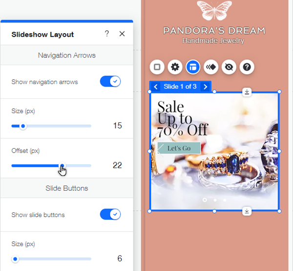
- Navigation Arrows: Enable the Show navigation arrows toggle to show arrows that visitors can use to change slides. Then drag the following sliders to edit the size and offset:
- Size: Edit the size of the arrows.
- Offset: Edit the distance between the arrows and the edges of the slideshow.
- Slide Buttons: Enable the Show slide buttons toggle to show circular navigation buttons at the bottom of the slideshow. Then drag the following sliders to edit the buttons:
- Size: Increase or decrease the size of the buttons.
- Offset: Edit the distance between the buttons and the bottom of the slideshow.
- Spacing: Edit the distance between the buttons.
- Formatting: Select Left to right or Right to left to match the reading direction of the site's language.
- Navigation Arrows: Enable the Show navigation arrows toggle to show arrows that visitors can use to change slides. Then drag the following sliders to edit the size and offset:


