

Wix Editor: Viewport Configuration for Mobile Devices
1 min
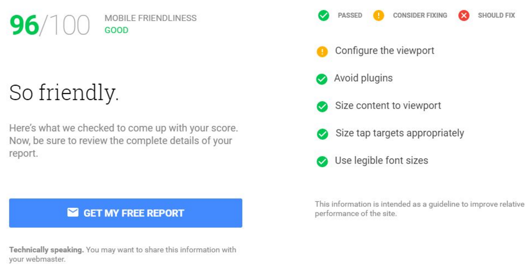
The viewport meta tag controls how a site is displayed on a mobile device. When Google evaluates how well your site is optimized for mobile devices, it looks at the viewport configuration as a criteria for optimization.
Wix uses the meta tag: <meta id="wixMobileViewport" name="viewport" content="width=320, user-scalable=yes">.
Google considers <meta name=viewport content="width=device-width, initial-scale=1"> to be a better option, as it looks at the width of the device and uses it as the width of the page. However, this can't be implemented in Wix for technical reasons.
As Google prefers the configuration above, Wix mobile sites lose points in the Google mobile friendliness tool when using this, however they still get a very good score.
Important:
You may see an error regarding the use of viewport configuration when running a test at https://testmysite.thinkwithgoogle.com/, but this can be ignored as your Wix mobile site score is still high (see below).