
Wix Harmony Editor: Adding and Customizing Tabs
In this article
- Adding tabs to a page
- Customizing the content of your tabs
- Managing your tabs
- Designing tabs
- Adding transitions
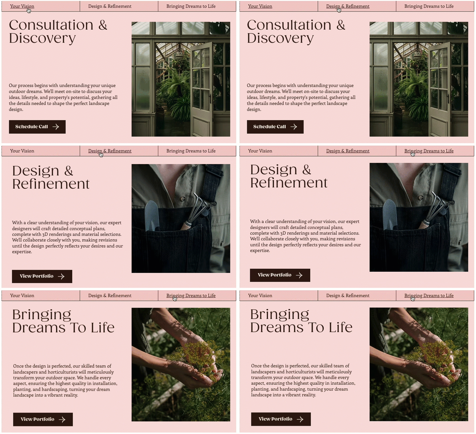
Tabs help you group related content in one place so visitors can switch between sections without having to scroll down or leave the page. They keep your pages clean and focused while still giving visitors quick access to all the details they need.
Adding tabs to a page
Add tabs when you want to keep a lot of information in one place without crowding the page. Choose a layout you like, then customize it to match your site.
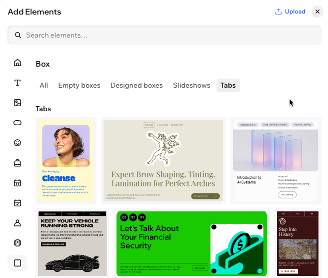
To add tabs:
- Go to your editor.
- Click + Add at the top left of the editor.
- Click the Box icon
 on the left.
 - Click Tabs.
- Select a design and drag it onto the page.
Tip: You can fully customize the design after adding the tabs element.
Customizing the content of your tabs
After adding the tabs element, create the content inside each tab. Click on any element in the existing design to customize it, and add more content from the Add Elements panel.
To customize your tabs:
- Go to your editor.
- Click the relevant tabs element.
- Click the dropdown at the top left and select the tab you want to customize.
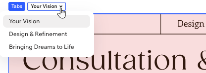
- Choose what to do next:
- Edit existing elements: Click an element in the tab and customize it using the available options on the action bar.
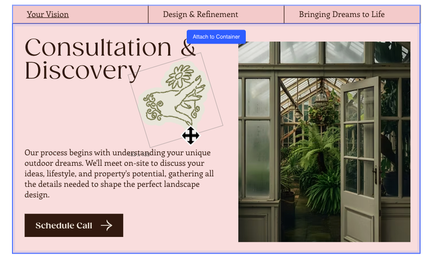
- Add more elements:
- Click + Add at the top left of the editor.
- Drag your chosen element over the tab.
- Drop the element when you see the Attach to Container message.
Managing your tabs
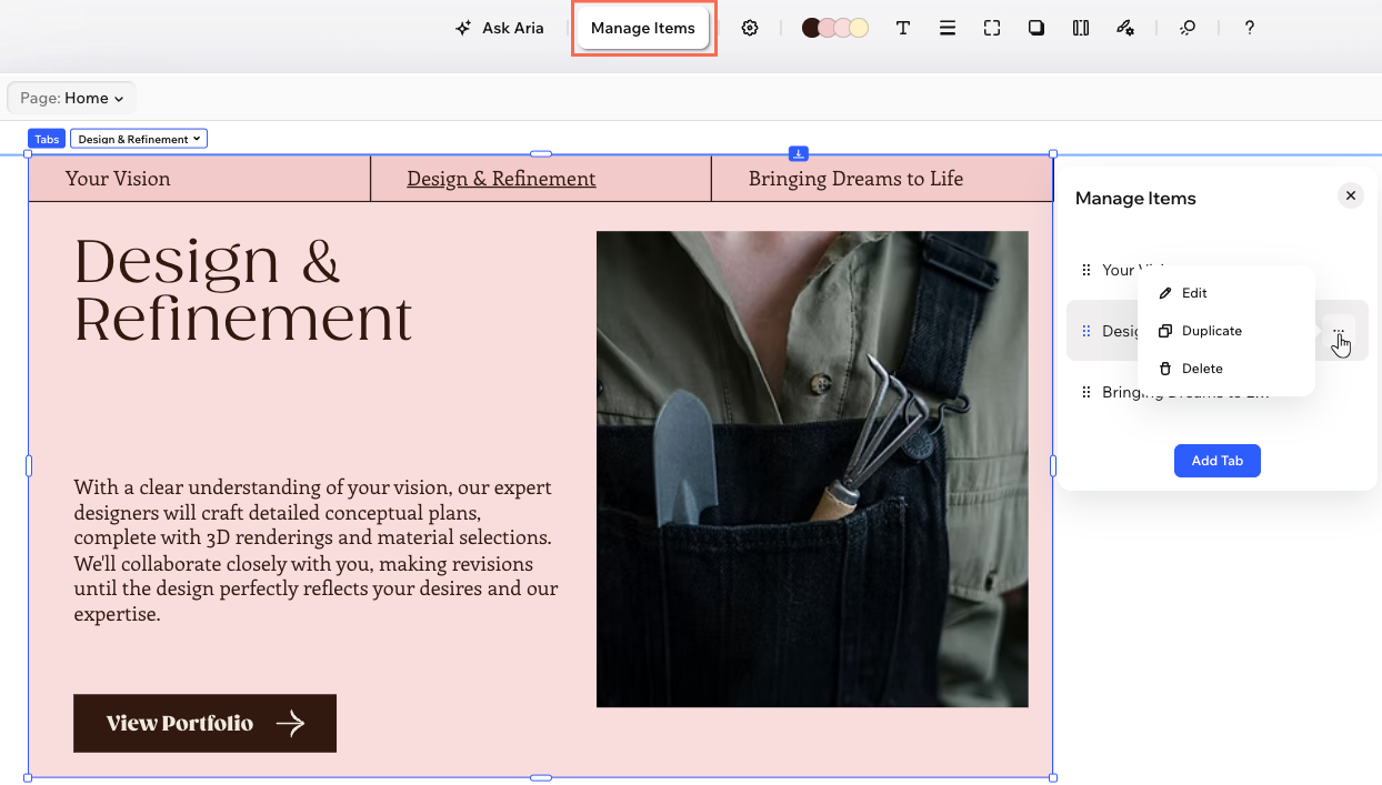
Use the Manage Items panel to stay on top of your tabs. From here, you can reorder them, add or remove tabs, duplicate ones that work well, and rename each tab so it clearly matches its content.
To manage tabs:
- Go to your editor.
- Click the relevant tabs element.
- Click Manage Items on the action bar.
- Choose what to do next:
Change the order of tabs
Add a new tab
Duplicate a tab
 .
.Rename a tab
 .
.Delete a tab
Designing tabs
Give your tabs a look that fits your site. You can adjust the spacing around the whole tabs element, style the tab menu (colors, text, borders, layout, and more), and customize the tab container so everything feels cohesive. If you set your tab menu to scroll, you can also style the scroll button to match.
To design the tabs:
- Go to your editor.
- Click the relevant tabs element.
- Click the All design options icon
 on the action bar.
 - Select the relevant option under Select a part and design the element:
Tabs
 : Change the background color of the tab menu, choosing one of your brand colors or a custom color.
  : Control the look and feel of the tab titles customizing their font, weight, size, color and formatting. You can also add shadow behind the text.
  : Define the borders of the tab menu so it stands out, choosing a color, width and style. You can add borders to the menu as a whole, around each menu item, or both.
  : Make the corners of the tab menu square or round by dragging the slider. Click the Edit individual corners icon
  to design each corner separately.
 : Add shadow to tab menu's container the individual tab items on the menu. You can set the position, blurriness, color and more.
 : Adjust the space between tabs and the tab menu, and add padding to different sides of the container to give your content more breathing room.
  : Set the width of the items on the tab menu and decide what happens when the visitor's screen is too small to show the whole menu. Additionally, decide if the site's text direction should apply to the tab menu or not.
 Content container
 : Define the borders of the tab so it stands out, choosing a color, width and style.
  to design each corner separately.
Scroll button
 : Set the color, size and opacity of the icon that appears on the scroll button.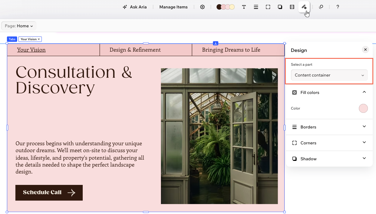
Adding transitions
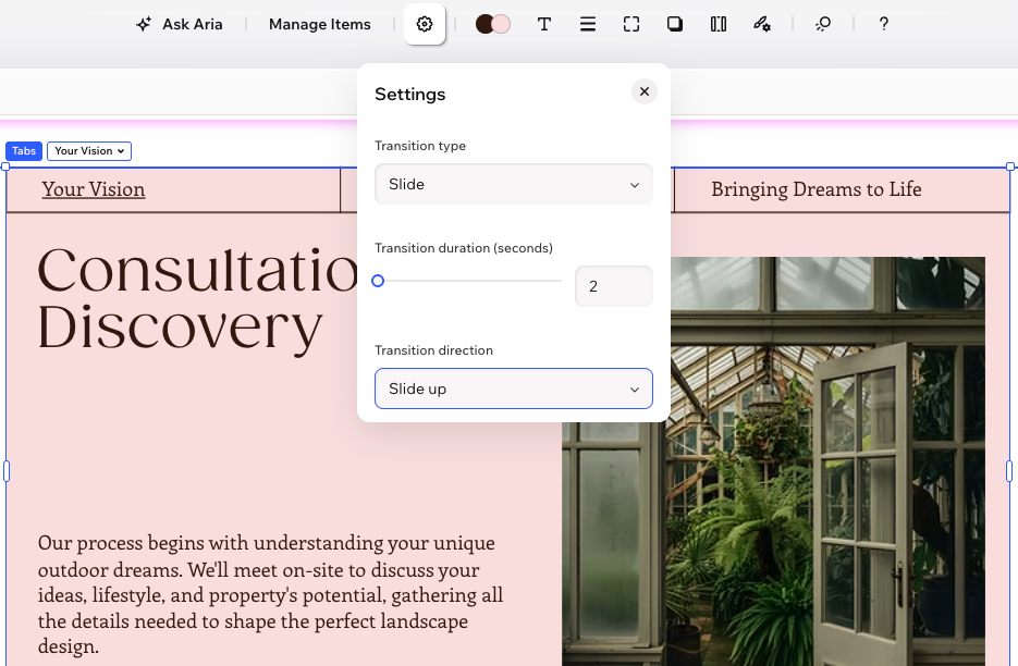
Add a transition effect so switching between tabs feels smooth for your visitors. Choose a transition type (cross-fade or slide) and set how long the effect lasts.
To add a transition effect:
- Go to your editor.
- Click the relevant tabs element.
- Click the Settings icon
on the action bar.
- Choose a transition type, and adjust it the way you want:
- Cross-fade: The tabs fade in and out when visitors click between them. Drag the slider under Transition duration to set how long the transition plays for.
- Slide: Tabs slide in when visitors click them.
- Transition duration: Drag the slider to set how long the transition plays for.
- Transition direction: Select whether tabs slide in from below or above.