

Wix Editor: Adding and Setting Up a Hover Box
4 min
In this article
- Step 1 | Add a hover box to your site
- Step 2 | Add elements to your hover box
- Step 3 | Customize the box design
- Step 4 | Add an effect to your hover box
Add a hover box to your site to create a cool, interactive effect for your site visitors.
Hover boxes change when visitors hover over them to reveal different elements and content. You can also add animation to the elements to further wow visitors, and encourage them to continue exploring your site.
Step 1 | Add a hover box to your site
Add a hover box to begin building eye-catching pages. There are lots of fun, colorful templates available, so you can choose one to match your site's look and theme.
To add a hover box:
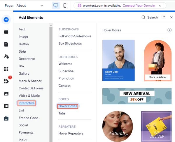
- Go to your editor.
- Click Add Elements
 on the left side of the editor.
 - Click Interactive.
- Click Hover Boxes.
- Click or drag your chosen box to add it to the page.
Step 2 | Add elements to your hover box
Add elements to your box to display relevant information and content for your visitors. You can add different elements for regular and hover mode, or both.
To add an element to both views, simply add it on Regular mode. To only display an element on Regular mode, add it, then hide it on Hover mode.
To display an element only in Hover, just add it on Hover mode.
To add elements to your hover box:
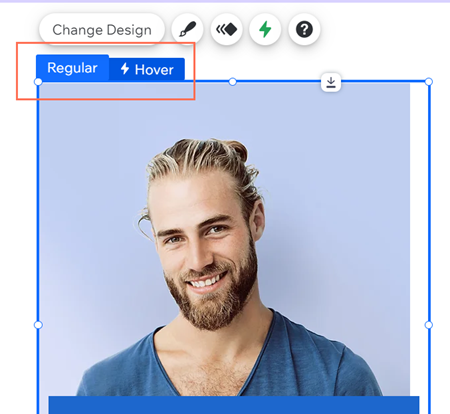
- Click the hover box.
- Click either the Regular, or Hover tab, depending on which mode you'd like to add the element to:
- Regular:
- Click Add on the left side of the editor.
- Click or drag your chosen element to add it to your box.
- Hover:
- Click Add to Hover on the left side of the editor.
- Click or drag your chosen element to add it to the box.
- Regular:
Note:
If you add a button in regular view, you can't edit the design in hover mode. As a workaround, you can hide the button in hover view, then re-add it and design it to your needs.
Step 3 | Customize the box design
You can customize the hover box to look exactly the way you want. Depending on the box design you select, you can adjust settings such as the fill, border, and corners to suit your site's needs.
To customize the box design:
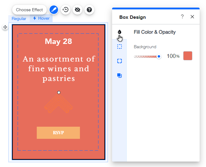
- Click the Design
icon.
- Click Customize Design.
- (Optional) Select a different preset design at the top.
- Choose from the following tabs to adjust each setting:
- Fill Color and Opacity: Choose a background color and drag the slider to adjust its opacity.
- Border: Adjust the border's color, opacity, and width.
- Corners: Use the boxes to adjust the pixel size of the box's corners.
- Shadow: Enable or disable a shadow, and adjust the angle, distance, size blur, color, and opacity.
Step 4 | Add an effect to your hover box
Effects bring your Hover Boxes to life. With a range of choices available, you can create an effect that is both eye-catching and fun.
You can also customize the effect to perfectly suit your site and hover box.
To add and customize an effect:
- Click the hover box.
- Click the Hover tab.
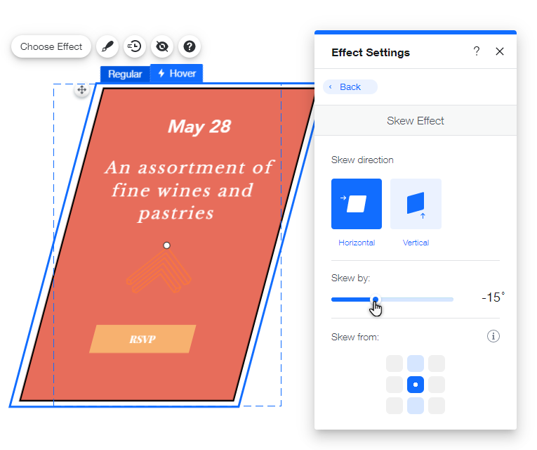
- Click Choose Effect.
- Click Customize the adjust the effect's settings.
Click an option below to learn more about how you can customize each effect.
Grow
Shrink
Skew
Rotate
Combo
