

Wix Editor: Adding and Customizing Share Buttons
4 min
In this article
- Adding and setting up share buttons
- Choosing which buttons to show
- Adjusting the share buttons' layout
- Designing the share buttons
Share buttons are an excellent tool for increasing your sites visibility. These buttons let visitors to share the site's homepage or the specific page they're viewing. With seamless integration into platforms such as Facebook and WhatsApp, sharing has never been simpler.
Adding and setting up share buttons
Add the design you like, then choose whether the button links to the current page or the site's homepage.
To add and set up the share buttons:
- Go to your editor.
- Click Add Elements
 on the left side of the editor.
 - Click Social.
- Select Share Buttons.
- Drag the design you like onto the page.
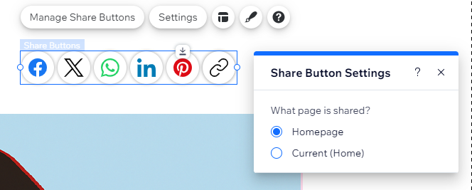
- Choose the page the buttons link to:
- Click Settings.
- Select the relevant option under What page is shared?.
Choosing which buttons to show
Choose the social platforms where you'd like visitors to share your site. You can remove irrelevant buttons and rearrange them to fit your preferences.
To choose which buttons to show:
- Select the Share Buttons element.
- Click Manage Share Buttons.
- Click the More Actions icon
 .
.

- Choose what to do next:
Replace icon
Edit text
Hide
 .
. .
.Adjusting the share buttons' layout
Modify the button layout to match your site’s design. Decide whether to display the social network icons, text alone, or both side-by-side. Additionally, adjust options such as alignment and spacing to provide a clear display for visitors.
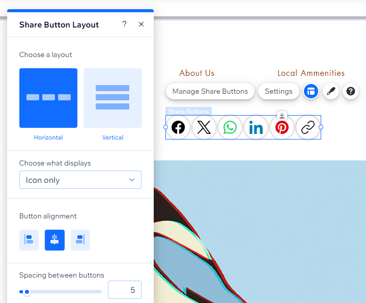
To adjust the buttons' layout:
- Select the Share Buttons element.
- Click the Layout icon
 .
. - Choose what to adjust:
- Choose a layout: Decide if the buttons are displayed horizontally or vertically.
- Choose what displays: Choose if you want to only show the icons, only show text, or both.
- Icon position: When you set both text and icons to appear, you can choose where the icon appears in relation to the text (e.g. above the text).
- Button alignment: Align the buttons to the left, right or center or the element.
- Spacing: Drag the sliders to increase or decrease the space between the buttons, rows and icon and text (when applicable).
- Button direction: This controls the order of the buttons, based on the way you arranged them in the Manage Share Buttons panel.
Note: This option is only available if you choose the Horizontal layout.
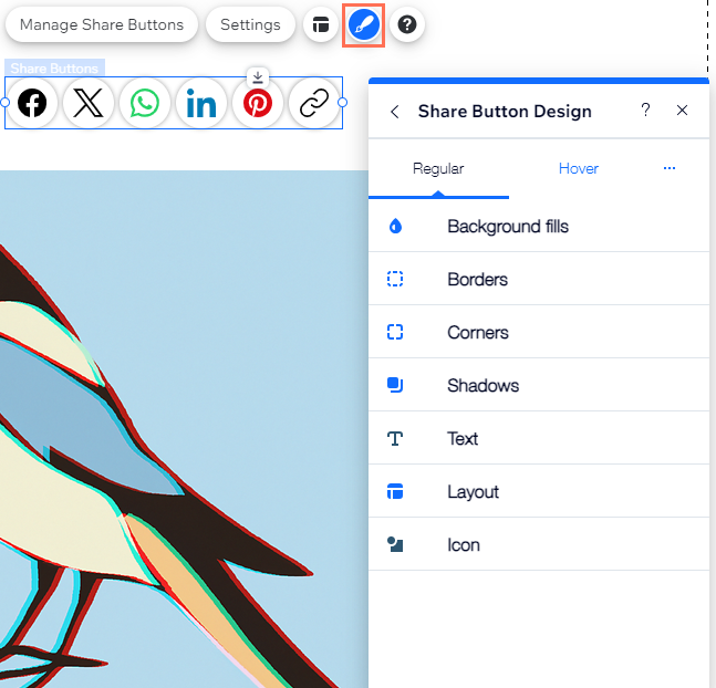
Designing the share buttons
There are many ways to customize the share buttons. Add an engaging background, resize the icons, style the text, and more. You can design the buttons for two different states: Regular and Hover.
To design the buttons:
- Select the Share Buttons element.
- Click the Design icon
 .
. - Click Customize Design.
- Select a state from the drop-down: Regular or Hover.
- Choose how to design the buttons:
- Background fills: Pick a color, gradient or image fill for the buttons. You can add multiple layers and adjust their opacity for a more interesting effect.
- Borders: Add borders in the color and style you want to make the buttons stand out.
- Corners: Make the corners of the buttons square or round.
- Shadows: Add shadow behind the element for a cool 3D effect.
- Text: Style and format the text appearing on the element.
- Layout: Add padding around the icons to make the buttons bigger.
- Icon: Adjust the icon size and angle.