
Understanding Your Site Speed Dashboard
3 min
In this article
- Metrics used to calculate site speed
- The Site Speed dashboard layout
- Understanding Google PageSpeed
The Site Speed dashboard shows your site's current loading speed and offers helpful tips to improve page loading.
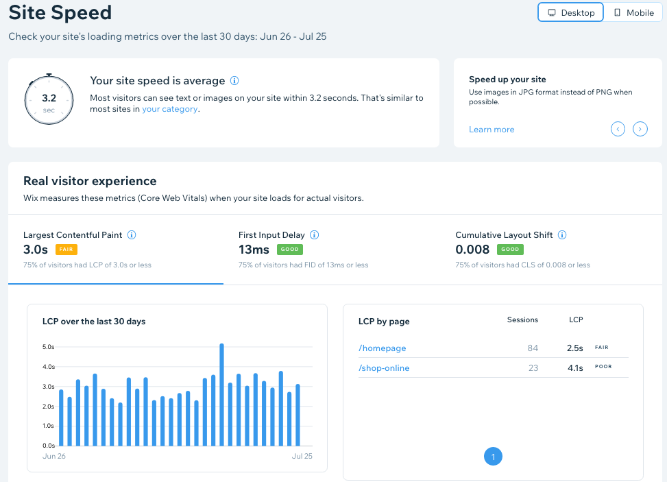
The dashboard is made up of two main sections. The first section 'Real visitor experience' shows the Core Web Vitals of your site based on what your actual site visitors are experiencing when loading a page. This pulled from Wix's data and is available for all sites. The second section 'Google PageSpeed simulation' is an estimation of your site performance from Google PageSpeed Insights. The Site Speed dashboard also offers tips to improve performance.
Important:
Site speed data is only available for sites that have received 10 or more site sessions in the last 7 days.
Ready to get started?
Go to Site Speed in your site's dashboard.
Metrics used to calculate site speed
Your site speed is calculated using real user data. When a page starts to load, Wix measures the following metrics:
- First Contentful Paint (FCP): The time it takes for the first content element to appear on the page when your site loads.
- Largest Contentful Paint (LCP): The time it takes for the largest image or block of text to appear on the page.
- Interaction to Next Paint (INP): An assessment of your site's responsiveness to all click, tap, and keyboard interactions that occur throughout each visit on every page. The final INP value is the longest interaction observed.
- Cumulative Layout Shift (CLS): Measures all layout shifts during the lifespan of a page. A layout shift occurs any time a visible element changes its position while the page loads.
The LCP, INP and CLS are the Core Web Vitals.
Tip:
Click Desktop or Mobile at the top to switch between site speed metrics on different devices.
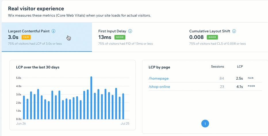
The Site Speed dashboard layout
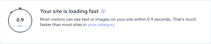
The site speed calculation at the top of the dashboard is pulled from your site's First Contentful Paint (FCP). This calculation also shows how your site performs in comparison to others in your category. If you want to update your category click your category.
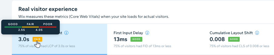
In the Real visitor experience section, labels next to each metric show how that particular Core Web Vital is performing on your site. The labels show a range that is defined by Google. The three possible labels are Good, Fair or Poor. Hover over a label to see the range. There are also tips in this section to help you improve the performance of Core Web Vitals.
Click a tab to view more extensive charts for a specific metric, including its performance over the last 30 days, performance per site page, as well as that metric's distribution across all visitors on your site.
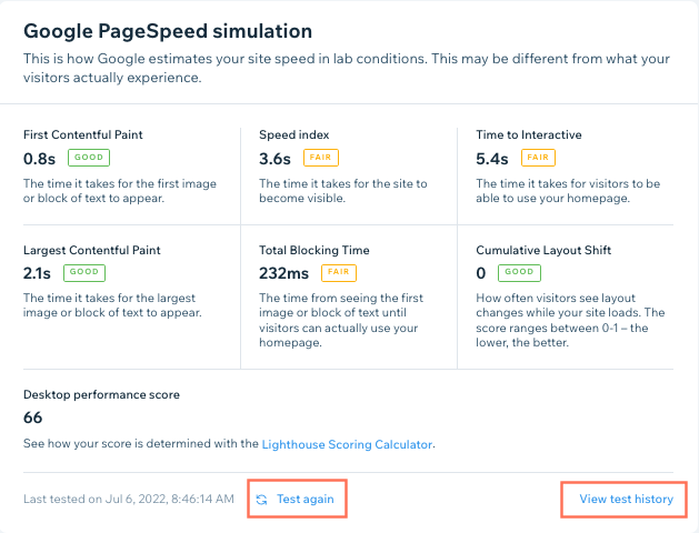
Understanding Google PageSpeed
The PageSpeed simulation section shows the Google Lighthouse performance scores, which estimates your site's speed based on lab conditions. The estimate may be different than what your visitors actually experience, as the simulation is of a low-end device and a slow 4G network. The performance score is between 1 and 100, with 100 being the best possible score. Click Test again to run another site speed test or View test history to see previous tests you've run.
Learn more about your PageSpeed Insights