Latest Improvements to Store Product Galleries
4 min
In this article
- Limit the color swatch display
- Price and title layout
- Sale price layout
- Add to Cart icon
- Add to Cart button placement
- Product option display
- Digital badge
- Sale price design
- Sticky sidebar
- Rounded corners
We've introduced a number of gallery enhancements that can help elevate your design and improve your store's functionality. Have a look at what you can do.
Limit the color swatch display
Keep your page looking clean by limiting the number of colors you display with your products.
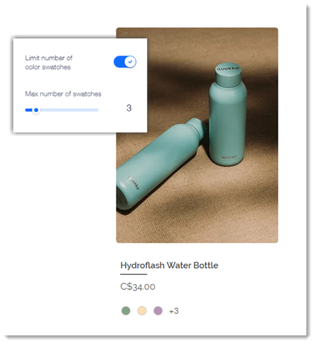
To customize color swatches, go to the Layout tab and click Product options.
Price and title layout
Choose how you want to display product names and prices: side by side or stacked on of top of the other.
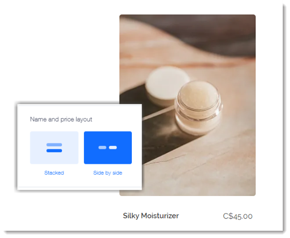
To customize the sale price layout, go to the Layout tab and click Product info. Scroll down to choose your preferred Name and price layout.
Sale price layout
You can now control how you display sale prices. Choose whether to place the crossed out original price above, below, left, or right of the discounted price. This helps you highlight discounts in a way that best suits your store's design.
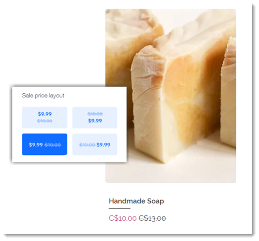
To customize the sale price layout, go to the Layout tab and click Product info. Scroll down to choose your preferred Sale price layout.
Add to Cart icon
You can now choose what customers click to add a product to the cart. Display an Add to Cart icon, an Add to Cart button, or both. Choose the icon design that works best for your store.
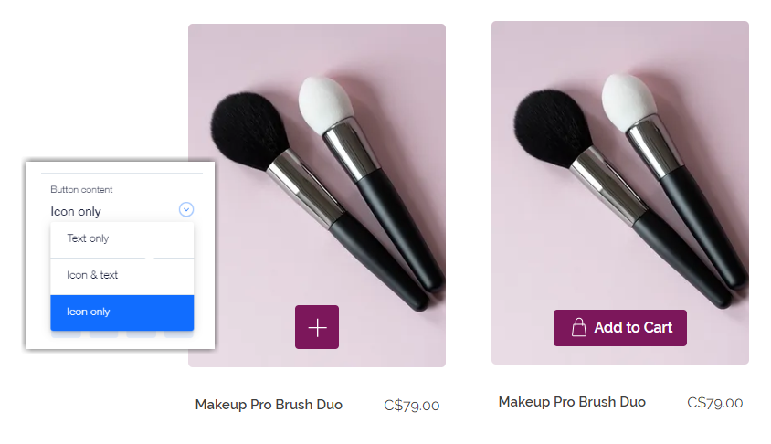
To customize the sale price layout, go to the Design tab and click Add to Cart button, then choose your preferred button content.
Add to Cart button placement
We've added the option of placing the Add to Cart button right over your project image. This saves important page real estate and streamlines your customers' experience.
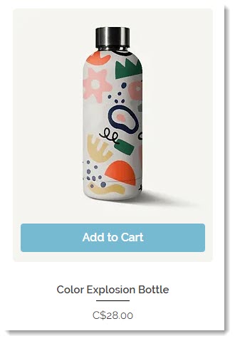
To enable the display of the Add to Cart button, go to the Display tab. To set where the button appears, go to the Layout tab, then click Add to Cart and select an option. For more customizations, go to the Design tab.
Product option display
You can now choose whether you want to display all of your product options or just color swatches.
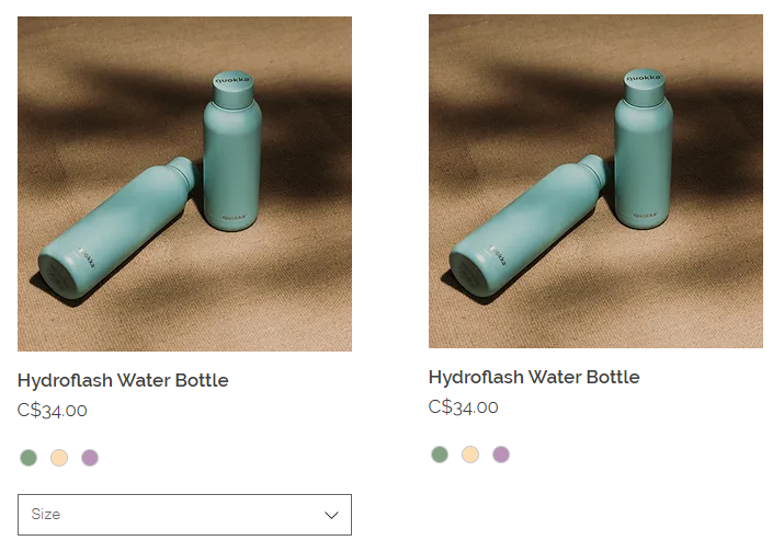
To enable the display of product options, go to the Display tab. To limit the display to color swatches, go to the Layout tab and click the Product Options section.
Digital badge
Decide if you want to show or hide the download badge display on digital products.
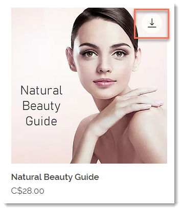
To hide the digital download badge, go to the Display tab and deselect that option.
Sale price design
Customize text fonts individually for the regular price, sale price, strikethrough price, and the discount name.
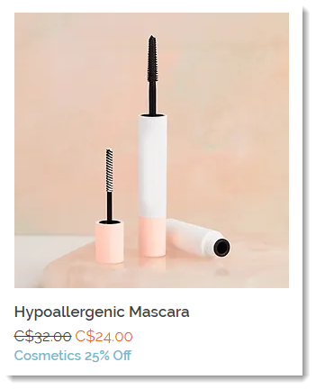
To access the price text customizations, go to the Design tab and click Product Info.
Sticky sidebar
Want to stop your category list (in the Category Page) and/or your filters from disappearing when scrolling down to view more products? Now you can make the sidebar "sticky".

To enable, go to the Settings tab, click Scroll behavior and then click the Sticky sidebar toggle.
Rounded corners
Curve the corners on dropdown product options and quantity counters for a consistent look.
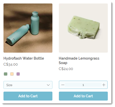
To access these corner customizations, go to the Design tab and click Quantity & product options.
