

Wix Blocks Tutorial - the Footer Widget (Beta)
7 min
Note
This product was a limited beta (2018) and will soon be outdated. See our updated help articles to learn more about the redesigned upcoming Wix Blocks workspace.
In this tutorial you will create a footer with a logo, address, and links to other pages, for reuse on many sites.
No Code Needed
You don't have to write any code to learn how to reuse design elements with Blocks. At the end of this tutorial you have a code option, if you want to try it.
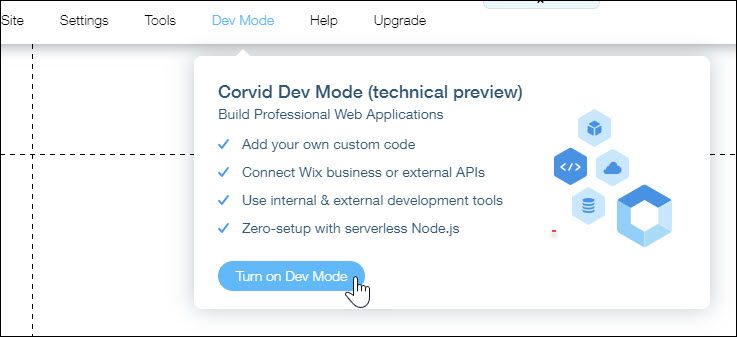
Step 1 | Enable Velo by Wix
In the Wix Editor, enable Velo by Wix. From the menu, select Dev Mode> Turn on Dev Mode.
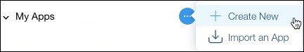
Step 2 | Open Blocks
In the left pane, hover over My Apps, open the ... menu, and select Create New. This opens a Blocks page for developing a single app. It contains a standard widget, which is what you need for this tutorial.
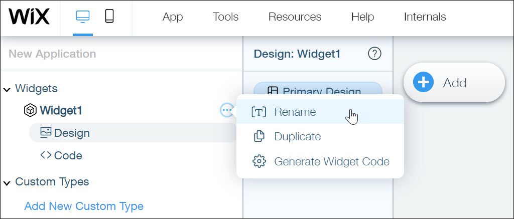
Step 3 | Rename Your Widget
- In the New Application sidebar, hover over the widget name, and from the widget more menu, select Rename.
- Name the widget FooterWithLogo.
Step 4 | Save Your App
Click Save and give your app a meaningful name, such as FooterCollection.
Important
In this release you cannot rename your apps.
Step 5 | Add Design Elements
Add elements to the widget. In our example, we added our company's contact info, links to important site pages, an image, and a social bar.

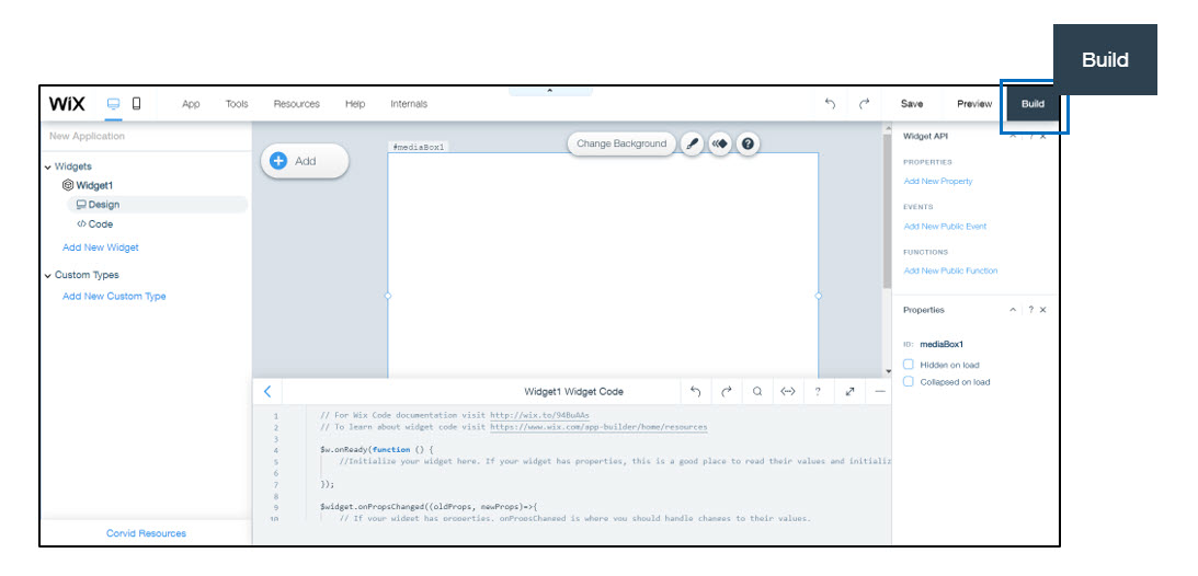
Step 6 | Build Your Widget
Click Build in the upper right corner. You've created your first widget!
Step 7 | Try your Widget on a Wix Website
- From your Wix dashboard, open one of your websites.
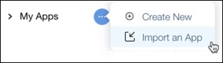
- Expand My Apps, select Import an App, and import your app.
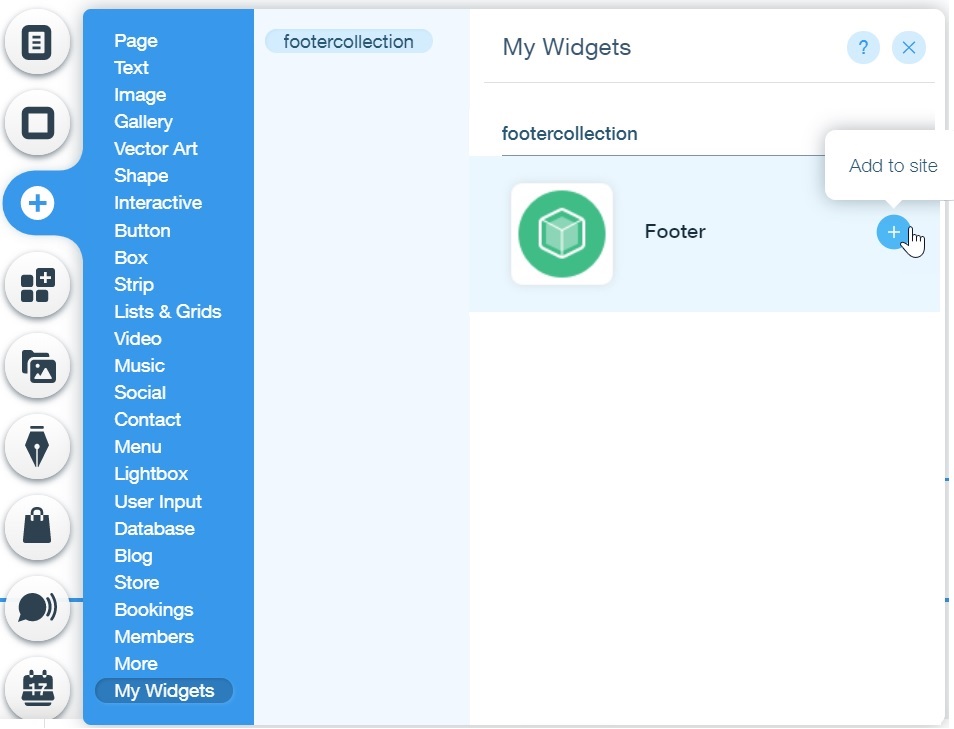
- From the Add panel, add the widget to your site.
Step 8 | Preview the site
Preview the site to view the widget. You've installed your first widget!
This footer widget can be installed, customized and used on any Wix site. You or your users will be able to change the name, logo image, text and more to match the look and feel of the site.
This footer widget can be installed, customized and used on any Wix site. You or your users will be able to change the name, logo image, text and more to match the look and feel of the site.
Code Options
Adding a bit of code
Your footer is complete. If you want to make it just a little more flexible, you can add a small amount of code.
Step 1 | Change the Image ID
- Go back to your Blocks page.
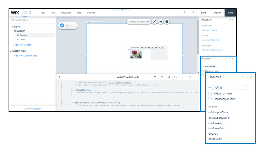
- Select the logo, and locate its Properties panel.
- In the Properties panel, change the ID of the image to myLogo.
Step 2 | Add Widget API Properties
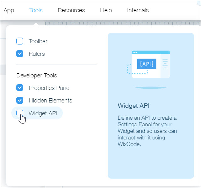
- In the right panel you should see the Widget API panel. If you don’t, from the Tools menu select Widget API.
2. Click the  next to Properties in the Widget API panel to add a new property.
next to Properties in the Widget API panel to add a new property. 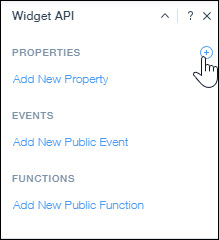
3. Enter a Property name, logo and a Display name, Choose a logo.
4. From the Property type dropdown, select Image.
Your New Property settings will look something like this.
4. From the Property type dropdown, select Image.
Your New Property settings will look something like this.

5.Click the camera icon to add a default image. Your New Property will now look like this:
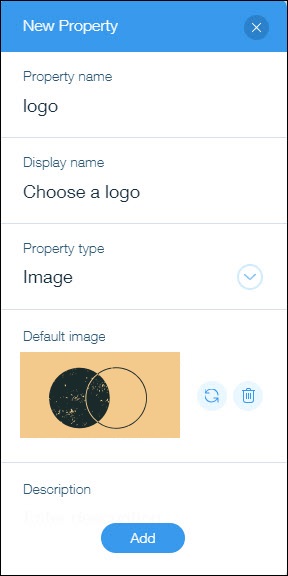
6. Click Add.
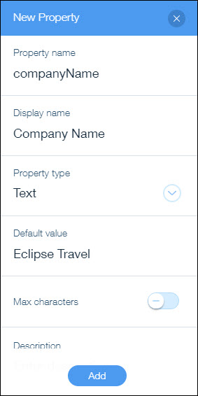
Do the same for the company name. Add a new property called companyName, of the type Text. It will look something like this:
Step 3 - Provide the Code
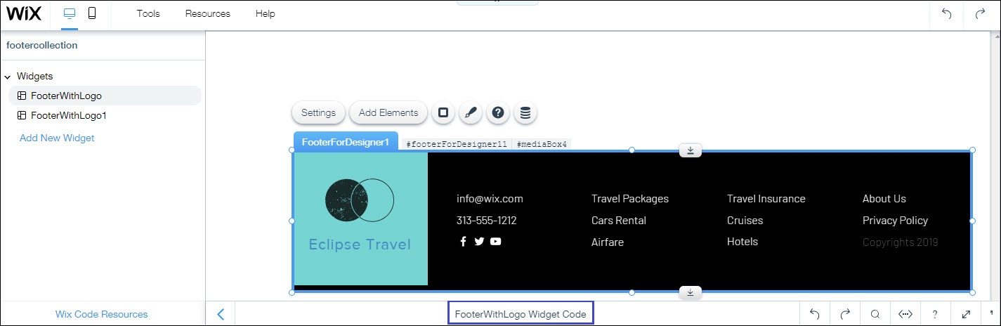
- At the bottom of Blocks, double click the bar that says YourWidgetName Widget Code to open the code panel. Here’s what the bar looks like for the FooterWithLogo widget.
The default code looks like this:

2. Overwrite all of the code in the code panel with the code below.
1$w.onReady(function () {
2    //Initialize the widget with the logo and company name from the Settings panel
3    $w('#myLogo').src = "httpד://" + $widget.props.logo
4 $w('#companyName').text = $widget.props.companyName
5});
6
7//Change the logo and company name if the user changes the value in code
8$widget.onPropsChanged((oldProps, newProps) => {
9 $w('#myLogo').src = "http://" + $widget.props.logo
10 $w('#companyName').text = $widget.props.companyName
11});
What the code does
The code tells the widget to use your properties when it loads and to use new properties when the user or the site code changes them.
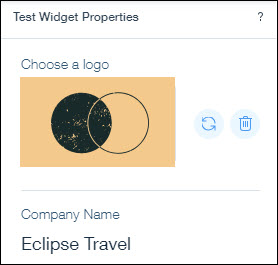
Step 4 | Test a Property
- Click Preview. From the Test Widget Properties panel on the right, you’ll see your display text “Choose a logo” and default image.
- Click the
 icon and select a new image. The new image will appear in your widget.
Step 5 | Build and Test Your Widget
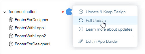
- Click Build. Now, your widget is available with an image that a site owner can change from the widget Settings panel.
- Open the website on which you installed the first version of the widget. There is a red notification icon by the name of the app, that indicates that an update is available.

3. Hover over the notification icon, and from the more menu, choose Full Update.
4. Open the widget’s Settings.
Upload a new image.
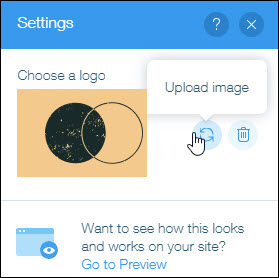
Click Preview to see your widget in action. Keep in mind, you can create a property for any element in the widget, so users can change those values in the widget's Settings Panel or with code.
