

Wix Editor: Customizing Your Popup
8 min
In this article
- Adjusting the layout of a popup
- Setting up the popup overlay
- Setting the popup background
- Customizing the popup Close button
- Customizing the X icon
Customize your popup to make it look how you want. You can choose an overlay to cover the page around the popup, set the popup's position, and change the background to create a design that's unique to your brand.
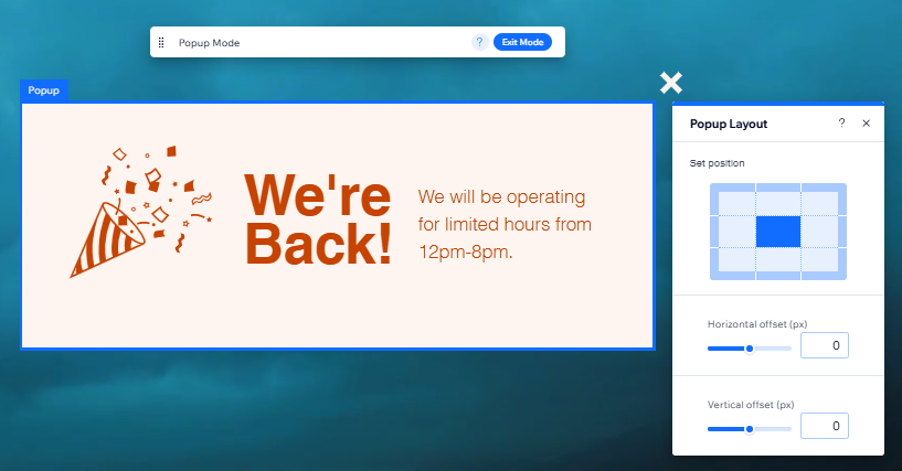
Adjusting the layout of a popup
Set where the popup appears on your page. You can choose a corner of the page where it should appear, and adjust the distance of the popup from the edges of the screen (offset).
To choose your popup's layout:
- Go to your editor.
- Click Pages & Menu
 on the left side of the editor.
 - Click Popups.
- Click the relevant popup to open it.
- Select the popup in the editor.
- Click the Layout icon
 .
. - Choose how you want to adjust the layout:
- Set position: Click a rectangle on the grid to set the position of your popup on the page.
- Horizontal offset: Move the box to the left or right of the screen.
- Vertical offset: Move the box up or down on the screen.
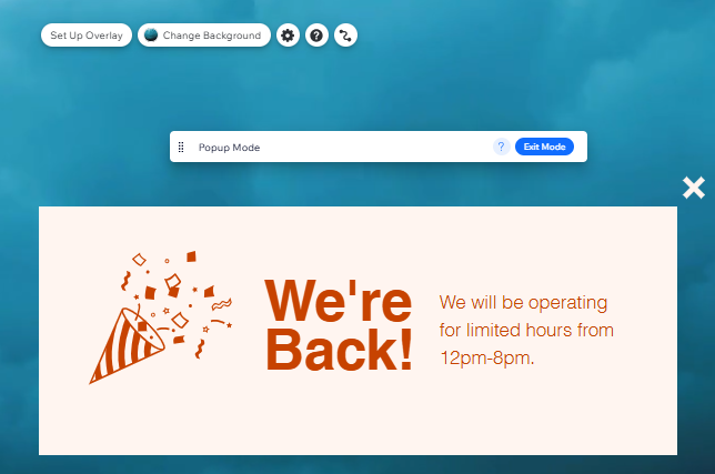
Setting up the popup overlay
Your overlay is the space around the popup that blocks out the rest of your site. This helps visitors focus on the message of your popup. Choose if your site visitors can click the overlay to close to the popup.
To set up the overlay:
- Go to your editor.
- Click Pages & Menu on the left side of the editor.
- Click Popups.
- Click the relevant popup to open it.
- Click anywhere outside of the popup to select this area.
- Choose what to do next:
- Decide if visitors click the overlay to close the popup:
- Click Set Up Overlay.
- Enable or disable the Clicking Closes Popup toggle.
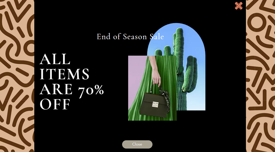
Note: If you disable this option, make sure that you have either an 'X' icon or 'Close' button on your popup.
- Design the overlay:
- Click Change Overlay Background.
- Choose between a color, image or video background.
- (Optional) Click Settings to adjust the overlay.
Tip: You can adjust the opacity of color and image backgrounds. We recommend making the overlay slightly transparent so that your visitors can still see the page behind the popup but understand that it is blocked.
- Decide if visitors click the overlay to close the popup:
Overlays on your mobile-friendly site:
- It is not possible to edit your popup overlay on the mobile version of your site.
- If you add a color or image overlay on desktop, this is automatically applied to your mobile site. However, if you add a video overlay, this will convert to a still image from the video on the mobile version of your site.
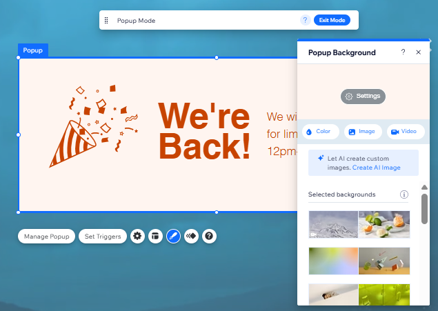
Setting the popup background
Choose to have either a color, image or video background on your popup. Depending on the type you choose, you can also adjust settings such as the visibility and scaling.
To choose a background for your popup:
- Go to your editor.
- Click Pages & Menu on the left side of the editor.
- Click Popups.
- Click the relevant popup to open it.
- Select the popup in the editor.
- Click the Design icon
 .
. - Click the type of background you want for your popup:
- Color: Select a color from the Color Picker, or add and adjust a stunning gradient.
- Image: Select your own image, one from Wix, or Shutterstock.
- Video: Select a free Wix video or upload your own.
- (Optional) Click Settings to adjust the background to your liking.
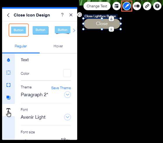
Customizing the popup Close button
Adjust the look and layout of the button visitors click to close your popup. You can choose the text, set the alignment of the button text, and customize its design for Regular and Hover view to make it stand out.
To customize the Close button:
- Go to your editor.
- Click Pages & Menu on the left side of the editor.
- Click Popups.
- Click the relevant popup to open it.
- Select the popup in the editor.
- Click the Close button.
- Choose how to customize the button:
Change the text that appears on the button

Adjust the text alignment on the button
 .
.
Design the button
 : Choose a background color for the button, and adjust its visibility.
 : Add borders to the button to create a contrast against your popup. Choose a color, and set the width to make it as big or as small as you need.
 : Choose how you want to corners of your button to look. You can adjust each corner differently, and make them rounder or more square.
 : Add shadows to your button for a cool 3D effect. You can set the size, visibility, angle, and more to give it more impact.
 : Customize your button's text with settings such as font, size, and spacing. You can also add formatting like bold and italics, and choose the color.
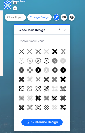
Customizing the X icon
If you've enabled an X (close popup) icon in the Popup Settings panel, you can adjust its look to suit your aesthetic. Choose from a range of designs, and customize the color, visibility, and border.
To customize the X icon:
- Go to your editor.
- Click Pages & Menu on the left side of the editor.
- Open the relevant popup.
- Click the popup in the editor.
- Click the Close Popup (X) icon.
- Click the Design icon
.
- Choose how you want to customize your X icon:
- Select a new design: Click a preset from the panel to set a new design for the icon.
- Customize the icon: Click Customize Design, and edit the icon how you want:
- Fill color & opacity: Select the icon's color from the color picker, and use the slider to make it more or less visible.
- Border: Choose a color for the icon border, and set its width (in pixels).