Wix Editor: Resolving Alignment Issues on Your Live Mobile Site
3 min
In this article
- Single line of text is split over two lines
- Text and other elements are overlapping
- Text is not aligned with other elements
- Alignment issues with other elements on mobile
Your site's content may not look the same across all mobile devices, as different browsers and devices use different rendering engines. For example, text elements can expand, overlap or become misaligned with other elements on certain mobile screens.
Single line of text is split over two lines
You may notice that a single line of text in your mobile Editor is split into two lines on the live site. This can depend on the device, and may look different on different screens.
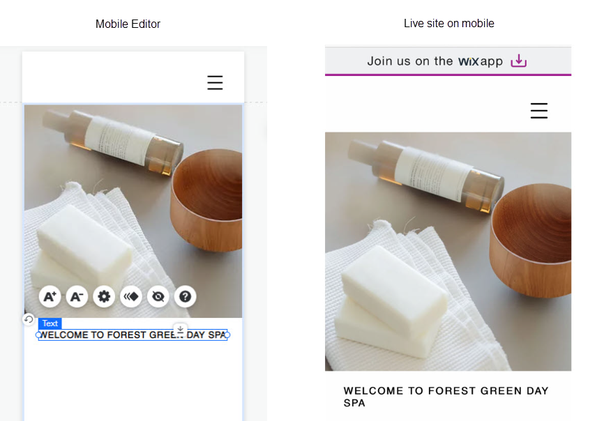
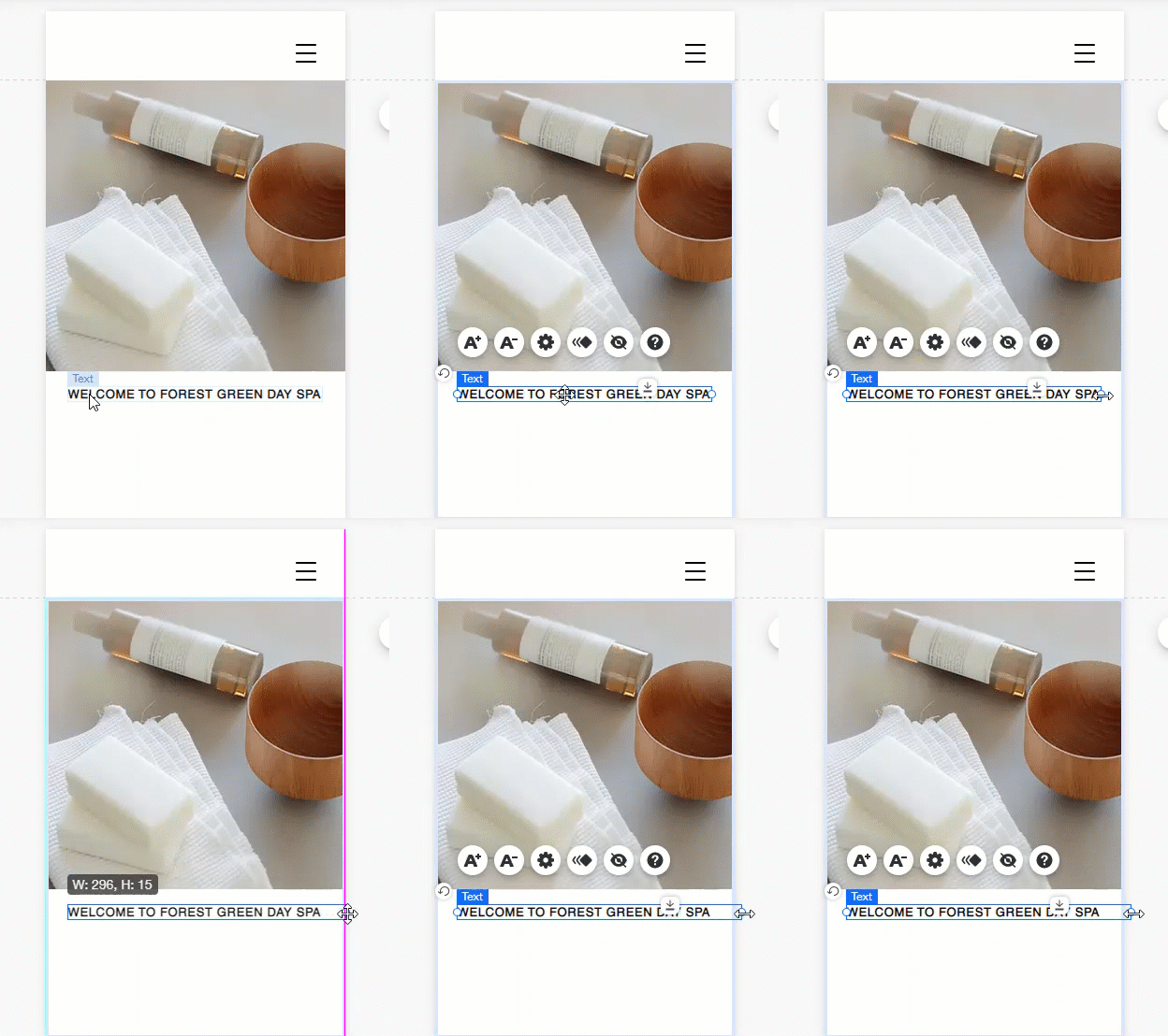
In order to resolve this issue, simply widen the text box by clicking and dragging the handles. This only makes the text box larger, and does not affect the size of the text itself.
Text and other elements are overlapping
If you've added a large amount of text to your site in a single text box, and added an element on top of it, the text may overlap with other elements on your live site. This is usually seen in text that has been added to your site in the desktop Editor.
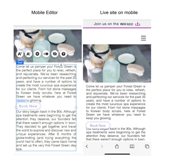
To resolve the issue:
- Open the desktop Editor.
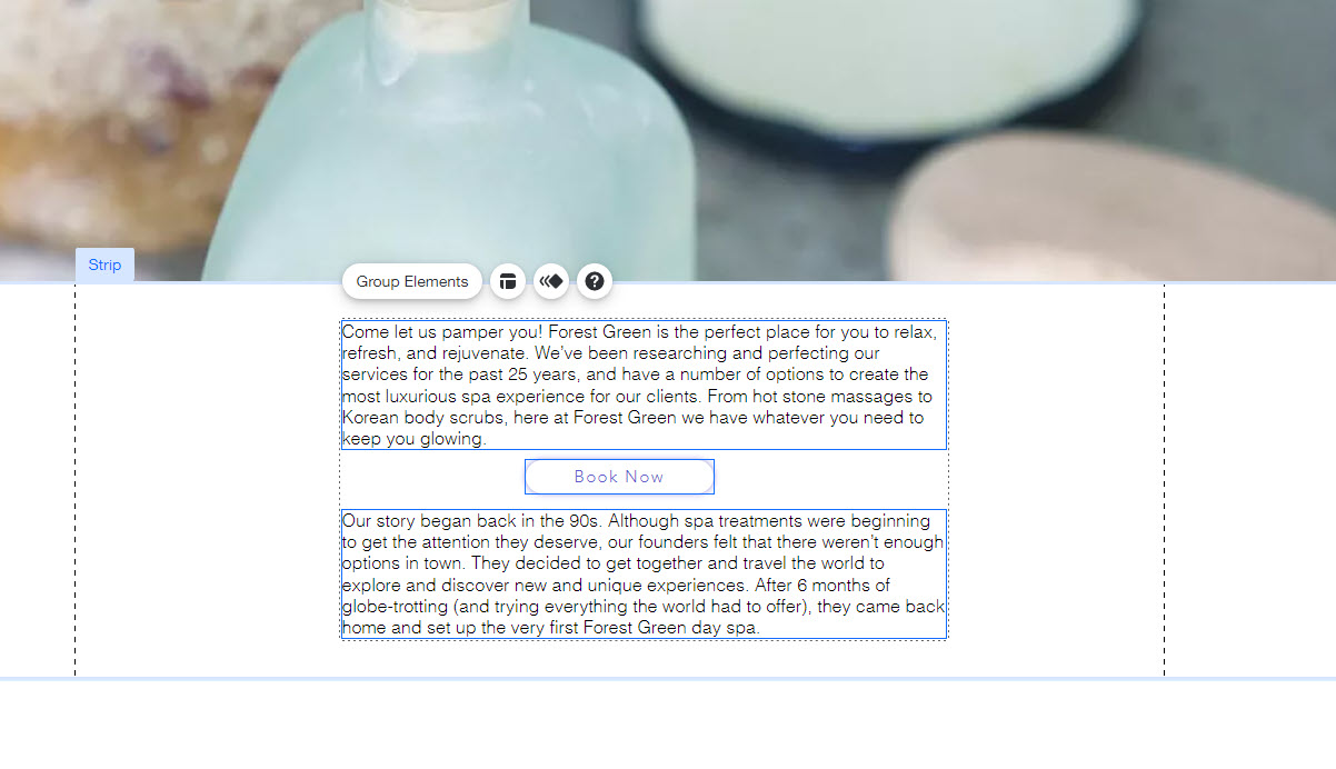
- Break up the text into multiple text boxes - one per paragraph.
- Add the elements between the text boxes with some space between them.
- Group the elements together to ensure they're aligned. Click here to learn how to group elements
Text is not aligned with other elements
If you have a lot of text in a single text box, it may not align with other elements on your mobile live site.
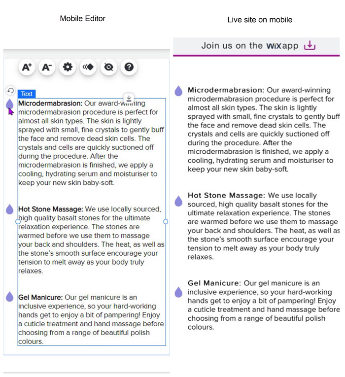
To align text with other elements:
- Open the desktop Editor.
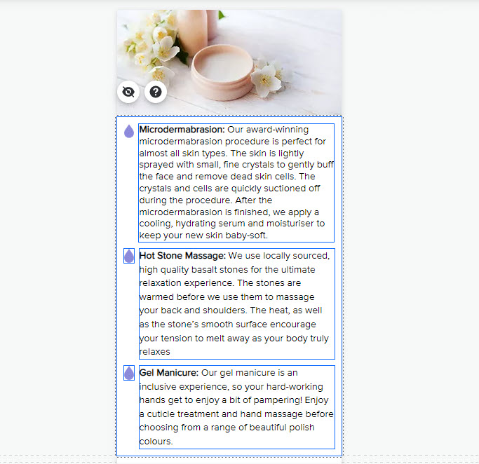
- Split the text into multiple text boxes - one for each paragraph.
- Group the text with the relevant elements. Click here to learn how to group elements
Alignment issues with other elements on mobile
You may find that elements you've arranged horizontally aren't aligning as expected on the mobile version of your site.
To prevent these elements from shifting, group them together and attach them to a transparent container box.


