Editor X: Adding and Customizing Tabs
6 min read
Editor X is transitioning to Wix Studio, our new platform for agencies and freelancers.Learn more about Wix Studio
Use the tabs element to organize and group related content on your page. This element lets you show multiple sections of content in a compact manner, making it easy for your visitors to find the information they need.
In this article, learn how to:
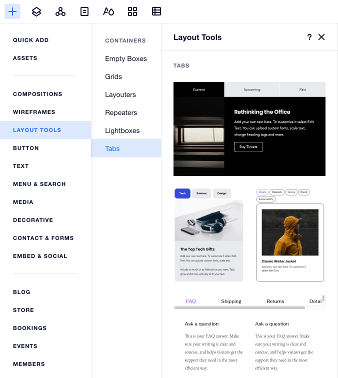
Adding the tabs element to your page
Add as many tab elements as you need to organize your information. After choosing a preset and dragging it onto your page, customize the content and add the elements you need.
To add tabs:
- Click Add Elements
 at the top of Editor X.
 - Click Layout Tools.
- Click Tabs.
- Choose a design preset you like and drag it onto your page.
- Customize the content of your tabs:
- Click the Tabs element you just added.
- Click Manage Tabs.
- Select the tab you want to work on.
- Edit the tab's content:
- Add more elements.
- Edit existing elements.
- Adjust the grid to your desired layout.
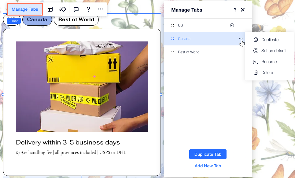
Managing your tabs
Use the Manage Tabs panel to add, duplicate, rename or delete tabs. This panel also allows you to navigate between your tabs – click a tab to see how it looks.
To manage your tabs:
- Click the tabs element.
- Click Manage Tabs.
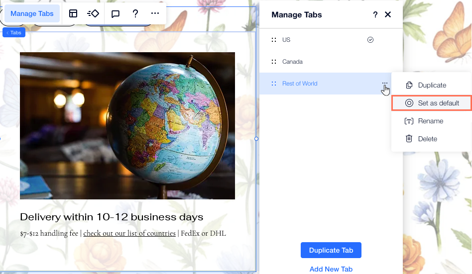
- Hover over the relevant tab and click the More Actions icon
 .
. - Choose what you want to do with this tab: Rename, Delete or Duplicate.
Want to add a blank tab?
Click Add New Tab at the bottom of this panel.
Designing your tabs
Personalize your tabs element so that it matches the style of your page. You can design the tab menu as well as the container that shows the tab content.
Tip:
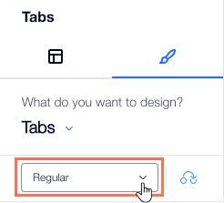
You can design the tab menu for 3 different states: Regular, Hover and Selected.
To design your tabs:
- Click the tabs element.
- Click the Inspector icon
 at the top of Editor X.
 - Click the Design tab
 .
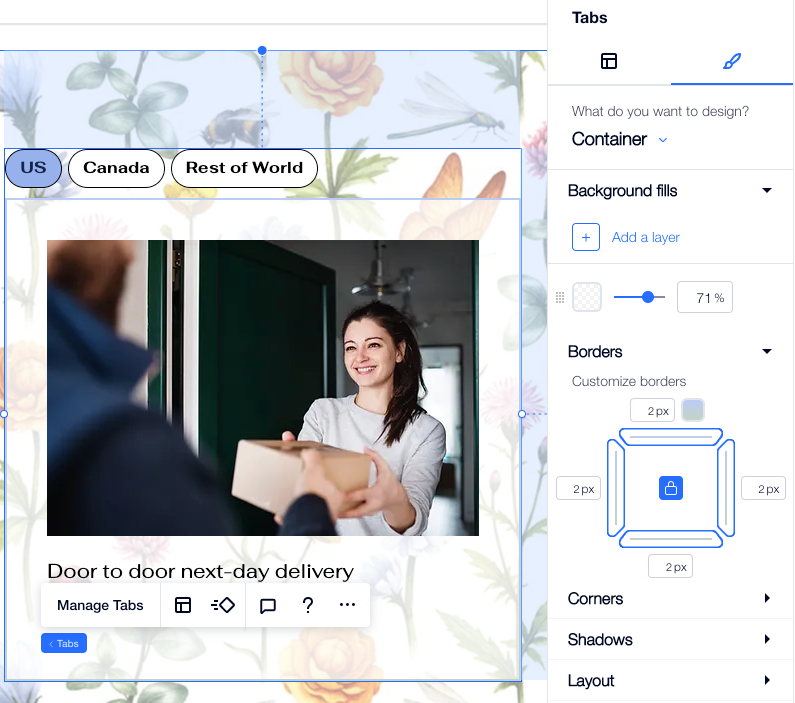
. - Choose the part you want to design from the drop-down:
- Menu container: This container shows your tab menu.
- Tabs: These are the tabs appearing on the menu.
- Container: This is the container that shows the content of each tab.
- Use the available design options:
- Background fills: Apply a color, gradient or image background. You can add multiple background layers and adjust their opacity.
- Borders: Add borders to create a contrast against your site page. Choose a design and color, and set the width.
- Corners: Choose how you want to corners to look. You can adjust each corner differently, and make them rounder or more square.
- Shadows: Add shadows for a cool 3D effect. You can set the size, visibility, angle, and more to give it more impact.
- Layout: Adjust the padding to make it larger or smaller. You can enable or disable the Lock icon
 to adjust each side separately, or make them match.
 - Text: Style and format the tab names appearing on the menu. You can change the font, size, color and more.
Note:
The available options depend on the part you choose to design (i.e. Menu container, Tabs or Container).
Choosing a default tab
The default tab is the first one your visitors see. You can change the default tab to whichever you want to appear first.
Tip: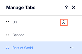
In the Manage Tabs panel, you can see a checkmark icon next to the current default tab.
To set the default tab:
- Click the tabs element.
- Click Manage Tabs.
- Hover over the relevant tab and click the More Actions icon .
- Click Set as default.
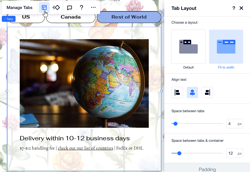
Adjusting the tab layout
Customize the layout, spacing and padding of your tabs element so it looks just the way you want. If you have a large amount of tabs, you can also decide how to show them on the menu – let visitors scroll to see the rest of the tabs or add more rows to the menu so they all fit.
To adjust the tab layout:
- Click the tabs element.
- Click the Layout icon
 .
. - Adjust the layout using the available options:
- Choose a layout: Decide how much you want your tab menu to stretch:
- Default: The menu does not stretch to fit the width of the element. You can then align the menu to the left, center, or right.
- Fit to width: The menu stretches to fit the width of the element. You can align the text on your menu to the left, center, or right.
- Spacing between tabs: Drag the slider to change the spacing between the tabs on the menu.
- Spacing between tabs & container: Change the space between the menu and the container that shows the content of each tab.
- Horizontal padding: Adjust the padding on the left and right of the menu tabs.
- Vertical padding: Adjust the padding on the top and bottom of the menu tabs.
- How to display tabs that don't fit: Select how to display tabs that don't fit in the menu:
- Scroll: Visitors can scroll through the menu to see more tabs.
- Wrap: Another row is added to fit the other tabs. You can then use the slider to adjust the spacing between the rows.
- Display items from: Display tabs on the menu from left to right, or vice versa.
- Choose a layout: Decide how much you want your tab menu to stretch: