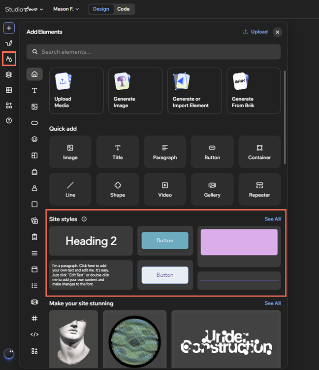
Use styled elements to keep buttons, lines, and containers consistent across the site.
Customize the default styles to match the site's branding, or create your own.
About styled elements
The top styles for each element are generally the default styles for apps or other elements you add to the site. For example, if you add the Feature Service element in Wix Bookings, the Book Now button has the primary button design by default.
You can also add the styled elements themselves at any time from the Add Elements panel under Site styles.
Customizing styled elements
Customize the design of existing styled elements to give the site a fresh new look. This automatically updates any elements on the site with that style.
To customize styled elements:
- Go to your editor.
- Click the Site Styles icon
 on the left side of the editor.
- Scroll through the tabs or click the Arrow icon
 in the panel.
- Select the relevant option: Buttons, Lines, or Containers.
- Use the options to customize the design:
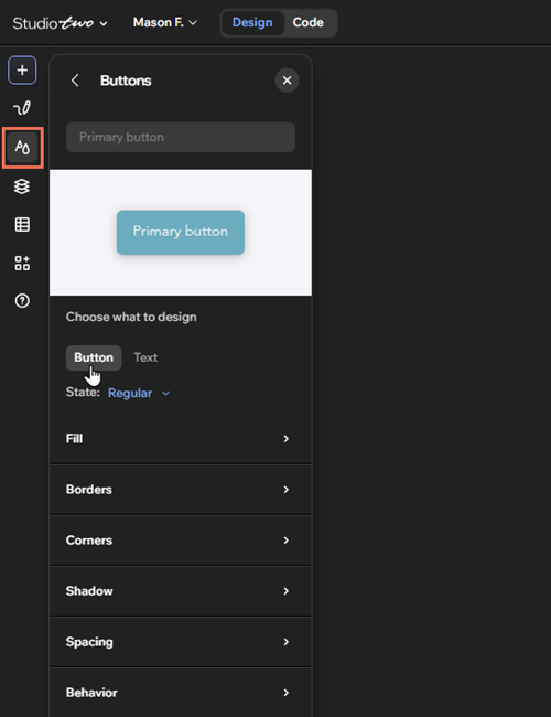
Click the button you want to customize.
Choose which part of the button to design:
Button:
State: Select whether to customize the button for the Regular, Hover, or Disabled state.
Fill: Select a new color for the button's background.
Borders: Add borders to the button. You can set the color, width, and style for the entire button, or click the Edit individual borders icon  to change each side.
Corners: Make the corners of the button rounder or more square (in px). You can use the same measurements for the entire button, or click the Edit individual corners icon  to adjust each side separately.
Shadow: Apply a shadow and adjust it to your liking. You can customize the size, color, and more.
Spacing: Use the options to customize the button's spacing:
Padding: Adjust the horizontal and vertical padding around the button. You can use the same measurements for the entire button, or adjust each side separately.
Gaps: Adjust the spacing between the button text and icon.
Behavior: Set the button's alignment.
Text:
State: Select whether to customize the text for the Regular, Hover, or Disabled state.
Text style: Choose a style from the panel to apply to the text.
Font: Select a font from the dropdown, and choose its weight (Regular, Bold, etc.).
Note: Weight is not available for all fonts.
Size: Enter the text's size (in px) into the field.
Color: Select a new color for the text.
Padding: Adjust the horizontal and vertical padding around the text.
Style: Apply formatting options such as bold and italics to the text.
Case: Choose whether the text is all uppercase, lowercase, or title case.
Shadow: Apply a shadow and adjust it to your liking. You can customize the size, color, and more.
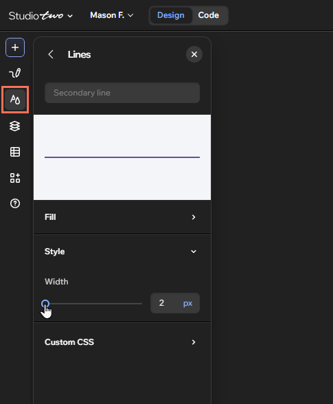
Click the line you want to customize.
Edit it using the options:
Fill: Choose a color for the line. You can select a site color, or add a custom one.
Style: Set the width of the line (in px).
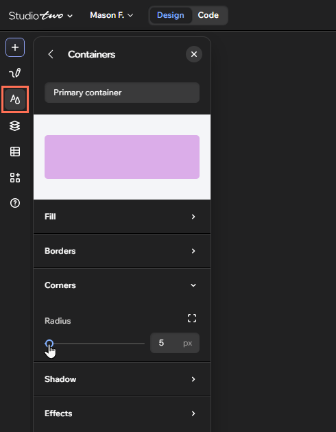
Click the relevant container.
Customize it using the options:
Fill: Select a new color for the container.
Borders: Add borders to the container. You can set the color, width, and style for the entire container, or click the Edit individual borders icon to make changes to each individual side.
Corners: Make the corners of the container rounder or more square (in px). You can use the same measurements for the entire container, or click the Edit individual corners icon to adjust each side separately.
Shadow: Apply a shadow and adjust it to your liking. You can customize the size, positioning, and more.
Effects: Apply a background effect to the container, and use the slider to adjust its intensity.
Adding new styled elements
Depending on the site's brand, you may want a wider range of styled elements. You can add new designs from the relevant tab in the Site Styles panel.
Customized an element on the canvas and like its look? You can apply it to an existing style, or save it as a new one.
To add new styled elements:
Go to your editor.
Decide what you want to do:
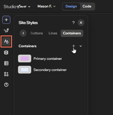
Add a new element in Site Styles
Click the Site Styles icon on the left side of the editor.
Scroll through the tabs or click the Arrow icon in the panel.
Select the relevant tab: Buttons, Lines, or Containers.
Click the Add icon  .
Enter a name for the element into the field.
Set up your custom design using the options.
Save a custom design from the canvas
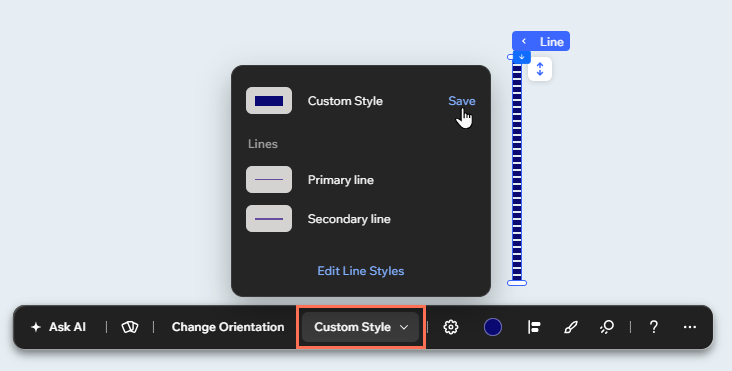
Click the relevant element.
Click Custom Style on the action bar.
Click Save beside Custom Style in the panel.
Choose how you want to save the element:
Update style: Select the style you want to apply the design to, and click Save.
Create new style: Enter a name for the style and click Save.
Managing styled elements
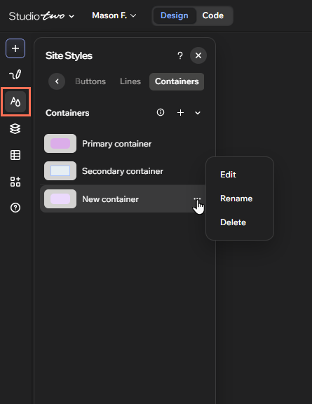
Manage custom styled elements to keep the site's branding organized. You can rename them to match their functions, or delete any you no longer need.
To manage styled elements:
- Go to your editor.
- Click the Site Styles icon on the left side of the editor.
- Scroll through the tabs or click the Arrow icon in the panel.
- Select the relevant tab: Buttons, Lines, or Containers.
- Hover over an element and click the More Actions icon
 .
- Choose what you want to do:
- Rename the element: Click Rename and enter the new name into the field.
- Delete the element: Click Delete. If the style is applied to elements on the site, choose a replacement style from the dropdown.
FAQs
Select a question to learn more about working with styled elements.
Why can't I delete some styled elements?
It is not possible to delete the site's default styled elements. This is because the primary designs are automatically applied to other apps and elements you add to the site. However, you can update their look as needed.
Does updating styled elements affect other parts of my site styles?