Editor X: Adding a Custom Interaction
6 min read
In this article
- Step 1 | Add a trigger (click or hover)
- Step 2 | Set up your interaction
- Step 3 | Customize the animation
- FAQs
Editor X is transitioning to Wix Studio, our new platform for agencies and freelancers.Learn more about Wix Studio
Add Interactions to create an animated experience as visitors click or hover over elements. The interaction can animate the same element that triggered it, or any other element on the page.
With custom interactions, you have full creative freedom to design your animation from scratch. You can also control the animation's timing to make it truly effective.

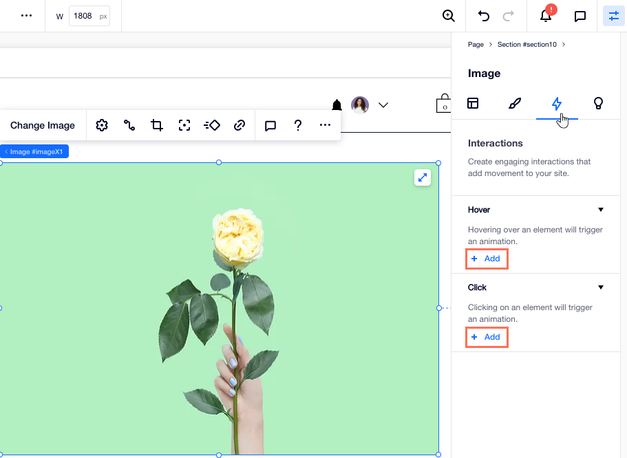
Step 1 | Add a trigger (click or hover)
To get started, select the element that triggers the interaction. This is the element that your visitors hover over or click before seeing the animation. Then, go to the Interactions tab in the Inspector panel to add your new interaction.
Tip:
You can add multiple interactions to an element so it triggers different animations on hover or click.
To add a trigger:
- Select the element that should trigger the interaction.
- Click the Inspector icon
 at the top of Editor X.
 - (In the Inspector) Click the Interactions tab
 .
. - Click + Add under Hover / Click.
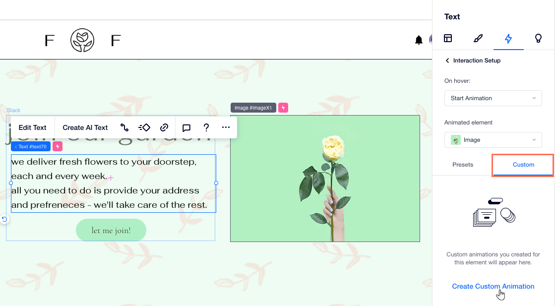
Step 2 | Set up your interaction
You can now choose which element gets animated, the animation that should appear and the exact action that happens on hover or click (e.g., apply the animation, toggle it on / off, etc.)
To set up your interaction:
- Select an option from the On Hover / On Click drop-down:
- Start Animation: Clicking / Hovering over the element triggers the chosen animation.
- Toggle On/Off: Similar to a toggle, clicking the element triggers the animation and a second click removes it.
- Reset Animation: Clicking / Hovering over the element removes any animation that was previously applied.
- Select an option from the Animated element drop-down:
- Make the element trigger its own animation: Click the element's name (the word (self) appears next to it).
- Animate a different element on the page: Select an element from the drop-down, or click Choose on Canvas to select it on the page.
Tip: Hold the Cmd / Ctrl key to select a child element.
- Click the Custom tab.
- Click Create Custom Animation.
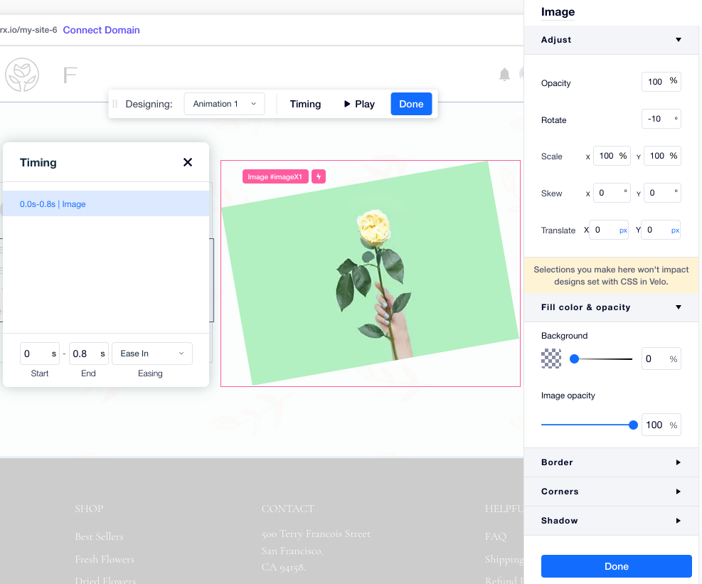
Step 3 | Customize the animation
Now it's time to build your animation from scratch. Add all kinds of layout and design transforms to change your element's size (Scale), position (Translate), angle (Rotate), fill color and more.
You can also design your element's initial state to complement the animation you built. This is how the element looks when it loads, before visitors interact with it. To tie it all together, set the animation's duration and ease.
To customize the animation:
- Choose how you want to customize your animation:
Adjust the element's design
Design the element's initial state

Set the animation's duration and ease
2. (Optional) Click  Play on the floating bar to preview your animation.
Play on the floating bar to preview your animation.3. When ready, click Done.
What's next?
Review and manage your Interactions list for each element.
FAQs
Click below to learn more about creating interactions.
How does it look when an element triggers its own animation?

How does an interaction between different elements look?

Can one element trigger multiple other elements?

Can a single element have multiple animations?
