

Wixel: Creating and Customizing Charts
In this article
- Creating a chart
- Customizing your chart data and design
- FAQs
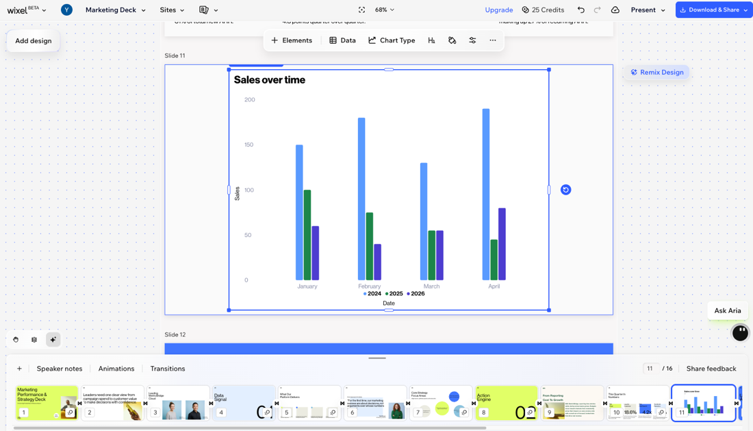
Charts turn your data into clear visuals you can add to
Wixel Slides. Use them to show trends over time, compare categories, or break down a whole into parts, while keeping the design on-brand.
Note:
Actions that involve generating and editing charts with AI use AI credits.
Creating a chart
You can add a chart to any slide from the toolbar on the left side of your project. Start from scratch, generate a chart using a file with data you already have, or use AI to build a chart from public data.
To add a chart:
Select the relevant slide in your project.
Choose how you want to create your chart:
Manually populate a chart
 on the toolbar.
Upload a file with your data
Generate a chart with AI from public data
Customizing your chart data and design
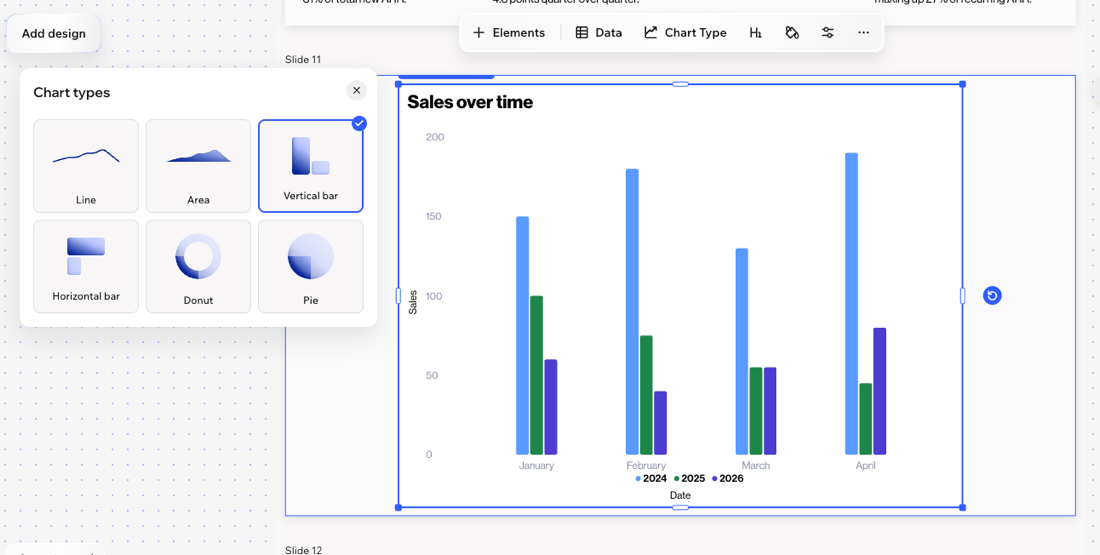
Once your chart is on the page, you can fine-tune the data, switch chart types, and
match the design to your project theme.
Note:
The available display options can change depending on the chart type you choose.
To customize your chart:
Select the relevant chart.
Choose what you want to do:
Edit the chart data
Change the chart type
Customize the theme
Edit the formatting
 on the action bar.
Customize the chart colors

Adjust display options
 on the action bar.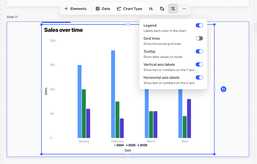
FAQs
Click a question below to learn more about charts in Wixel.
How do I choose the right chart for my content?
What file types can I upload to create a chart?
What is the maximum amount of data I can add?