UX Guidelines for Editor Experience
A Blocks widget blends seamlessly, both with the site-builder's editing environment, and the experience of the site visitor. Following these guidelines will help make the experience of whoever installs your app as easy and intuitive as possible. Whenever in doubt, use this rule of thumb: their experience should be similar to what you see in the Wix site editor. All guidelines refer to the Configuration and Panels tabs in the Editor Experience  panel in Blocks.
Selecting Elements
You can define whether your widget elements can be selected by a site builder who installed your app, in the Configuration tab in the Editor Experience panel. In general, invisible elements, such as layout tools (for example, a stack), should be defined as non-selectable. This makes the experience of the site builder who installs the widget easier and clearer.

For example, take the following widget. You can see in the Layers tab in Blocks that it has a layouter, an image, a stack, two texts and a button.
See example
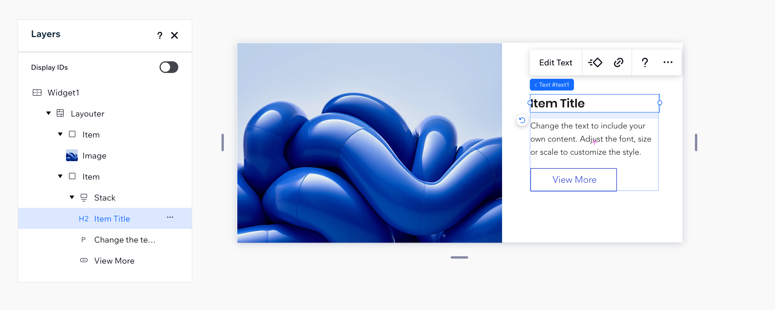
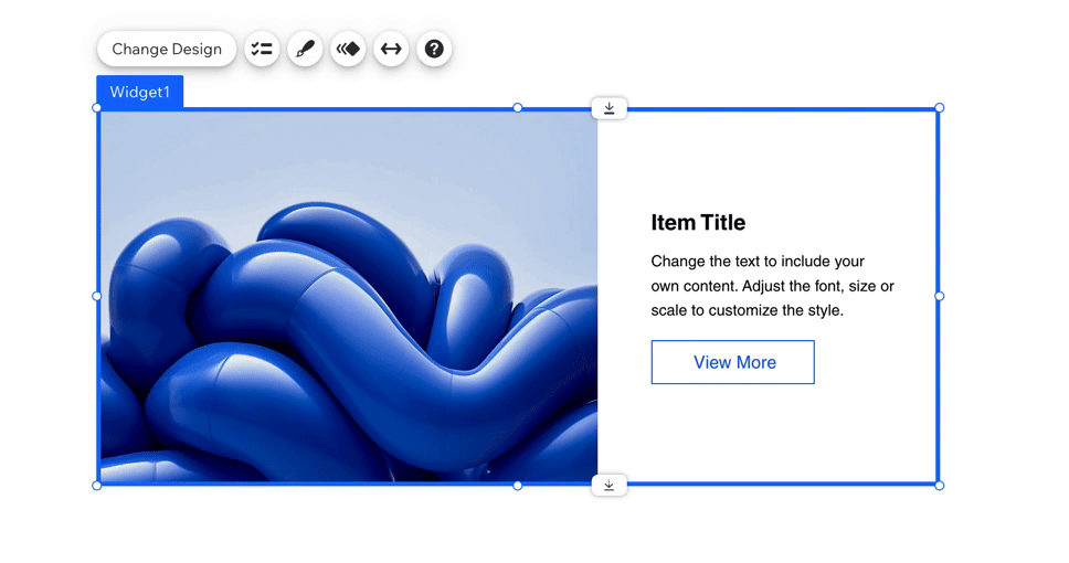
We defined all the non-visible elements of this widget as non-selectable. When it is installed in the editor, only the image, texts and button can be selected.
See example
Exceptions
In some cases, en element is not a layout tool and still you will want it to be non-selectable:
- When your widget is a custom element.
- When an element is essential for the widget and therefore cannot be removed. If you uncheck the "Can be removed" checkbox, the "Can be selected" checkbox will automatically be unchecked.
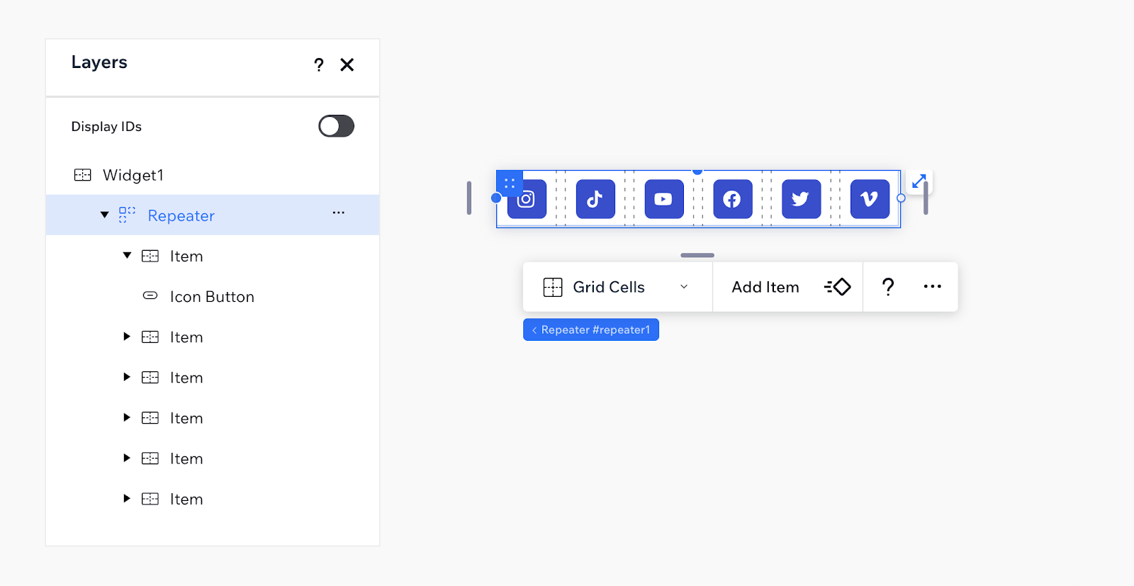
- When the entire widget is treated as a single element. For example, a social bar, a small rating widget, or a calendar. Here is an example of a social bar, that does not allow selecting inner elements. We defined the repeater, its items and the button non-selectable. Everything you need to configure is done through the widget's Settings panel.
See example
Display Names
You can set display names for your widgets and their elements. The display name appears in a site builder's site-editor. For example, the button in this widget was given a meaningful display name: "Add to Cart".

- Don't use the word "Widget" in your widget's display name (you also shouldn't use it in the widget name itself).
- Give the widget elements a meaningful display name. For example, if your widget has an input element for a site-visitor to write their email address, call it "Email" and not "Input".
- Use title case to capitalize the display name.
Configuring Action Bars
Widgets and their elements come with default action bars (floating menus). The buttons on the action bars are called action buttons .

Action Bar Design
- You can remove and add action buttons. Note that the main action (the left one, which has a word on it and not only an image), can't be removed.
- If a text field has dynamic text, which the site-builder should not edit, make sure to change the main action from "Edit Text" to "Design Text". This sort of text can be changed from the Dashboard.
- We recommend not to connect a design panel to the paintbrush action button, since it will work only in the Wix editor and not in the Studio editor.
Action Bar Text
- Make sure that the name or icon of the action button matches the goal of the panel that opens. For example, a design icon will open a design panel.
- Make sure that the name is short and clear. For example: "Settings". It can also be a call to action (CTA), such as "Manage App".
- Use title case for the button names.
Custom Panels
You can create custom panels and connect them to the widget or element action bars. Before creating a custom panel, make sure to understand the different types of panels in Blocks.
Panel Design
- Hiding elements: only show panel elements that are needed. You can use the panel code to hide unnecessary elements.
See example

- Disabling elements: If you choose to show a disabled element instead of hiding it, use a tooltip to say why it's disabled. Every panel element has a tooltip and enabled property that can be changed with code (for example, see the API reference for a Panel Button).
See example
- Autosave: Confirmation buttons such as “OK” and “Cancel” are usually not used in panels, since the changes are applied immediately.
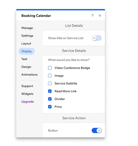
- Tooltips: Do not overload panels with text paragraphs. If you need to add more information, expose it with a tooltip.
See example
Panel texts
Panel text should e clear, concise and useful, to ease user decision making. Be consistent, use the same terminology, structure and tone of voice everywhere.
- Capitalization: Use title case for the panel title, and sentence case for other panel texts.
- Title length: Approximately 20 characters.
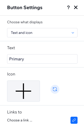
- Title wording: First state the name of your widget / element and then the name of the action . For example, if your widget is a product and the button is Settings, name your panel: Product Settings.
- Labels: Labels should be short and clear as possible. They can be questions, but not necessarily. For example, "Choose what displays" could also be "What's displayed?"
See example
- Section divider headings: Section dividers should separate between different topics in a panel. They should not be written as a question.
- Avoid using Parentheses unless absolutely necessary.
- Avoid the word "Click". Instead of Click to Update, just say: Update.