
Studio Two Editor: Working With the Inspector Panel
This article refers to the new Studio Two Editor, released in November 2026. If you're unsure whether you’re using the Studio Editor or the Studio Two Editor, view more information here.
Edit the properties of any element, section, or page from the Inspector panel. Set how elements resize across breakpoints, adjust the design, add motion, and connect content to a data source, all from one place.
 at the top right of the editor. The panel opens on the right, showing the name of the element you're working on at the top.
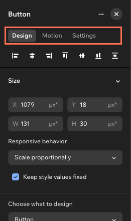
The Inspector adapts to show the available options for whatever you select on the canvas.
Design
Control how an element looks and behaves across breakpoints from the Design tab. This is the first tab you see in the Inspector, and it holds everything from size and spacing to color, typography, and custom CSS.
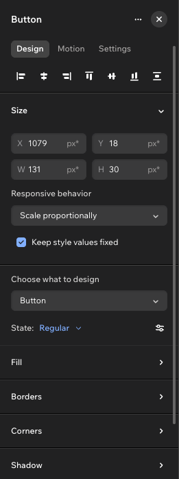
Click the icons at the top of the tab to align the selected element within its parent. Below those icons, the available sections depend on the element you select:
- Size: Set the width and height of the element, and choose how it's resized on different screens.
- Element design: Set the look of the element, including colors, borders, corners, shadows and typography. When elements are built from several parts (e.g. menu), or have their own hover and disabled states (e.g. button), you first choose the part or state you're styling.
- Layout (containers and sections): Adjust the way elements are arranged inside their parent. Choose a grid layout, set the padding, and decide what happens to overflowing content. Switching Vertical spacing from Automatic to Manual lets you space elements differently at each breakpoint.
- Position: Choose a position type (e.g. sticky, pinned) and set the margins and docking to ensure the element stays in place as the screen size changes.
- Appearance: Set the opacity and rotation of the element.
- Cursor: Add a custom cursor to an element, section, or page.
- Anchor: Add an anchor so you can link directly to the element, and copy its anchor URL.
- Custom CSS: Write your own CSS for the selected element.
Motion
Add movement to elements and sections from the Motion tab. You can apply different types of animations to the same element. For example, an element can fade in as it loads, react to the visitor's cursor, and shift as they scroll.
The available animations and effects depend on the chosen element.
Choose the type of motion you want:
Entrance: Animate the element as it first loads. For example, make it expand, fade in, or tilt at an angle.
Loop: Animate the element in a continuous loop, not triggered by any specific action.
Scroll: Animate the element as the visitor scrolls up and down the page.
Mouse Effects: Make the element react to cursor movement with an animation.
Click: Animate the element when a visitor clicks it.
Hover: Animate the element when a visitor hovers over it.
Note: Some elements, like buttons and menus, offer a built-in hover state so you won't see the option to add another hover animation. To customize the hover state, go to the Design tab and select Hover under State.
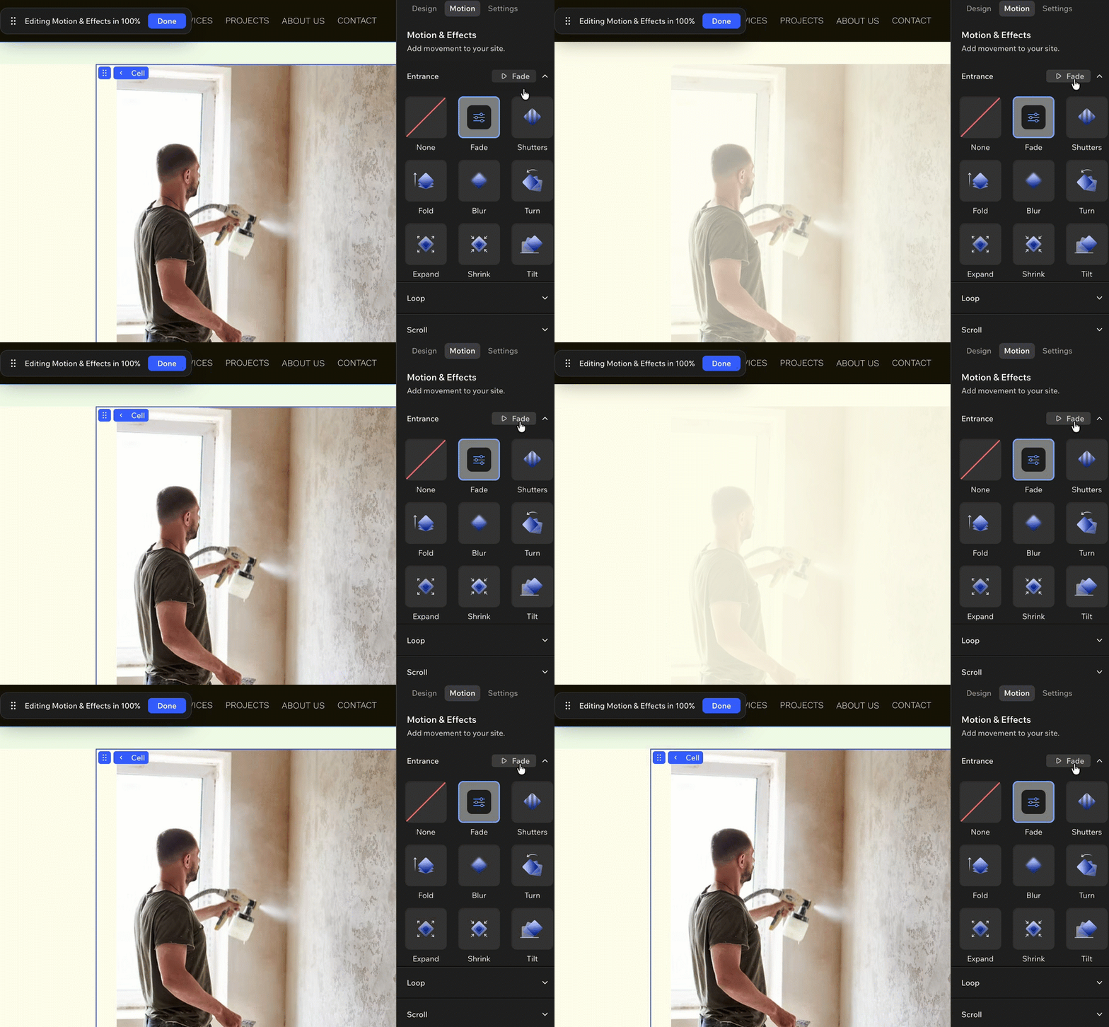
Hover over animation presets to get a preview of the type of movement before selecting it.
Settings
Set up advanced behaviors for your chosen element from the Settings tab.
Data sources: Connect a page, section, or container to a data source. The elements inside it can then use that source’s data, actions, and functionality. Click Connect Source to get started.
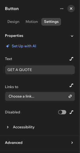
Properties: Edit the content and behavior of the selected element. The options depend on the element – when selecting a button, for example, you can customize its text and link, or disable it. Click the Connect to data icon next to a field to connect it to a data source instead of entering a value manually, or Set Up with AI to get help from Aria.
Accessibility: Make the element easier to use with assistive technology. Depending on the element, you can set its role, mark it as decorative, add an accessible name, and choose how screen readers announce updates.
Advanced:
Visibility condition: Hide the element when a condition from a data source is true / false.
Event handlers: Run a function when something happens to the element, like a click or mouse hover. Event handlers are available for certain elements, such as buttons.
 next to a field to connect it to a data source instead of entering a value manually, or Set Up with AI to get help from Aria.
FAQs
Click a question below to learn more.
 at the top of the Inspector to get started.