Studio Two Editor: Working with Mobile Responsive Settings
This article refers to the new Studio Two Editor, released in November 2026. If you're unsure whether you’re using the Studio Editor or the Studio Two Editor, view more information here.
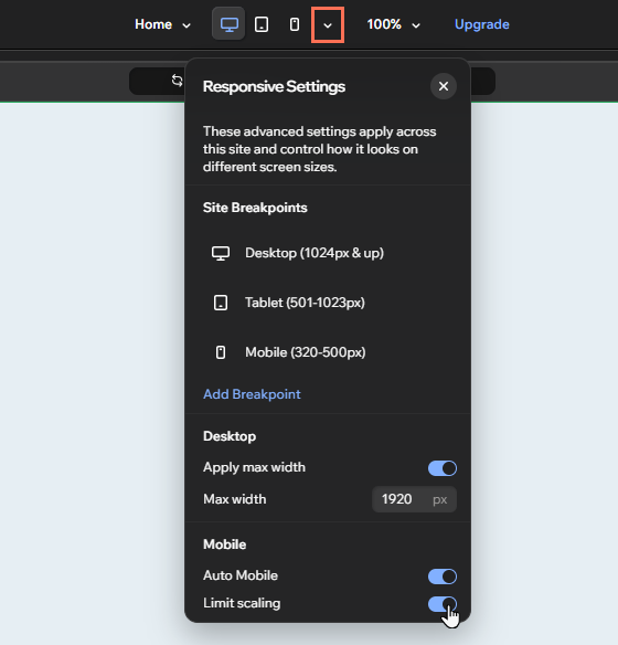
Use the mobile responsive settings to ensure the site looks great and functions well across every device. There are 2 mobile responsive options: Auto Mobile and limit scaling.
Auto Mobile and limit scaling are enabled by default on all sites you create with the Studio Two Editor, but you can disable and re-enable them as needed.
Disabling Auto Mobile on a site
When you make structural changes on the desktop breakpoint (e.g. adding elements or changing their position), the Auto Mobile feature automatically optimizes the layout for the mobile breakpoint.
You can disable Auto Mobile on the site from the Responsive Settings panel in your editor.
Disabling Auto Mobile doesn't affect any existing automatic adjustments the tool has made. However, any new changes you make are not automatically optimized for the mobile breakpoint.
To disable Auto Mobile:
Click the Customize Breakpoints icon
 at the top of the editor.
Click the Auto Mobile toggle to disable it.
Click Turn Off in the popup.
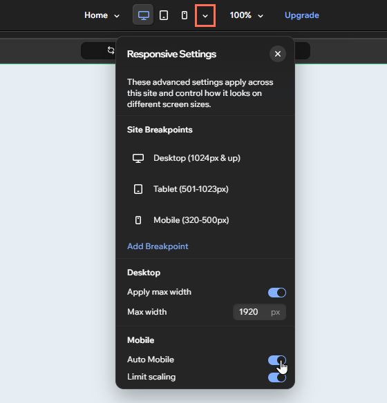
You can always click the toggle again to re-enable Auto Mobile across the site.
Disabling and re-enabling Auto Mobile on specific sections
You may have a specific layout in mind for certain sections on mobile devices.
To exclude a section from Auto Mobile, adjust its layout from the mobile breakpoint. This automatically disables the feature on that section without affecting the rest of the site.
If you change your mind, you can always re-enable Auto Mobile on those sections later.
Changing the responsive behavior of an element on the mobile breakpoint also disables Auto Mobile on its parent section.
To re-enable Auto Mobile on specific sections:
- Go to your editor.
- (If on a different breakpoint) Click the Mobile icon at the top of the editor.
- Click the relevant section.
- Hover over the Auto Mobile icon
 next to the section.
- Click Turn On for this Section.
- Click Turn On in the popup.
 at the top of the editor.
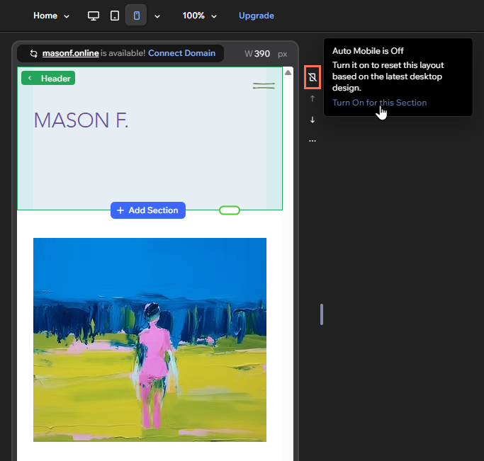
This option is only available when Auto Mobile is enabled for the entire site.
Working with limit scaling
Limit scaling is the mobile equivalent of the site's max width — it limits how much elements grow on mobile screens that are 700px and above.
To ensure the best possible experience for site visitors, we recommend keeping limit scaling on. However, you can disable and re-enable it as needed.
To disable or enable limit scaling:
- Go to your editor.
- Click the Customize Breakpoints icon at the top of the editor.
- Click the Limit scaling toggle to disable or enable it.