Lay out your content on a grid. Every section in the Studio Two Editor comes with a section grid that holds your layout together as the screen size changes.
Choose the grid layout that fits your content best, or edit the CSS grid manually when you want to set the rows and columns yourself and size each one with responsive units.
Working with a section grid
Shape the section grid around your content. Blank sections start as a single cell, so most layouts begin with a split into rows, columns or a collage. From there you can add cells, even out their sizes and flip the grid to try a different composition, without dragging any elements around.
To customize a section grid:
Go to your editor.
Select the relevant section.
Click the Open Inspector icon  at the top right of the editor.
(If not already open) Click the Design tab and scroll down to Layout.
Choose how you want to customize the grid:
Rearrange the cells you already have, without moving any of your elements out of them. The options adapt to the current number of cells, so the list only suggests arrangements that fit.
What you see in the Inspector depends on your current section grid:
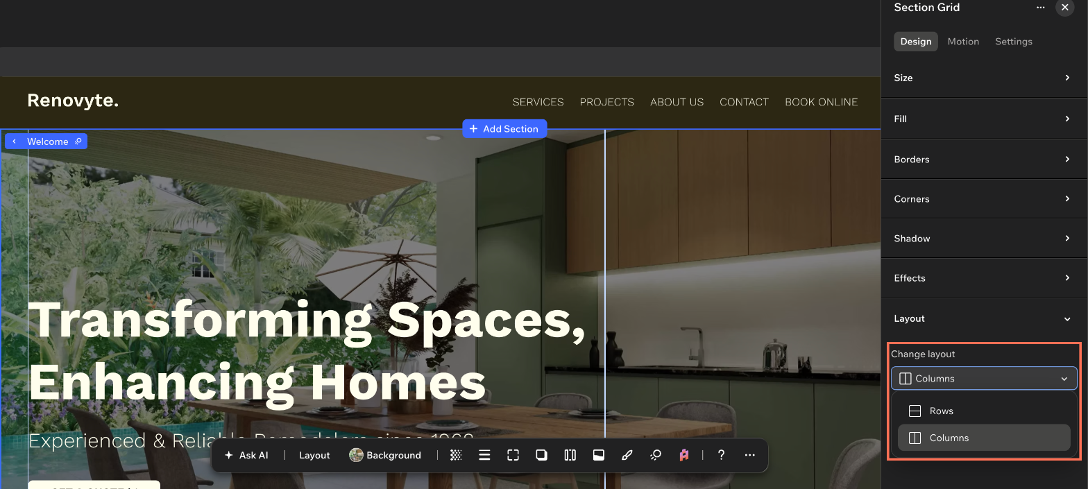
If your section grid only has 1 cell, you can select a layout with more cells under Choose layout.
If your grid has multiple cells, you can click the Change layout dropdown and select a layout (Rows, Columns, Collage or Cards).
Note: The available layouts depend on the number of cells in your section grid. For example, the Cards layout is only available for 4-cell grids.
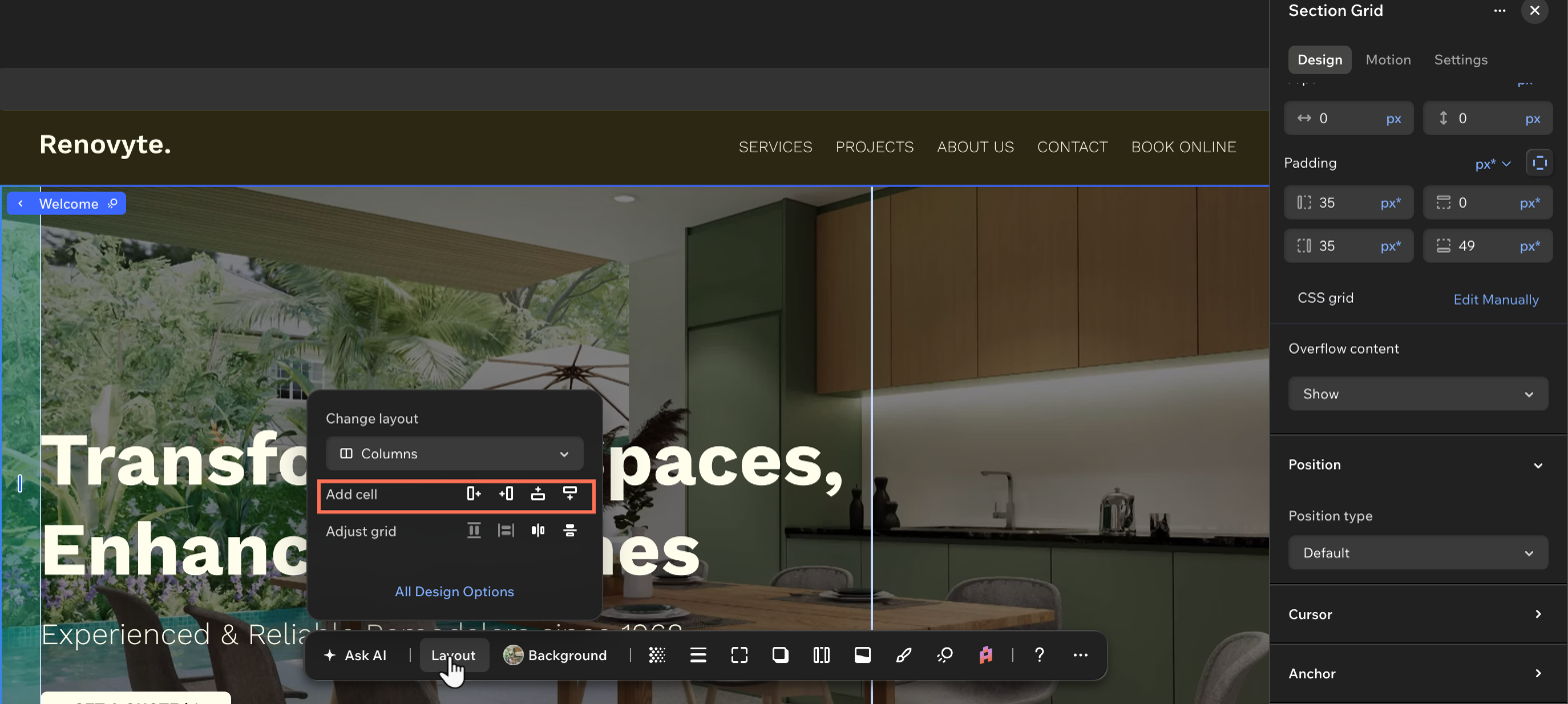
Extend the grid when your layout needs another cell. You choose which edge of the grid it's added to.
Click Layout on the action bar, then click the direction you want the new cell to go in under Add cell: Right  , Left
 , Top
 or Bottom
 .
To delete a cell, right-click it on the canvas and select Delete, or press the Delete key on your keyboard. This also deletes the elements that are currently in the cell.
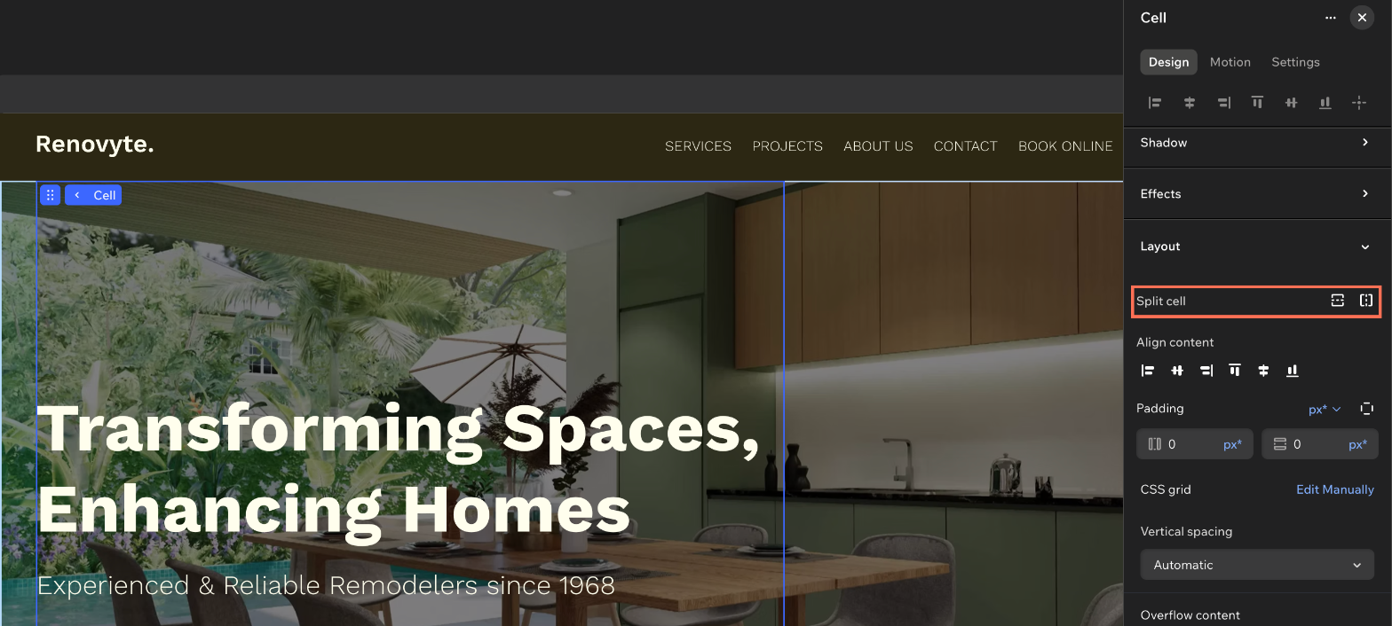
Split 1 cell into two. This may cause some elements to move, in order to fit neatly into a cell, but you can always change their position on the canvas.
Select the cell on the canvas, then choose the relevant option next to Split cell in the Inspector: Split horizontally  or Split vertically
 .
Good to know:
You can also split cells by clicking the same icons on the action bar.
Combine 2 cells into one, or have them trade places. Merging is only available when the cells sit in the same row or column, while swapping works with any 2 cells.
Click the first cell.
Hold the Shift key while clicking the second cell.
Click Merge or Swap on the action bar.
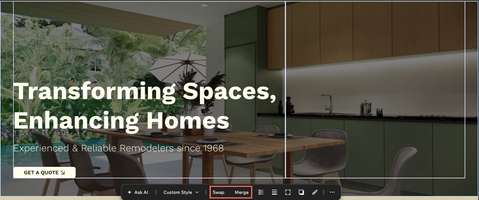
Even out or flip the grid
Tidy up the proportions of the grid, or reverse the order the cells appear in. Flipping is a quick way to test a different composition, since the cells and the elements inside them move together.
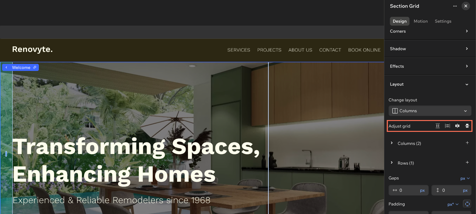
Select the relevant option next to Adjust grid in the Inspector:
Equalize columns  : Give every column the same width.
Equalize rows  : Give every row the same height.
Flip columns  : Reverse the order of the columns.
Flip rows  : Reverse the order of the rows.
Good to know:
These actions are also available on the action bar. Click Layout, then click the relevant icon next to Adjust grid.
Set the vertical spacing manually
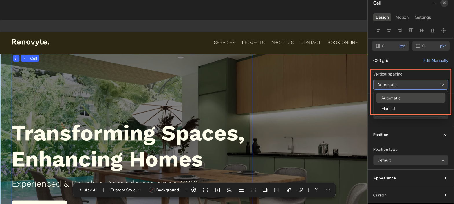
Take over the row heights while keeping the section grid. The editor sizes the rows for you by default, and you can hand the spacing back at any time.
If the section has more than 1 cell, select the relevant cell first. Then, click the Vertical spacing dropdown and select Manual, or select Automatic to return the sizing to the editor.
Note:
If the section's responsive behavior is 'Fit to screen', the vertical spacing is already set to manual.
Editing the CSS grid manually
Edit the CSS grid manually to control the columns and rows precisely. Manual editing lets you size each column and row in responsive units such as fr, Min/max or %, and set the number of columns and rows yourself instead of picking one of the preset layouts.
You can edit the CSS grid of a whole section or of a single cell:
To edit the CSS grid manually:
Go to your editor.
Select the desktop breakpoint at the top of the editor.
Select the relevant section or cell.
Click the Open Inspector icon at the top right of the editor.
(If not already open) Click the Design tab and scroll down to Layout.
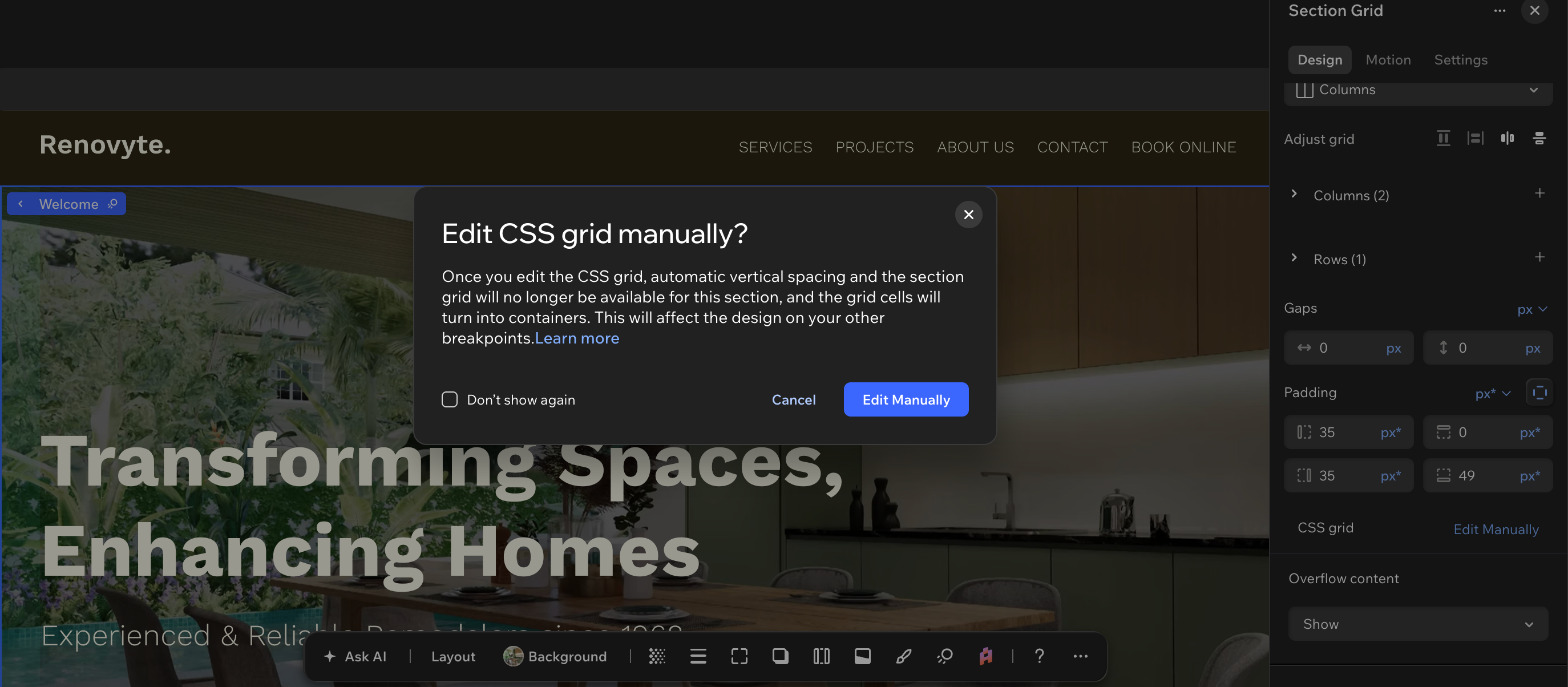
Click Edit Manually next to CSS grid.
(In the popup) Click Edit Manually to confirm.
Tip: Select the Don't show again checkbox to skip this confirmation on the site from then on.
Working with a manual CSS grid
Build the grid line by line. A manual CSS grid gives you the rows, columns and gaps as separate values, using responsive units like fr, min/max, % and more. Tailor the grid at each breakpoint — the design cascades down from desktop, so make sure to adjust it to fit smaller screens too.
To customize a manual CSS grid:
- Go to your editor.
- Select the relevant section or cell.
- Click the Open Inspector icon at the top right of the editor.
(If not already open) Click the Design tab and scroll down to Layout.
Choose how you want to customize the grid:
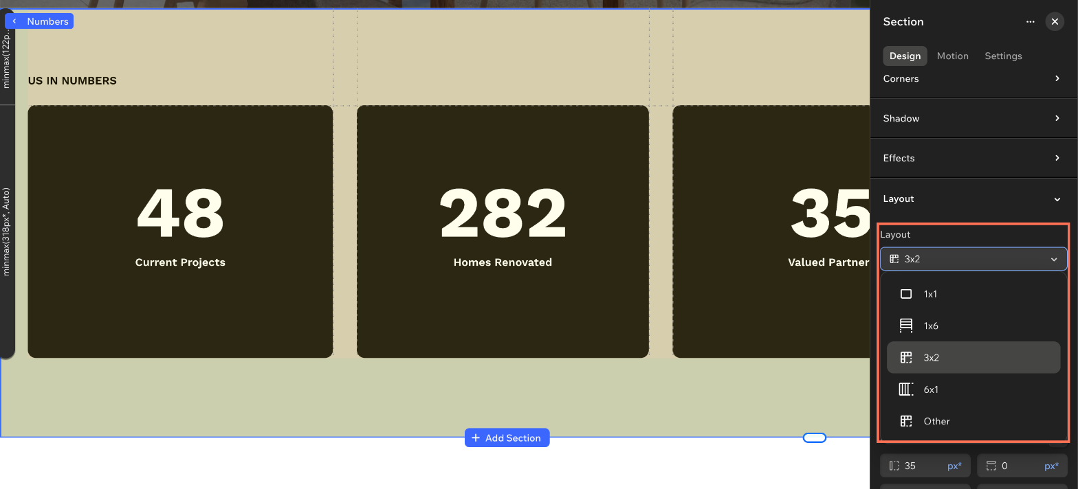
Reorganize the cells in your grid by selecting a new look from the Layout dropdown. The list of available layouts is based on the current number of rows and columns, suggesting different ways to arrange them.
Good to know:
You can also do this from the action bar. Click the Layout dropdown (it shows the current grid size, e.g. 2x2) and select a new look.
Resize the rows and columns
Set the size of each row and column yourself, in the unit that suits it.
Click Columns / Rows to see the full list.
Enter a size and a unit next to the relevant row or column number.
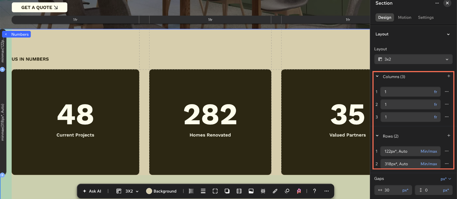
Good to know:
You can also resize the rows and columns directly on the canvas. Click the Customize grid on canvas icon  on the action bar, then drag the gridlines to the position you want. Your elements will stay in place.
Add or remove rows and columns
Change the structure of the grid after you've built it. Adding a row or column can shift elements around to make space for it.
Click Columns / Rows to see the full list.
Click the More actions icon  next to the relevant column / row.
Select the relevant option:
Column: Add column left, Add column right or Delete column.
Row: Add row above, Add row below or Delete row.
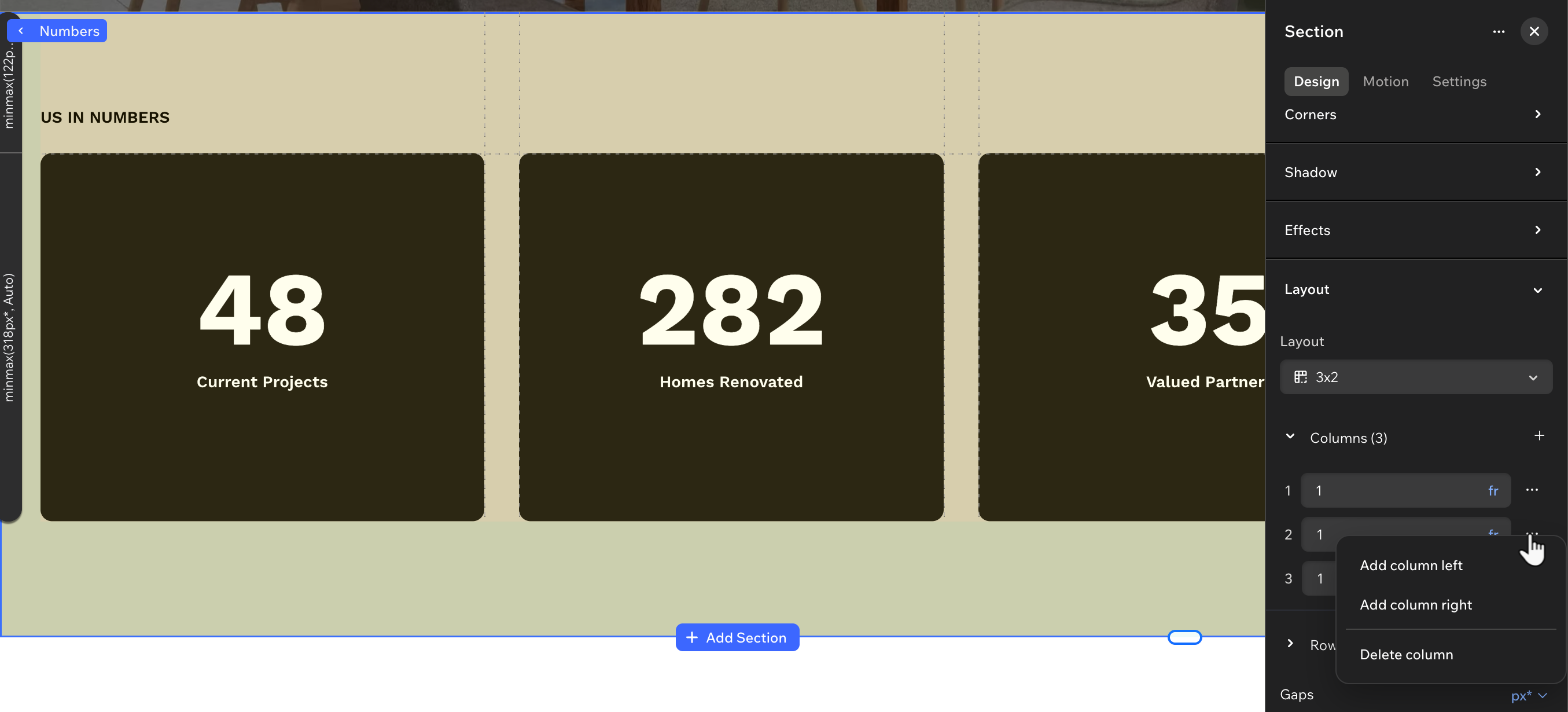
Good to know:
You can also add rows and columns directly on the canvas. Click the Customize grid on canvas icon  on the action bar, then drag from the left or top edge of the grid to add a new gridline. Your elements will stay in place.
You can't delete the last column / row in the grid. Delete column / Delete row is unavailable when there's only one.
Space the rows and columns apart. Enter the values you want next to Gaps, and click the current unit to switch to another. For example, switch from px* to vw if that works better for you.
You can use the same unit for both gaps (horizontal and vertical), or choose a different one for each gap.
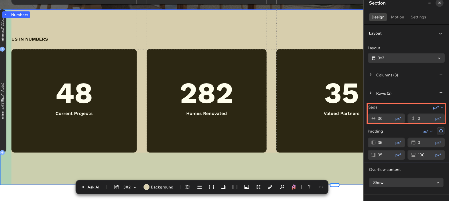
Move an element to a different cell
Reposition an element, or stretch it over several cells, without dragging it across the canvas.
Select the element you want to move.
(In the Inspector) Scroll down to Position.
Click the relevant cell under Location in grid cells.
Tip: Stretch the element across several cells by holding the Shift key while clicking the cell you want it to reach.
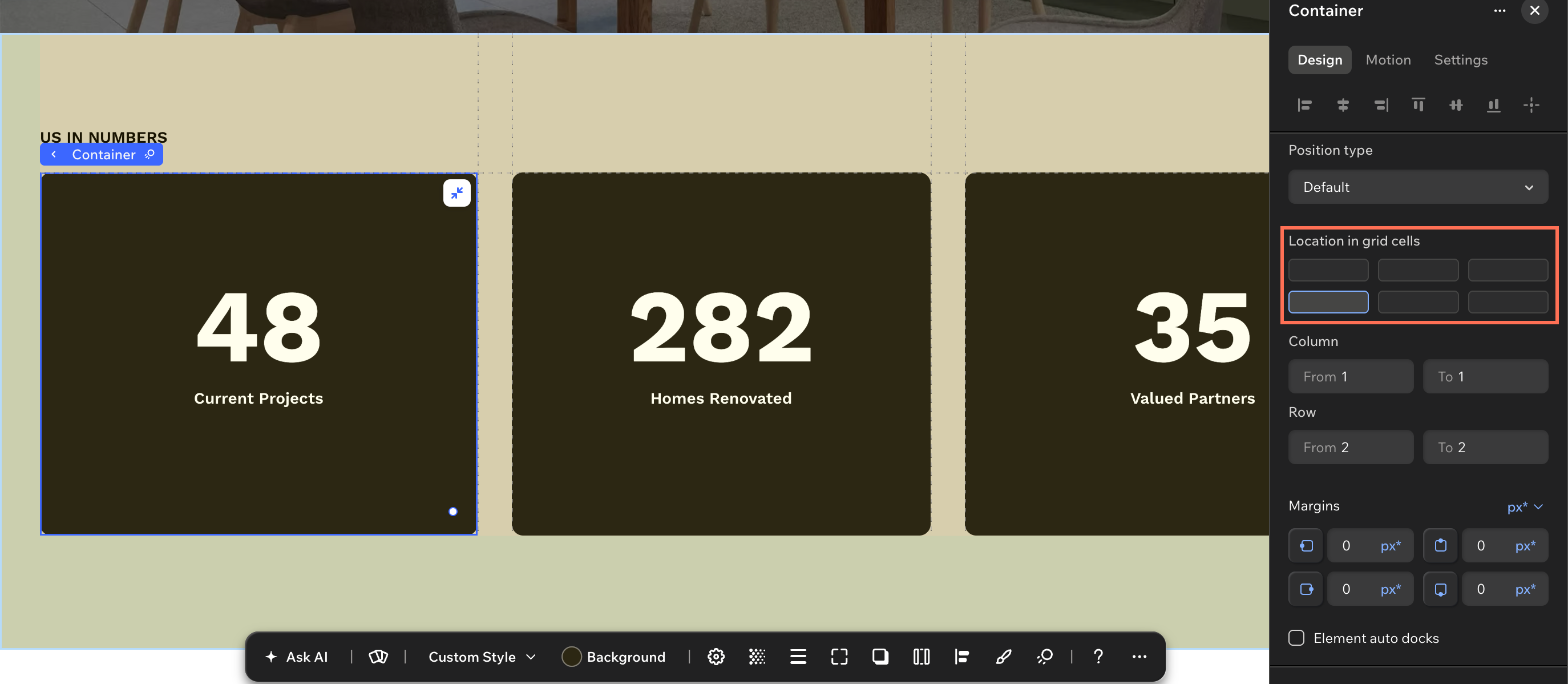
FAQs
Click a question below to learn more about cells and grids.
Why can't I add any more cells to my section?
A section grid holds a maximum of 16 cells, and Add cell stops working once you reach it.
If the design needs more, you can split the content across 2 sections or edit the CSS grid manually and build the structure you need there.
I want to set my own row heights. Do I have to edit the CSS grid manually?
No. You can set Vertical spacing to Manual to control the heights yourself in a section grid.
Editing the CSS grid manually is a bigger change. It replaces the section grid altogether and gives you every row and column as a value you set yourself. Reach for it when you need the responsive sizing units, or a structure the preset layouts don't cover.

 at the top right of the editor straight away.