Studio Two Editor: Working with Breakpoints
This article refers to the new Studio Two Editor, released in November 2026. If you're unsure whether you’re using the Studio Editor or the Studio Two Editor, view more information here.
Breakpoints are screen size ranges that represent the possible sizes of visitors' devices (e.g. desktop or tablet). By default, all sites you create in the Studio Two Editor come with 2 breakpoints: desktop (1024px and above) and mobile (320-1023px).
With the Studio Two Editor, you can design the site for each breakpoint individually, ensuring that site visitors have the smoothest experience on every device.
Adding new breakpoints
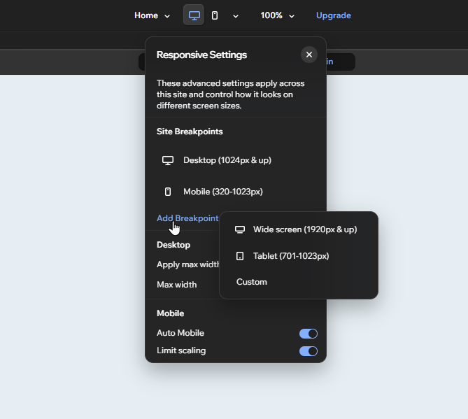
You may want a wider variety of screen size ranges (e.g. tablet or small desktop). Add a preset breakpoint from the Responsive Settings panel, or create a custom range.
To add a breakpoint:
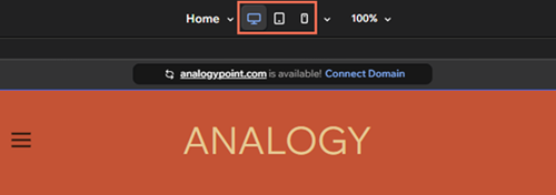
Click the Customize Breakpoints icon
 at the top of the editor.
Click Add Breakpoint and select the type you want:
Wide screen: For screens 1920px and above. Select this option to design the site for very wide desktop screens.
Tablet: For screens between 701px and 1023px, so it covers most tablets.
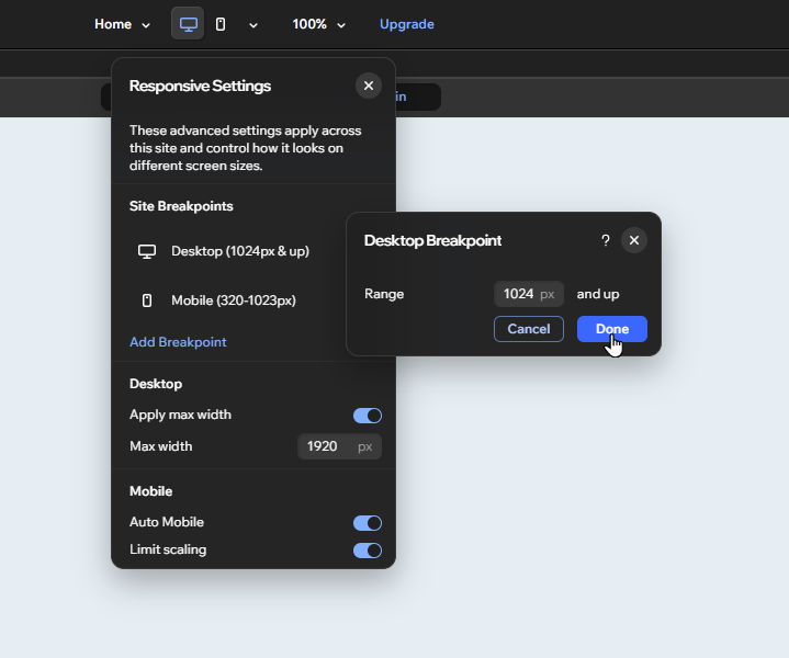
Custom: Select this option to create your own custom breakpoint range:
Enter the maximum screen size (in px) into the field.
Click Done.
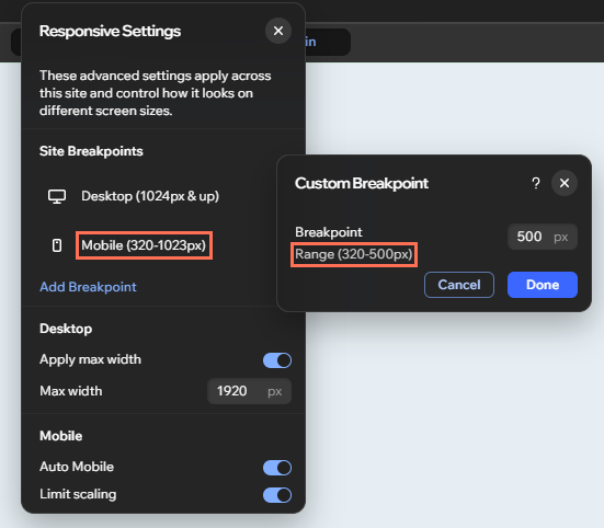
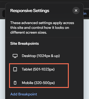
Whether you add a preset or custom breakpoint, you can customize its range.
Customizing existing breakpoints
Edit the size of existing breakpoints to create tailored views for site visitors. The part of the range you can edit depends on the breakpoint you're customizing.
To customize a breakpoint:
Click the Customize Breakpoints icon
at the top of the editor.(In the Responsive Settings panel) Hover over the relevant breakpoint and click the More Actions icon .
Click Edit.
Depending on the breakpoint, enter the new range:
Smallest breakpoint on the site: Enter the maximum size into the field.
Largest breakpoint on the site: Enter the minimum size into the field.
All other breakpoints: Enter the maximum and minimum sizes into the fields.
Click Done.
 .
Deleting breakpoints
You can delete any breakpoint you no longer need. The breakpoint below it automatically adopts its range.
However, keep in mind that when you delete a breakpoint, all customizations you made for that specific breakpoint are also deleted from the site.
To delete a breakpoint:
Click the Customize Breakpoints icon
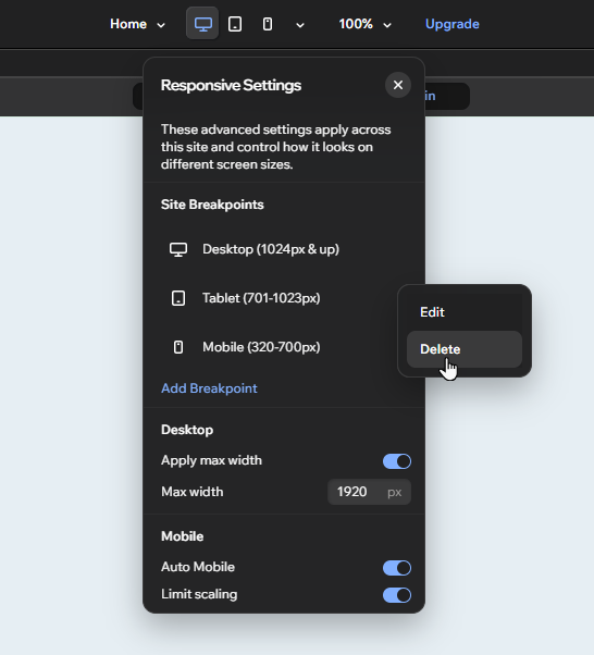
at the top of the editor.(In the Responsive Settings panel) Hover over the relevant breakpoint and click the More Actions icon .
Click Delete.
Click Delete in the popup.
Setting your canvas width
Set the canvas width of the current breakpoint in your editor. Each breakpoint represents a range of screen sizes, so you can choose an exact width that always stays the same.
The width you set must be in the range of the breakpoint you're currently working on.
To change your canvas width:
Open the relevant breakpoint from the top of the editor.
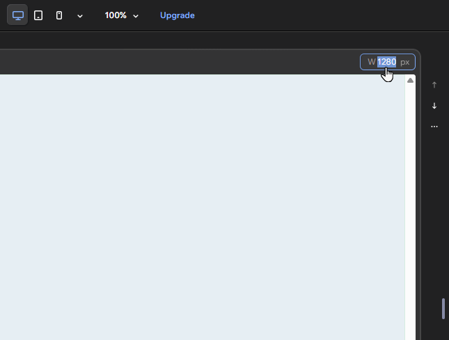
Click the canvas width field at the top right of the canvas.
Enter your chosen width (in px) into the field.
Press Enter on your keyboard.
(Optional) Repeat steps 2-5 for each breakpoint.
The canvas width applies to the entire site, so you don't need to set it up for each page.