
Studio Two Editor: Setting the Element's Size
This article refers to the new Studio Two Editor, released in November 2026. If you're unsure whether you’re using the Studio Editor or the Studio Two Editor, view more information here.
The Studio Two Editor lets you set the exact size for every element, so your design adapts to any device on its own. Resize on the canvas or in the Inspector panel to set an element's exact measurements.
As you resize, you'll see px*, a unit shown in pixels. It scales per breakpoint, based on the element's responsive behavior. Switch that behavior if the default doesn't fit your design, or turn on advanced settings for direct control over width and height.
Resizing elements
Choose how to resize elements based on the way you like to design:
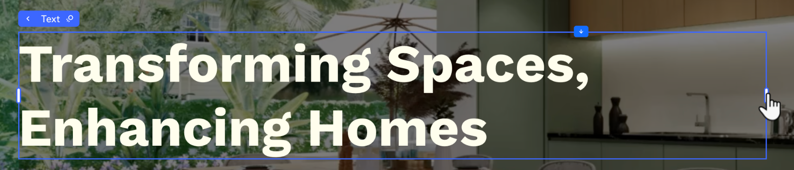
On the canvas: Click the element to select it on the page and drag the side handles until the element gets to the desired size. As you're dragging, you can see the element's exact size in pixels.
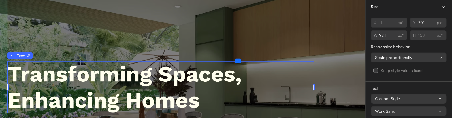
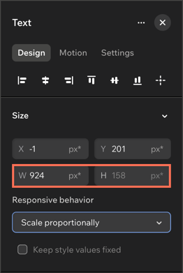
In the Inspector panel: Click the element and open the Inspector panel to see (and change) its exact width and height.
Working with px* as a unit of measure
The Size section in the Inspector panel features a relative unit of measure that is unique to the Studio Two Editor - px*.
The asterisk (*) next to 'px' means that the size is relative to the breakpoint you're currently working on. For example, if you switch from desktop to the mobile breakpoint, the element's width and height in px* would be accordingly smaller.
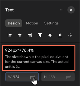
px* represents the value in pixels, while the actual measurement behind the scenes is responsive. Hover over px* in the panel to see the calculation and the responsive size unit that is being used (e.g. percentage, aspect ratio, etc.)
Choosing the responsive behavior
Set a responsive behavior that decides if, and how, an element resizes across breakpoints. Every element starts with a default behavior, but you can switch to one that fits your design better.
To change the element's responsive behavior:
Select the relevant element.
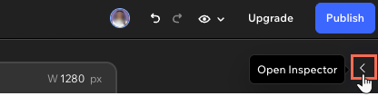
Click the Open Inspector icon at the top right of the editor.
 at the top right of the editor.
Click the Design tab.
Click the Responsive behavior dropdown under Size.
Choose a new responsive behavior.
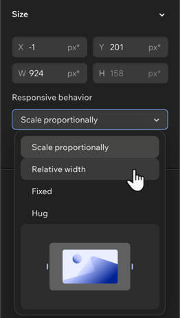
Hover over the options in the dropdown to see an animation illustrating what it looks like.
Using advanced size settings
Reach for advanced settings when you want direct control over an element's measurements (like px, %, or vh) instead of leaving it to px* and the responsive behavior.
Enabling advanced settings applies to the specific element you select, on all breakpoints. The advanced settings mode stays enabled for that element, for easy access, but you can disable it at any time.
To enable advanced settings:
Select the relevant element.
Click the Open Inspector icon at the top right of the editor.
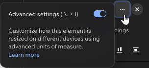
(In the Inspector) Click the More Actions icon
 at the top right.
Enable the toggle next to Advanced settings.
Edit the sizing as needed: Width, height, and min and max values.
Tip: Switch to a different unit (e.g. from px to %) by clicking it in the Inspector. This opens a list of the available measurements for the element.