
Studio Two Editor: Creating Custom Click or Hover Interactions
With custom interactions, you can create a unique animation that plays when visitors click or hover over content on the site. The interaction can animate the same element that triggered it, or any other element on the page.
Step 1 | Add a trigger (Click or Hover)
Get started by choosing the trigger element in your editor (the element that visitors should click or hover over to see the interaction). Then, you can add the interaction from the Inspector panel.
To add a trigger:
Select the relevant element on the canvas.
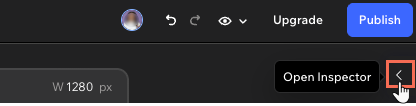
Click the Open Inspector icon at the top right of the editor.
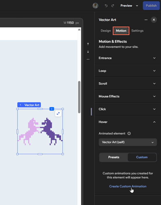
(If not already open) Click the Motion tab.
Select Click / Hover.
Select the Animated element:
Make the element trigger its own animation: Click the element's name (the word (self) appears next to it).
Animate a different element on the page: Select an element from the dropdown.
Click Custom.
Click Create Custom Animation.
 at the top right of the editor.
Step 2 | Adjust the element's design
Once you've added the interaction, get started by adjusting the design and layout of the target animation from the Inspector panel.
You can change how the elements looks when visitors trigger the animation, as well as its initial state (how it looks before visitors interact with it).
To design the target element:
(On the canvas) Click the Designing dropdown on the floating toolbar.
Choose what you want to design:
Initial state: How the element looks before visitors interact with the element.
Animation [number]: How the element looks when visitors trigger the animation. Note: As you can add multiple custom interactions to an element, they're numbered in the order you add them. For the example, the first interaction you add to an element is named Animation 1 by default.
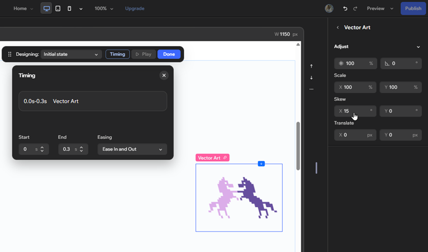
Click the Adjust dropdown in the Inspector panel.
Use the options to customize the element:
Opacity: Change the opacity of the element by entering a value lower than 100%.
Rotate: Make the element rotate in a certain direction by entering an angle in the text box.
Scale: Make the element shrink or grow. You can enter the same value in both X (width) and Y (height) so that the element resizes in its original proportion.
Skew: Make the element turn sideways. Enter a value for the width (X) and the height (Y) of the element.
Translate: Move an element right/left (X) or up/down (Y) by adjusting the X and Y values.
Click Done to save your changes.
Depending on the both the target element and the state you're designing it for, other design options may be available (fill color and opacity, layout, etc.).
Step 3 | Set up the interaction
After designing the target element, it's time to set up the interaction to behave how you want.
To set up the interaction:
(In the Inspector panel) Click the More Actions icon next to the relevant interaction, and click Adjust.
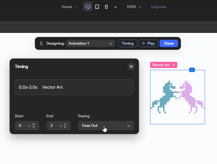
(If not already open) Click Timing on the floating toolbar.
Use the options to customize the interaction:
Start and End: Set the duration of the animation (in seconds) using these fields. The Start field also controls the delay of this animation.
Easing: Choose how the animation eases in and out.
Click Done to save your changes.
 next to the relevant interaction, and click Adjust.
FAQs
Click below to learn more about creating custom interactions.