Editor X: Choosing Between Flexbox-Based and Grid-Based Tools
5 min read
Editor X is transitioning to Wix Studio, our new platform for agencies and freelancers.Learn more about Wix Studio
Editor X offers various layout tools you can use to organize your elements, all of which serve different purposes. These tools are actually based on two common CSS technologies – Grid and Flexbox – which is important to keep in mind as you're planning complex compositions.
In this article, learn more about how Editor X uses CSS technologies:
About Grids in Editor X
A Grid is a two-dimensional CSS model that you can also find in Editor X, the two dimensions being its columns and rows. When designing large responsive layouts, grids help you control the structure of the elements as they're placed inside your pre-defined cells.
Note:
It is not possible to connect CSS grid elements to content collections.
The following elements in Editor X are based on a CSS grid:
Grid
The Grid element in Editor X is an actual CSS grid, so you can use it to create complex layouts while defining their responsive behavior. You can choose the number or size of columns / rows for each breakpoint so the composition is always pixel-perfect.
When setting the size of your columns, rows and gaps (gutters), there are many fixed and fluid measurements you can use like px, percentage, fr and more.
Container
A container is the most basic layout tool to create compositions. You can attach elements to this container box so it automatically becomes their parent element and defines their structure. This is a great tool for creating 'standalone' compositions that should be smaller than a section.
Tip:
You can place other layout tools inside a container. For example, you can apply a grid inside a container or add Layouters / Repeaters.
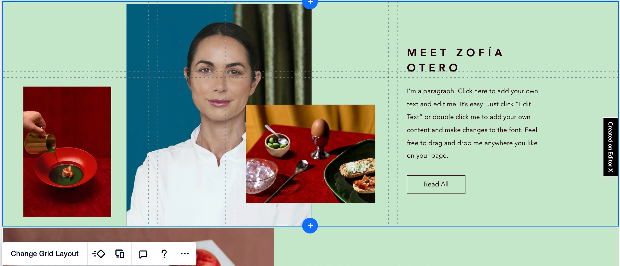
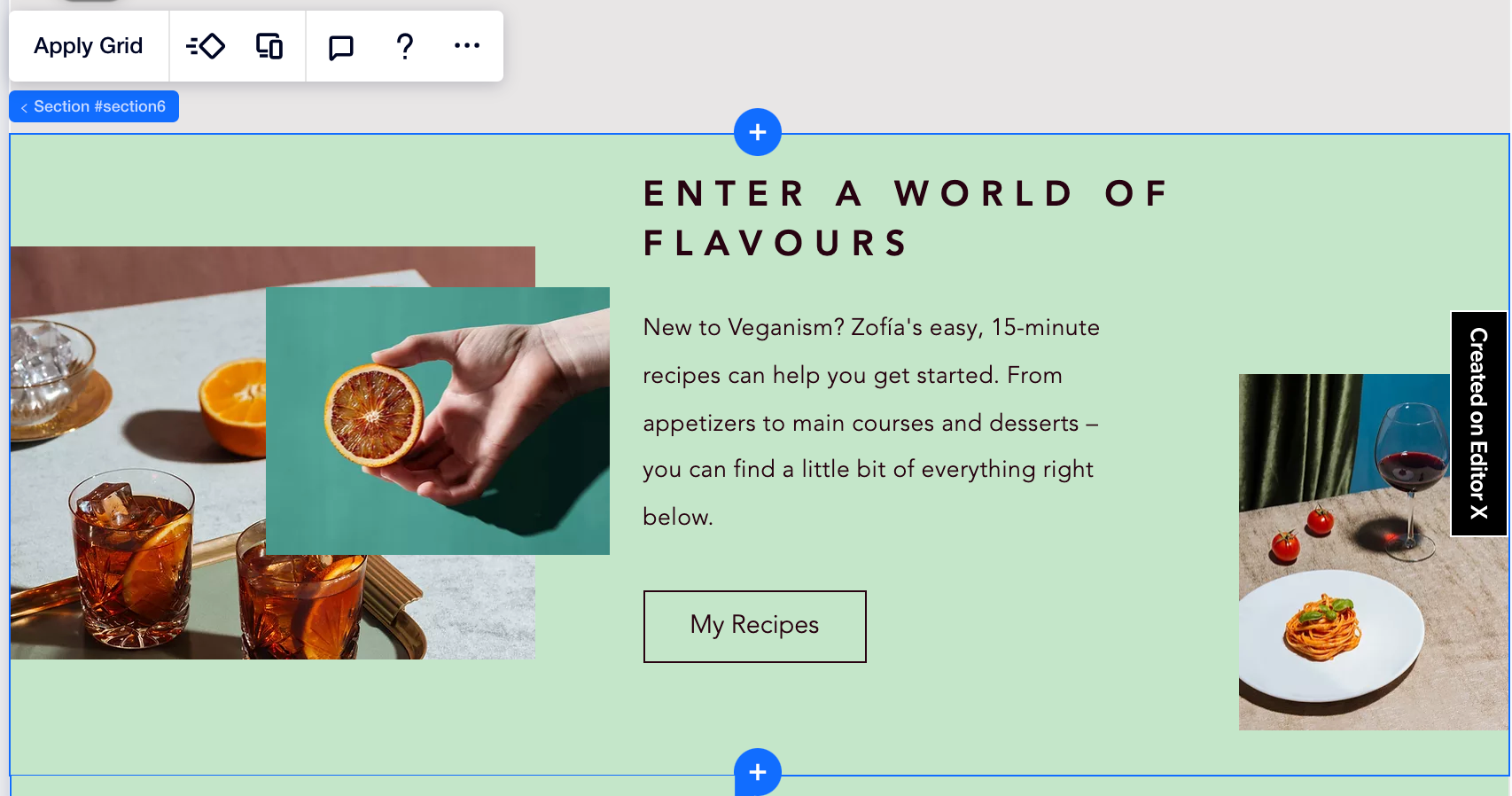
Section
A page section is also a container, so it defines the structure of any children elements attached to it. You can choose to apply a grid to your section or position the elements as needed.
About Flexbox in Editor X
Flexbox is a one-dimensional CSS model that we use in Editor X for most of our layout tools. In these tools, elements automatically adjust (i.e., flex) to fit the space in the parent element, whether it's wrapping, expanding to fill up space or shrinking to fit into the space.
The following elements in Editor X are based on Flexbox:
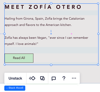
Stack
A Stack is a transparent flex container that holds elements placed in a vertical order. For example, you can stack several text boxes or a text element and a button placed below it. Stacking keeps the margins between elements intact and prevents elements from overlapping on smaller screens.
Working with breakpoints:
- While you can't delete a Stack nor its children elements from specific breakpoints, you can hide them using the right-click menu.
- You can set the order of your Stack elements per breakpoint.
Layouter
A Layouter is a flex container that holds several items in a layout of your choice. The Layouter items are containers, so you can add elements in a free composition or apply a grid if you want to structure it more.
All you need to do is choose a display type (e.g., Slider, Mosaic, Columns) and the Layouter does the rest – your items wrap to look great on every breakpoint. Having said that, you can choose a different display type for each viewport (e.g., Slider layouts work great for mobile devices).
Note:
It's not possible to connect Layouters to a data collection. As an alternative, you can use the Repeater element to display content from your collection.

Working with breakpoints:
- While you can't delete a Layouter nor its items from specific breakpoints, you can hide them using the right-click menu.
- You can also set the order of your Layouter items per breakpoint.
Repeater
A Repeater is a flex container that holds several items in a layout of your choice. Repeaters are ideal for when you want every item to have the same layout and design, but different content – like lists. The layout and design adjustments are automatic so you never have to worry about cohesiveness.
What really makes Repeaters unique is the ability to connect them to your content collections. This allows you to manage and update the content from the back-end without affecting the actual design.
Working with breakpoints:
You can set the order of your Repeater items per breakpoint.
How to choose the right Layout Tool
Before selecting one of our tools, plan the desired layout you want for each screen size. Then, you can choose a layout tool that includes the abilities you need.
Click below to learn about some key differences between layout tools in Editor X:
Responsive behavior
Connecting to content collections (data)
Control over spacing
Did this help?
|