Wix Editor: Customizing the Design of Your Mobile View
5 min read
The mobile Editor lets you tailor your site's mobile view to your specific needs. You can make small adjustments to keep the same feel, or create a distinct look for mobile with custom elements, different backgrounds and more.
Learn more about designing:
Customizing Desktop vs. Mobile-Only Elements
The ways you can customize an element on mobile depend on its source:
- Desktop elements: Elements you added to the desktop view automatically appear on your mobile view as well.
- Mobile-only elements: Elements (e.g., text, images, buttons) that are optimized for mobile and don't appear on your desktop view. You can add them directly from the Add panel.
Click below to learn more about customizing desktop and mobile-only elements:
Dekstop elements

Mobile-only elements
Note:
The available customization options for desktop elements vary based on the specific element.
Tip:
From the Mobile Tools panel  , you can add features that increase engagement and make navigation easier on mobile. Add a welcome screen, a Quick Action bar or a Back to Top button at the bottom of long pages.
, you can add features that increase engagement and make navigation easier on mobile. Add a welcome screen, a Quick Action bar or a Back to Top button at the bottom of long pages.Designing Text for Mobile
When designing text for your mobile view, the customization options differ based on the element's source.
Text Added from Desktop
If the text box was originally added on desktop, you can adjust its size, formatting and alignment for your mobile needs.
To change the actual text, head over to the desktop Editor.

Mobile-Only Text
Mobile-only text is fully customizable. You have all the same options available for desktop – edit the text, change the design and even get text ideas for some inspiration.

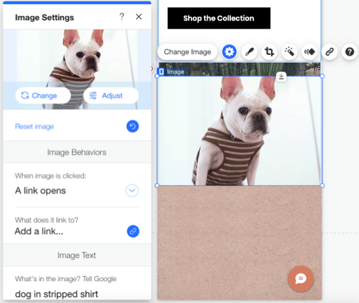
Adjusting Images for Mobile
When adjusting images for your mobile view, the customization options differ based on where the image was added from – desktop or mobile.
Image Added from Desktop
When adding an image on your desktop view, you can make some adjustments so the image fits mobile screens better. You can resize or crop the image, add animation and control the image behavior (e.g., a link opens when clicked).

Mobile-Only Image
When adding an image from the mobile Add panel, you have the same customization options as in desktop.
You can control the image behaviors, crop it, or adjust it using the Wix Photo Studio. You can also add animation and a link to mobile-only images.

Designing Your Mobile Menu
Design every aspect of your mobile menu, from the menu icon to the menu box and menu items, without affecting your desktop version. You can change the colors, the text, the background and add more elements to make it your own. Learn More

Customizing Page Background for Mobile
You can change your mobile background without affecting your desktop background. Choose a different color, a video or an image to better suit the mobile experience you're trying to create. Learn More
To change page background:
- Click the relevant page in your mobile Editor.
- Click the Background icon
 on the left.
 - Select a background color, image or video.

Note:
You cannot change the template for your mobile or desktop site. Click here to vote for this feature.
Did this help?
|